As kitchens continue to become the social hub of the home and an integrated part of living and dining areas, the joinery is being designed to look like it’s part of the furniture. This is becoming especially true in apartments and smaller homes where the kitchen serves multiple purposes beyond just food preparation and cooking. We spoke to five architects and designers about their approach to increasingly popular kitchen furniture design.
Francis Apartment by Studio Weave Architects

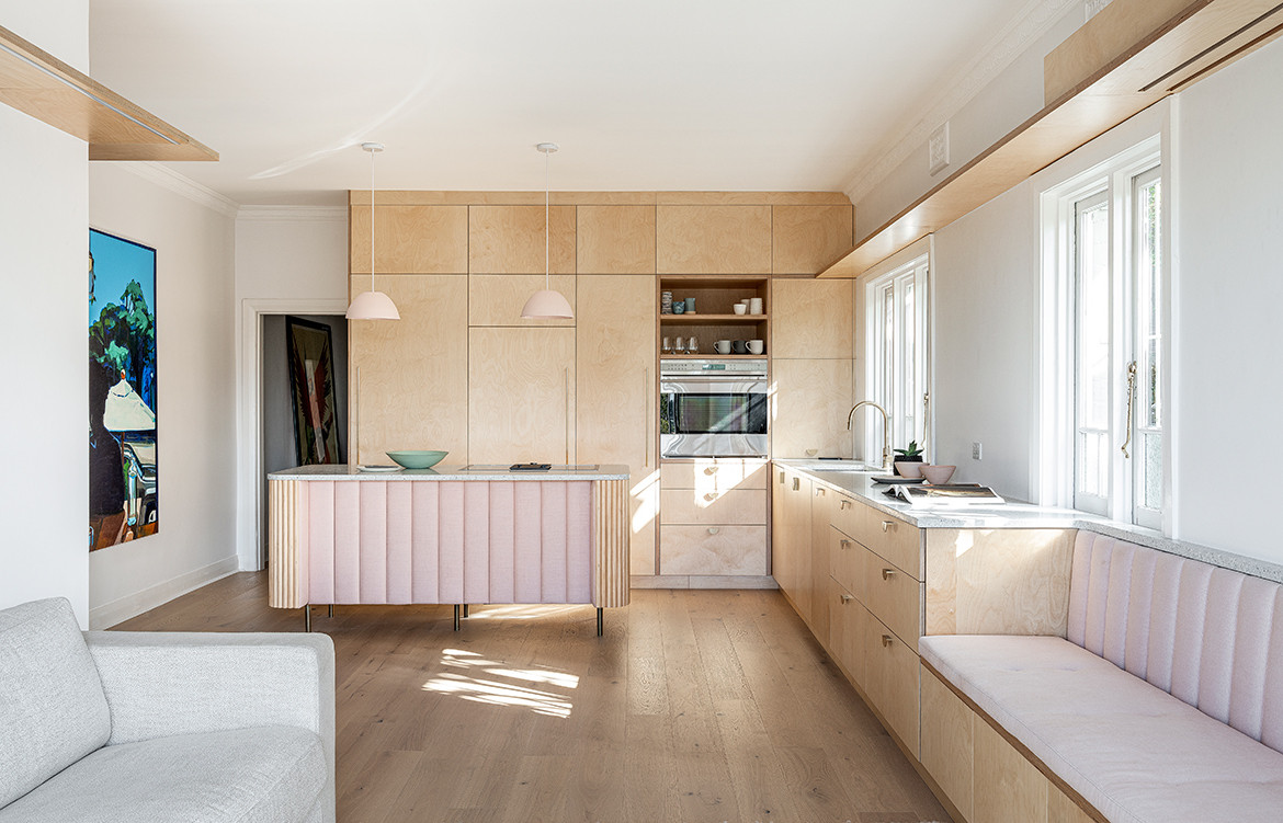
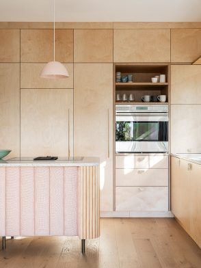
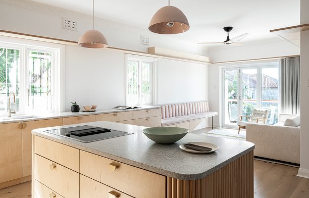
The owner of this two-bedroom apartment in Bondi loves to cook and wanted to create a space for entertaining guests. With limited room to work with, Studio Weave Architects integrated the kitchen and lounge area, and designed the joinery to not only look like furniture, but to actually be furniture. Curved corners on the kitchen island invite people to congregate around it, and benchtop joinery in the kitchen morphs into a bench seat in the lounge area.
The local Bondi area inspired the materials, forms and colours, with Studio Weave referencing its pastel hues, art deco architecture and coastal vibe. The plywood joinery has brass handles and legs, and pink fabric upholstery with channel-back stitching is on the bench seat and front face of the island. “Kitchen joinery is moving more towards furniture because clients and designers want to express themselves in a more unique way, especially as kitchens become such a focal point as a place to congregate and entertain,” says Davin Turner of Studio Weave Architects.
Studio Weave Architects
sweave.net
Photography by Tom Ferguson
Riverview House by Nobbs Radford Architects

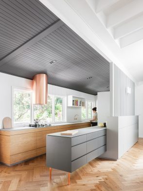
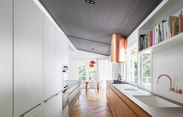
Well-designed storage is key in a home with young children, and this kitchen by Nobbs Radford Architects offers plenty of it. By cleverly integrating storage into joinery, the kitchen has a multi-purpose peninsula bench designed like a credenza unit. “The bench needed to accommodate simultaneous activities of cooking, eating and a place for children to do their homework,” says Alison Nobbs of Nobbs Radford Architects.
The peninsula bench is a visible part of the open-plan kitchen, dining and living area. The dark-grey joinery has drawers both sides and is raised off the floor on bespoke copper legs, allowing the herringbone flooring to flow underneath. “For each project we like to define its palette of materials and explore the different ways it can be expressed,” says Alison. “The ceiling of the kitchen and dining area are painted a very dark grey, which links these spaces and the joinery together, and we used copper in the legs, tapware, bespoke fittings, lighting elements and sculptural rangehood.”
Nobbs Radford Architects
nobbsradford.com.au
Photography by Kat Lu
A+H Apartment by Buck&Simple

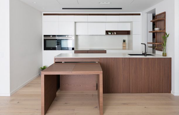
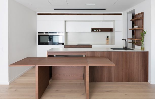
A+H Apartment is home to a young family who engaged Buck&Simple to do a minimalist transformation, maximising space and creating adaptable spaces for their lifestyle. “As housing and the spaces we live in get smaller, the planning needs to work harder and joinery often needs to fulfil multiple roles,” says Kurt Crisp of Buck&Simple. In A+H Apartment, an expandable dining table is integrated into the kitchen island to provide versatility for casual family meals and entertaining friends. The table slides out from the front of the island and extends to both sides.
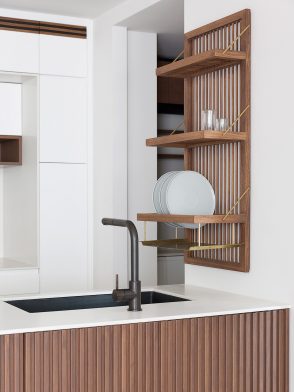
Joinery above the kitchen sink elevates the design of the humble drying rack. “Working with such a compact floor plan we looked at every surface for opportunities. It became a practical solution to wall mount the drying rack, but was essential to keep the design refined,” Kurt says. It is crafted with timber and brass, like other joinery pieces throughout the apartment, to maintain a consistent and cohesive material palette. “We see a changing dynamic as people place focus on their experience and interaction with objects. The function and feel of a bespoke product, tailored to a client’s needs, results in more enjoyment with items of higher quality materials and design,” says Kurt.
Buck&Simple
buckandsimple.com
Photography by Simon Whitbread
Port Willunga Beach House by Fabrikate

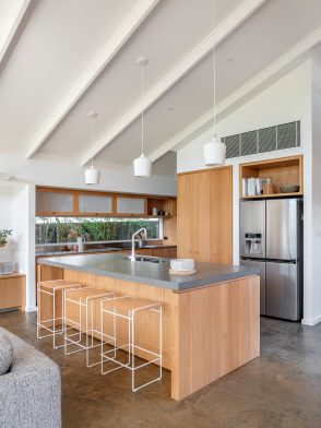
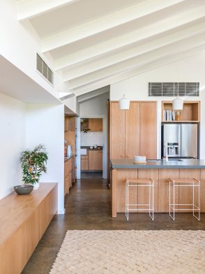
Port Willunga Beach House is a holiday home in a semi-rural beachside suburb south of Adelaide. The architecture, designed by Mountford Williamson Architecture, references the traditional Australian homestead with a high, pitched ceiling and exposed rafters, while the interior joinery, designed by Fabrikate, is a modern interpretation of the classic country house. “We live more casually now, so there is less formality in the kitchen. By creating a kitchen that is engaging, that looks and feels more like furniture and has a connection with other areas of the house, the kitchen becomes a nice space for people to spend time in,” says Kate Harry of Fabrikate.
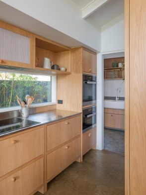
The kitchen island faces the dining and living area, and the kitchen bench looks out to bamboo along the side of the house. Fabrikate looked to the old Australian meat safe for inspiration for the joinery, raising cabinetry on legs, and inserting mesh panels into the overhead cupboards. Drawers have simple dowel handles that are also playful details in the bathroom joinery, and the timber continues into the living and dining area built-in sideboard.
Mountford Williamson Architecture
mountfordwilliamson.com.au
Fabrikate
fabrikate.com.au
Photography by Jacqui Way
Chamfer House by Ha

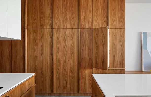
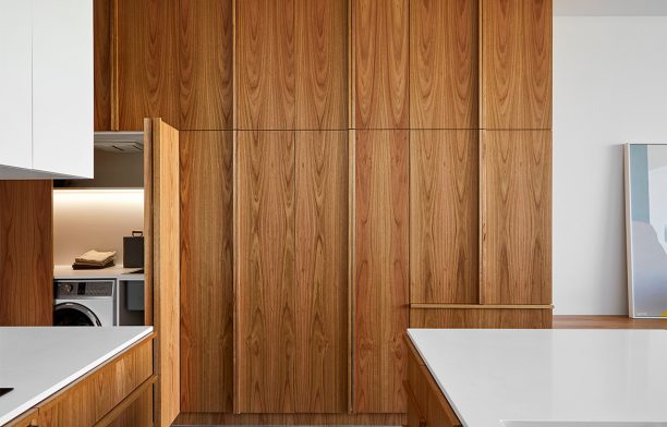
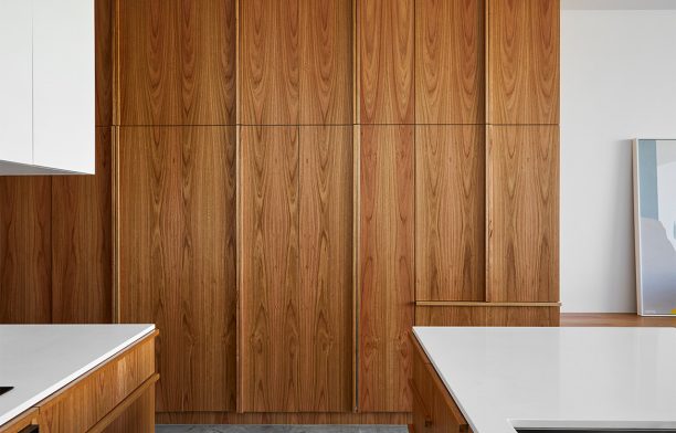
The kitchen is at the centre of this two-storey Victorian terrace renovated and extended by architecture studio Ha. Home to a young family, it needed lots of storage and typical of inner-city house, every square metre had to be functional. While Ha Architecture didn’t design the joinery like furniture, it extends through the hallway, kitchen, and into the living area with one beautifully crafted design. “It is an expensive investment when you are integrating a fridge, pantry, laundry and broom cupboard into one action-packed row of storage. We go the extra mile to make it a beautiful surface to frame the functional spaces,” says Nick Harding of Ha Architecture.
The Tasmanian oak joinery is a cohesive unit across the wall of the hall and kitchen, before extending along the wall of the living space where it functions as shelf, storage and hearth. The long joinery pull is a standard Ha detail developed over a number of projects and slightly differently each time. In the kitchen, the pull it is horizontal along the top of the drawers. “The subtly expressed pull acknowledges the functional means to operate a cupboard or drawer but allows us to be creative with patterning and repetition within the joinery,” says Nick. “This is important when function is designed to be concealed in spaces that need to be agile in confined inner-city living.”
Ha
h-a.com.au
Photography by Dave Kulesza and Bea Lambos

We think you might also like Kitchens That Connect To The Outdoors


