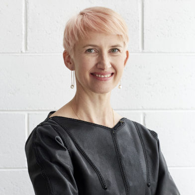
Architect, designer, art director: the Italian multi-disciplinary creative, Piero Lissoni, is what many of us would refer to as a living legend. His output is prodigious. His areas of speciality encompass the fields of architecture, landscape and interiors, product and graphic design; he has served as art director to B&B Italia (for which he was recently in Australia), as well as many, many more brands. Architecturally speaking, he has executed olympic parks, homes, hotels, factories and workplaces, luxury yachts and more.
How does he amalgamate all these skills and perspectives into a singular practice? Lissoni himself describes his process as “jumping in and out in this kind-of double level of life… I design buildings, I design spaces, I design interiors and after that I design pieces for moving inside in an interior way.”

It’s quickly apparent that Lissoni has an ability to look and consider any project or challenge in a universal way – to see the bigger picture, while also considering the fine grain, and all the layers in between.
“It’s a cultural approach,” he states matter-of-factly. “To [adopt] a humanistic approach, you need to open your mind and jump in and out of many different problematic points and start to look at the panorama with completely different eyes. Don’t be focused on the straight line,” he says.

Lissoni is “completely against” specialising in one singular typology. When he teaches at university (did I mention he also teaches?), he encourages his students to be holistic, to adapt a classical humanistic approach. “You need to start to think about different combinations of references in-between different scales of projects. When I’m architecturally designing a building, I’m at the same time discussing with the engineer [the possibilities of] dimension for the structures, position for pillars, beams, stairs, elevators, shafts….”
The interior comes next. However, as Lissoni is quick to clarify, the interior is not necessarily born of the building, nor the building of its interior. Both are connected. “It’s like a musicality,” he says. “I feel more musician than architect.”

Lissoni was recently in Australian in his role as art director of B&B Italia, presenting the brand’s new retail proposition: a wholistic landscape of furnishings that is presented with eclecticism and feels quite translatable. It is distinctly non-bourgeois in attitude, which Lissoni defines as being too perfect: “The combination is perfect but everything, it looks … a little bit artificial.”
Is retail design all becoming a little too bourgeois, in his opinion?
Lissoni elaborates on his point of view, referencing John Pawson’s 1995 ‘ice palace’ for Calvin Klein on Madison Avenue, New York. Its minimalistic design has been touted as “a radical departure from convention that has set the tone for the next 25 years of retail design”[REF].
Lissoni is apt to agree. “Everybody started to follow this new aesthetic. For 10 years everything was white, simple… but if you’re not John Pawson…” Well, enough said.

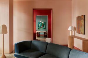
Lissoni observed other visionaries’ attempts to follow this new aesthetic, transforming “sophisticated attitudes” into minimalistic statements, failing to hit the right note while succeeding at creating “super banality”. While this new aesthetic gained traction, Lissoni, also recognised for his minimalistic aesthetic, looked to improve this attitude by approaching his retail designs with colour and material combinations that proposed something totally different.
The need to refresh and present a contemporary point of view sits at the crux of Lissoni’s approach to retail design and we see this in B&B Italia’s new retail proposition which pays homage to its heritage of modernity and language of contemporaneity.

As art director of B&B Italia, Lissoni adopts a “spheric approach” which recognises that every action and decision will influence numerous eventualities, felt both immediately and 10 years down the track. Lissoni’s reach extends all the way into B&B Italia’s new furniture releases. He references the Cordoba Outdoor chair, a 2023 release from Foster+Partners which felt good from the start. “When I saw the first drawings, I said to [the team], ‘We need to do that’,” he says.
Lissoni recognises that, while Norman Foster is quite technological in his approach, the chair appears gentle. It conceals its complexities within its calmly balanced structure, its canvas seat base and back stretched comfortably across its timber frame. Producing the Cordoba was “the right decision because the feel was good […] It looks very easy but it’s not”, Lissoni elaborates.

So, what exactly is Lissoni’s own design aesthetic?
“It’s a combination, it’s like a cocktail recipe. You need to combine together many different things… in a cocktail sometimes if you choose the correct ingredients but you choose the wrong quantity, then something becomes disgusting. You need to try to balance everything.” It’s a great analogy for the measure of skill and intuition that one must bring to the complex task of design.
He also credits his grandfather, who taught him how to dress. Little, seemingly inconsequential mantras – like never wearing socks with strange colours – taught him how to take risks and push the boundaries for truly inspired results. “When you dress yourself, try to choose some mistakes and therefore try to control the mistakes. If you control the mistakes you become elegant. I do the same in my work,” Lissoni elaborates.


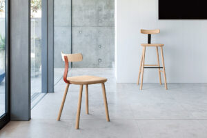
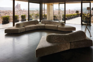
In Lissoni’s own designs a discordant feature can hit just the right note. He points to a series of cushions for B&B Italia designed with big dots in primary colours: off-beat and yet just the right chord alongside the clean, flowing lines of his sofa designs.
Ever the orchestrator, Lissoni is reminds us that he is architect first and “second I try to design everything with a special level of simplicity. For me, this one is my personal attitude. The whole simplicity is the public face of complexity.” Without complexity in the background, simplicity cannot shine… a fitting sentiment for this intelligent individual who designs in layers and sees through spheres.
Piero Lissoni
lissoniandpartners.com/en
Space Furniture
spacefurniture.com.au

We think you might also like to read about Piero Lissoni’s perfect design cocktail for B&B Italia.


