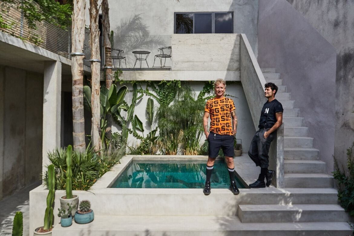
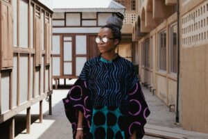
Gary Chard runs Chard International, where he has a portfolio ranging across all aspects of design — from private homes to events, art galleries and anywhere a brand needs to excite the senses. The event activation and interiors are often on the design radar through his work for the Australian Open. However, it is elsewhere that his heart lies: in Spain, with his partner Feskie.
What prompted the move to Spain?
I have always been attracted to Spain, to its unique and wild culture that grew out of the post-Franco era. Finding its freedom after coming out of those dark times in the late 1970s it felt like the last frontier. I started visiting Madrid each year for a few months around 2012.

Why the town of Sa Pobla, in the north of the island of Mallorca?
In 2019 I started looking for a property to buy and decided to look at the Baleares (Balearic Islands). My family used to holiday on Mallorca and always came back with incredible stories and crazy artefacts.
We knew that we had to find a place that was really well-connected, with all the services to make daily life comfortable and easy. There are a lot of stunning mountainside villages but they have no supermarkets and are isolated – great for holidays and Instagram images but not the best places to live and with hardly, if any, nightlife. We wanted a place that was real, that had a thriving community spirit where the locals lived.
Sa Pobla is a place that answered all of the above. It’s ten minutes from one of the island’s best beaches Playa de Muro and 20 minutes from the Serra de Tramuntana mountain range. There are no less than four supermarkets, myriad artisan carpenters and metalworkers and one of the biggest contemporary art galleries.

As a designer known for experiential spaces, how has that been realised in your home?
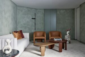
With our home, we needed to establish something more concrete, something that would evolve over time, where markings and wearings added to the space rather than detracted.
We wanted a home that was quiet, serene – we literally arrived on the island a week before the lockdown then spent 18 months in a rental apartment before we could get into our home.
This period of isolation made us want to create a sense of oasis: a contained space that was shielded.
We wanted a strong place that felt safe, we wanted to turn away from decorating and focus on building, away from consumerism and focus on living. We tried to build a home in the simplest and most economical way.

How much of the original building remains?
When we bought the place it had already been gutted and had a new roof – unfortunately inside there were no historic details other than the stone stairwell and sandstone (mares) walls.
What drew us though was the large open space that existed. In these towns, usually the houses consist of a rabbit warren of hallways and bedrooms and small windows. The houses can tend to be dark and closed in. As it was, this building was just four walls and a roof, no windows, no floors, no plumbing – there was nothing to preserve or protect – and it was like starting from scratch.

Can you tell me about the material palette?
It looks invitingly cool. The emphasis has always been on texture, and doing the minimum required to get the house liveable. Most of the upstairs walls are first stage concrete render (usually prepared as a base coat for a plaster finish) – we told the builder to stop at that point because it was stunning to see the work in it and the surface texture.
In one of the upstairs bathrooms three walls are like this and then the floor and end wall are a textured stone slab as they are prone to getting wet.
Where was a touch of luxury essential? One area of investment was in the main bathroom, which is clad in Shou Sugi Ban-like ceramic tiles by Ceramiche Refin with antoniolupi tapware combined with a sink handmade in Sa Pobla.

What’s your favourite part of the home?
Its history and sense of place, its story which grows daily as the neighbours tell us more and more about who lived there and how the house has evolved. They call it Can Masco (named after the family that first occupied it).
The courtyard feels incredibly important to how the house unfolds. Tell me about its impact on the home.
I love that it borders two streets, and we enter through the back lane garage, in effect turning the energy of the house around. Once inside and in regard to a physical space I love the garden with its small pool – the plants are only a year old but in time they will grow and this will become the absolute centrepiece of the house.
It provides our ‘views’ outside. The garden is designed to draw the eye, where everything inside is minimal and pared back intentionally not to compete. The small pool is modelled on the local rural water sources in Mallorca called Safareig (Middle Persian/Catalan). The lower floor opens up to the garden and in summer we never close these doors, we can live outside almost under a roof.

How do you see it changing and evolving?
The house will age. We have purposely left the walls and floors as basic as possible – raw cement – we celebrate the trowel marks of the workers and the way water and humidity have affected the surfaces.
We want to let the house live like that, without feeling the need to continually touch up paint, fix things up. Materials like natural stone basins and benchtops, raw wood, metal and slab tiles have been selected to help this. We have the upper third floor terrace with views of the mountains to finish, once done we can sit here and watch the sunset.


Project details
Homeowners – Gary Chard / chardinternational.com.au
Photography – Armelle Habib
The home of Gary and Feskie featured on the cover of Habitus #56 – the Coastal Living issue


