What are the best kinds of interiors?
I love interiors that you go into and you walk into a world that is utterly convincing. That’s what’s so interesting about the inside of a building – it’s a world. I think in contemporary architecture, the interiors fall through the cracks. It’s not really addressed as conscious design.
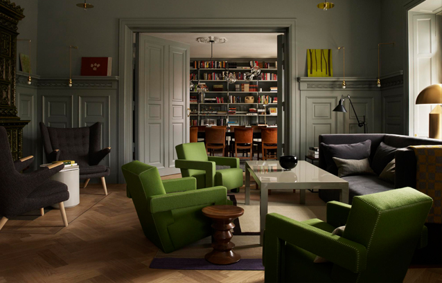
Ett Hem, Stockholm, photographed by Magnus Marding
What is the biggest misconception about interior design?
Well! When I finished one project in New York, I remember one of the wives of one of the investors going, “It must have been such fun shopping!” I think furniture companies sort of fill buildings with furniture, but I think what goes missing is the idea of building interior life.
How do you then go about creating an “interior life”?
Our particular approach is to always start with the human being. We start with real life. So our fundamental point of view is to understand how space is really used and how they will feel physically, emotionally, sensorially, and how they operate socially. It’s a very interesting starting point because once you establish that, the design follows. We don’t start with the design. We start with the behavior and the life that will be living in that space.
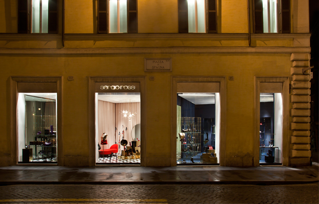
Sergio Rossi Store, Rome, photographed by Ruy Teixeira
Tell us more about your recently completed Twotwosix residential project in Hong Kong.
We basically stripped [the originaly building]. We kept the floor plates and nothing else, but we wanted to make it feel more a part of the neighbourhood rather than sort of bashing it down and putting something that has no relevance to the scale or soul of the area.
We knocked through the apartments and you could say that’s a sort of Western way of doing it – this kind of lofty thing, but we made sure that you could also get those smaller spaces back. We knew that in Hong Kong, you need to have those smaller spaces sometimes.
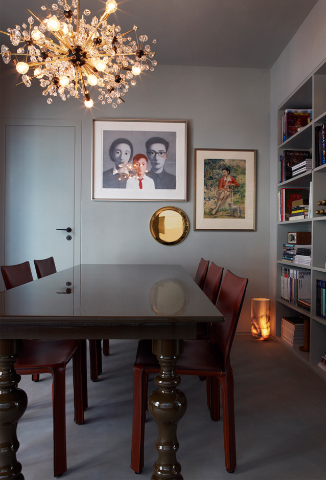
TwoTwoSix, Hong Kong, photographed by Magnus Marding
Did you discover a kind of Asian design sensibility while working on this project?
I think in addition to the more obvious and well-known shiny things, there’s also this love of shadow and things gleaming out of shadow. I think they like very natural woods – they like warmth, funnily enough. We did a range of furniture which is based on “seating for eating”, [and there was] a table for people to eat together quite closely. And I based it on that notion of the group eating together, being together. People in Asia love it. So there’s a warmth and a connectivity. That’s very clear here and I don’t think it gets talked about enough because I think it’s really strong and I really love it.
What is most challenging about working in Asia – Hong Kong specifically?
The most challenging part of it was the speed. You barely got the job and the builders are on site – keeping up with the builders is quite interesting. The whole point is you have to go with the context. You have to understand the nature of the place and go with it.
We had an interesting moment where we specificed a particular brick and [it was supposed to be a different colour]. And when we actually got the sample, we just thought, you know what, it’s a really nice colour, it’s what they can do, let’s work round it and design around it, and use serendipity as part of our design process. I’m not one of the “near-enough-is-good-enough” lot at all, but part of it is to understand that you’re dealing with a dynamic, living process and that you need to move with it as well.
Tell us about your recent collaboration with Georg Jensen
With product design, in a way, you have to imagine the user. And in this case, I’m often just thinking in terms of ourselves and the things that we lack. We have done so many interiors spaces and I know the things that are missing. And also from our own experiences. I’m always doing that thing: “Oh no, where did I put my keys”, and my cards are somewhere else. As banal as it sounds, you just need somewhere to put those things, where you find them every morning and you put them every night. And it becomes a sort of beautiful ritual as opposed to this shuffling of things around on a shelf.
We have a running list in the studio of things that don’t exist and funny enough, the things that we did for Georg Jensen fit exactly into that category.
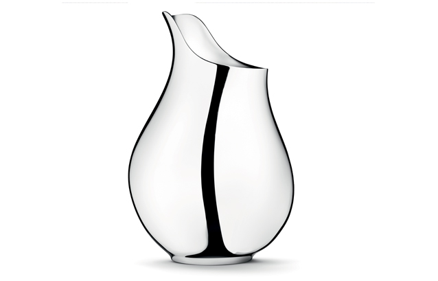
Mama Vase by Ilse Crawford for Georg Jensen


