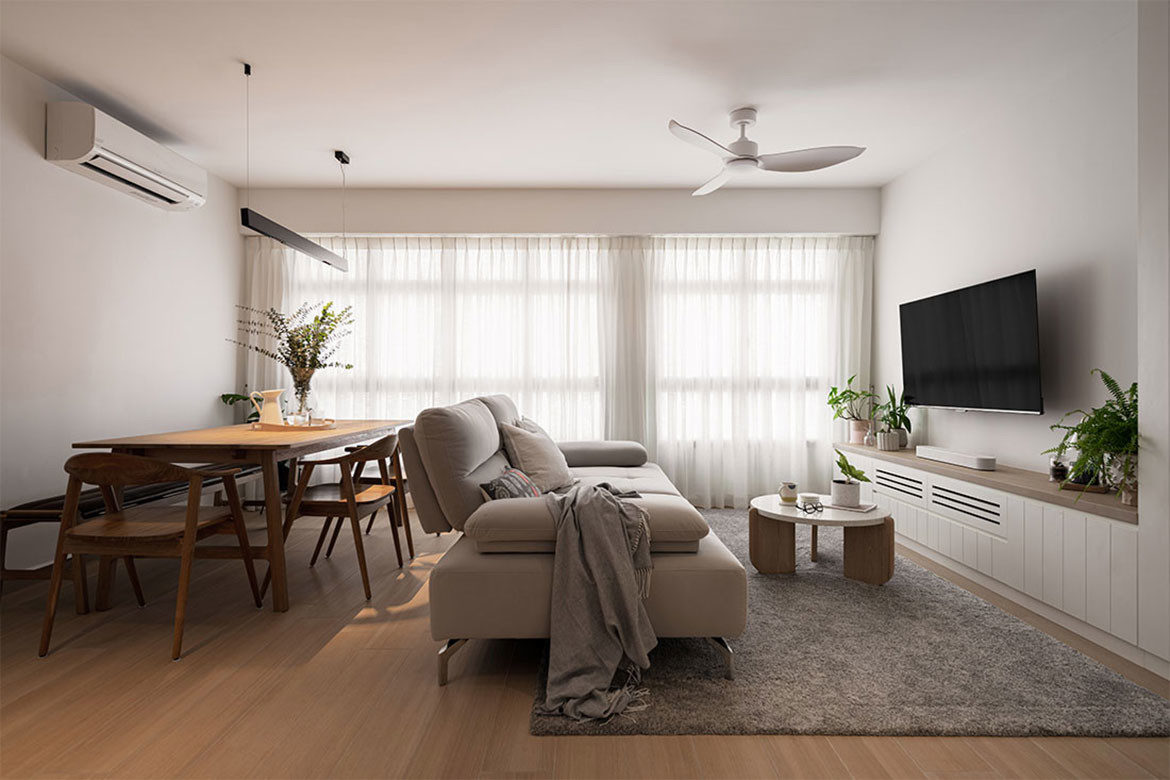
Like many homeowners these days, the couple living in this BTO flat desired a home where they could relax and unwind together. The Scandi aesthetic appealed to them, and they conveyed their brief to design consultants Raymond Soh and Gary Chong from OVON.
Other than their desire for an inviting Scandi-inspired home, the homeowners had specific lifestyle needs – one of which was to have sufficient storage, and to turn their living area into a workout-ready zone.
Raymond and Gary designed a television console bearing different heights to be able to contain various items from workout gear to cleaning tools. Raymond says: “We put in shiplap-inspired grooves on the cabinetry, so it brings more visual depth and detail to the space.”

Full-height mirrors are also installed on the cabinets and these not only enhance the visage of space in the living area, they come in handy during the homeowners’ workout regimes.
Beyond the living area, the designers have combined the dining zone and kitchen into one cohesive space for cooking, prepping, having meals, and even doing casual work.
Raymond explains: “The homeowners really wanted a multipurpose space to cater for different activities, so we hacked away the original enclosed kitchen, and merged it with the dining space.” An island counter was proposed and it has proved useful in accommodating the homeowners’ work-from-home duties, and entertaining friends and family.

Choosing a white quartz countertop with marble-look veins for the main dining table, these beautiful textures helm the space with a bright and welcoming ambience.
The kitchen is decked in quartz countertops of similar marble-inspired veining, and is paired with subway tiles and cabinets in light wood-look accents. The shiplap detail has been carried over from the living area to the kitchen cabinetry for a consistent Scandinavian appeal.
The open eat-in kitchen overlooks the front entrance which is right next to the household shelter. However, one would be hard-pressed to locate it as it has been well-concealed with laminates and mirrors.

One of the common bedrooms has been converted into a study room for the homeowners. A simple setup of unadorned white walls and vinyl flooring in light wood tones with a spot of greenery offer calm and contemplative vibes.
Like most parts of the home which did not come with flooring, the common bathroom has been newly tiled with a two-tone treatment of white and grey stone-look tiles. “It adds a welcome contrast and dimension to the bathroom, so the space doesn’t appear dull or flat,” shares Raymond.
Furnished with a custom L-shaped wardrobe which has been seamlessly integrated with the vanity table, the main bedroom enjoys a space-efficient layout and a crisp white palette that gives the space its spacious and airy vibe.

Similar to the common bathroom, the main bedroom sports a two-tone tile treatment which elevates the white and woody hues alluding to the Scandi theme. The designers also installed a louvred door frame and Venetian windows blinds, and these streamlined details provide the perfect finishing touches.
Details
Interior design – OVON
We think you may also like this home that has highly considered storage


