Inspired by functionality and sporting a pared-down aesthetic, the new SP01 collection by Tim Rundle will appeal especially to minimalists.
A New Zealander based in London, Tim is an industrial designer whose varied experience is backed by having worked for renowned design brands and studios such as Tom Dixon and Conran and Partners. He also runs the prestigious Design Products Masters program at the Royal College of Art in London.
We find out more about his ideas behind the new SP01 collection and its contemporary pieces.
What were your inspirations for the new SP01 collection?
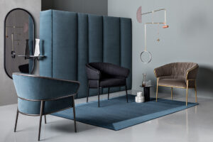
One of the key themes in the collection was taking familiar typologies and stripping them back to the essential, making them visually light in terms of the way they occupy a space. For example, the Caristo armchair could be viewed as our take on a classic wing chair, with all the bulk removed and having a lightweight frame. The silhouettes of the Michelle mirrors draw on the arched forms common in Art Deco interiors, but pared back and injected with useful functions, such as the small side table surface.
How would you describe the look of the pieces, and how do you envision them in home interiors here?
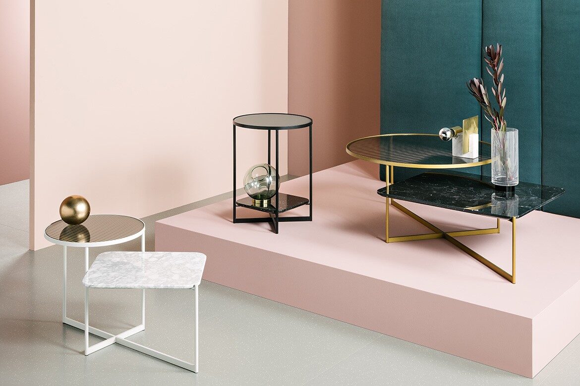
We think all the pieces have a very international feel, drawing on design traditions from around the world. After all, they were designed by a New Zealander in London, for an Australian brand manufacturing in Italy. As a result, they can sit equally comfortably in a Victorian house in London and in a modern apartment in Singapore. In warmer, urban climates, I think the Mohana tables in white could have a certain cool, calming effect in an interior.
Tell us about the use of colour and structured forms in the collection.
The forms are all based around the idea of softening the inside – the human part, with an almost architectural approach to the outside, or frame. The pieces are all easy to read in a formal sense, with frames almost drawing their outlines in space. For the most part, the structural elements have been finished in monochromes or subtle metallic tones, allowing for truly individual solutions, together with the wide range of upholstery.
What are the key materials in this collection?
One of the materials we had the most fun with was the fluted glass of the Mohana tables. The way the two surfaces overlap creates a great optical effect with the marble, creating a kind of graphic composition for the home. The fine steel frames apparent in each product of the collection was crucial in allowing us to create visually light furniture pieces that were still extremely comfortable and sturdy.
What was your favourite aspect of working on the collection and its designs?
This was the studio’s first collection working with Italian manufacturers, which was a great experience. There is an amazing history of furniture design in Italy, and this is evident in a real passion for realising a creative vision at the absolute upmost quality. We made numerous prototypes; adjusting seat angles by a degree at a time to get the right angle for comfort, and dimensions by a couple of millimeters here and there to get the proportions perfect.
SP01 collection
spacefurniture.com.au


