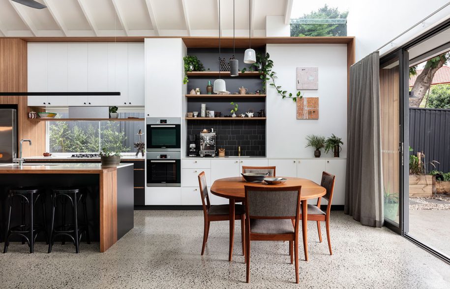
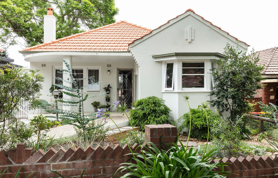
We revisit some our favourite recent Alts & Ads projects that respect the heritage of the original building while extending or reconfiguring the internal layouts to make way for growing families, evolving needs or an unforeseen change in circumstances.
Downside Up House by WALA

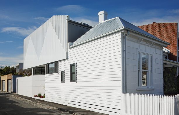
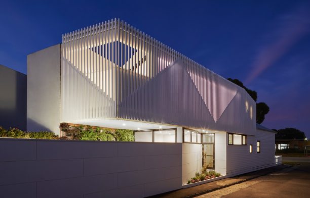
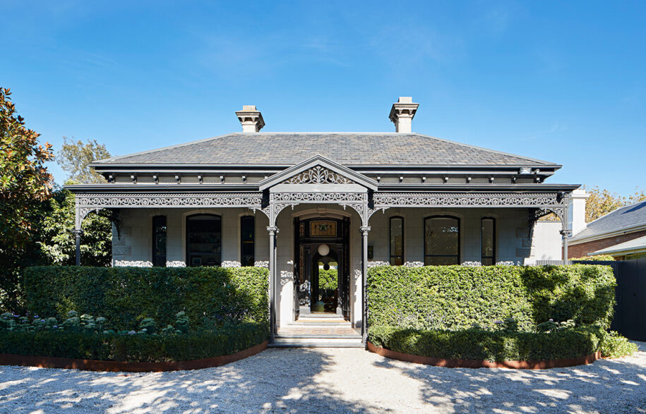
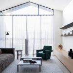
Downside Up House in Albert Park, Melbourne, is a heritage-listed Victorian villa with a contemporary extension.The original building was a double-fronted heritage-listed Victorian house in serious need of repair. The modest-sized, triangular-shaped site presented a challenge on its own accord, not to mention a series of rear lean-tos that had been added in ad-hoc fashion.
The new extension turns the typical ‘rear extension’ on its head. Designed by WALA, the house has living rooms upstairs, bedrooms downstairs, and a batten-screen façade that references the pitched roofs of the Victorian typology.
Photography by Tatjana Plitt. Read the full story here
Glamorgan by DAH Architecture

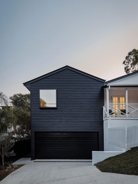
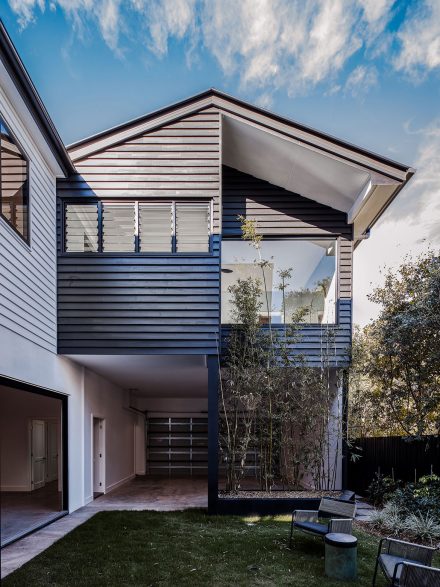
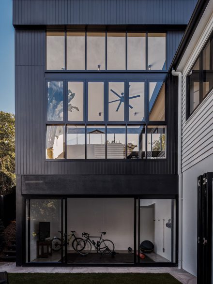
Clients of DAH Architecture wanted an industrial, loft-like extension to their character Queenslander. For this, David Hansford, co-founder of DAH Architecture, was presented with a number of challenges. “The site is on Brisbane’s fifth steepest street, the house was in complete disrepair when we first measured it up and it had been victim of some strange alterations over the years,” he explains.
Ultimately, the team created a full height, industrial-style steel glazed addition to the rear. Along with a radical infusion of light, the high ceilings enabled the design team to create a striking and moody industrial kitchen.
Photography by Andy Macpherson. Read the full story here
Pavilion House by Robson Rak

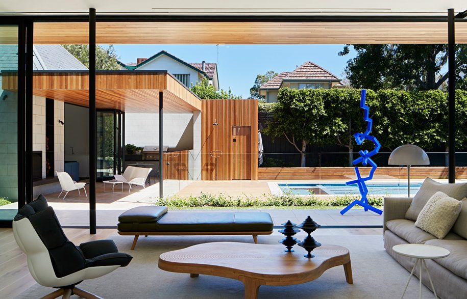
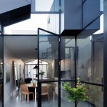
Reflecting their clients’ love for Mid-Century architecture, Robson Rak has designed Pavilion House with a particular composition that balances the integrity of its existing 1888 Victorian residence with a modern new glass pavilion. The brief for the architects was to design a welcoming and expansive home that would not only connect to the surroundings but also elevate the existing fabric features.
The L.A.-style Pavilion extension and the existing Victorian terrace are more aligned internally than they may appear at first glance. Separating the two structures with two internal courtyards also brought lush greenery into every room, giving it a sense of space and an abundance of natural light.
Photography by Shannon McGrath. Read the full story here
Port Melbourne House by Pandolfini Architects

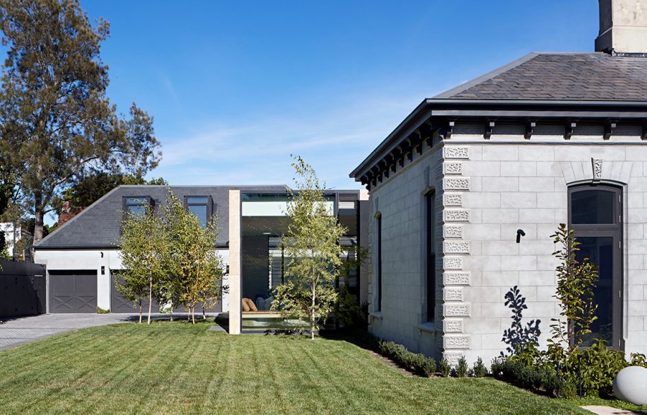
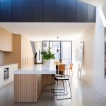
The century-old house had been largely untouched when Dominic Pandolfini, founder of Pandolfini Architects, purchased it. He carefully restored the front with a crisp, light palette, and designed a two-storey extension that’s not visible from the street. A courtyard in the middle of the house separates the old and new forms, reducing the visibility of the extension from the street and bringing natural light into the centre of the plan. The extension consists of a double- and single-storey volume spliced by a large skylight that spans the width of the building.
Photography by Rory Gardiner. Read the full story here
Collector’s Cottage by Mark Szczerbicki Design Studio

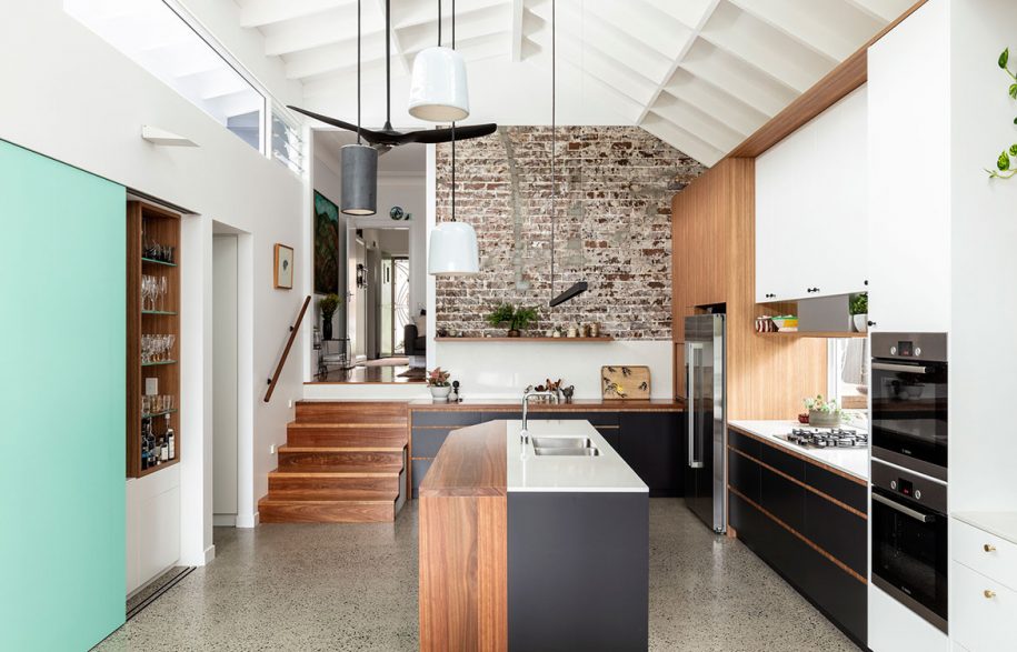
This new addition to a worker’s cottage by Mark Szczerbicki Design Studio comprises a new open plan kitchen, dining area and seamless transition to a second alfresco dining area. A feature wall of exposed brick of the side of the new kitchen references the original build and offers a raw touch to an otherwise finely finished interior. In a similar vein, rafters inside are left exposed (but painted white) and the exterior of the extension – hidden from the streetscape thanks to a sloping site – is clad in Cedar, left to patina over time to an anticipated silvery-grey effect.
Photography by Tom Ferguson. Read the full story here


