The elegance of a black exterior, once the domain of Japanese architecture alone (as Shou Sugi Ban can attest), the appeal of black buildings have continued to gain traction due to remarkable architects creating incredible projects.
Whether using black to soften the project into nature or to create a startling contrast, black is very much at the cutting edge of architecture.
Like an all white exterior, black is only perfect when every element is concise, every detail aligned and all surface variations even. When architects get this right, the result is breathtaking.
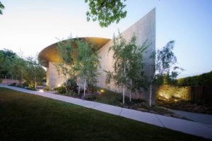
Portsea House by Wood Marsh


Approaching Portsea House, one might mistake the home’s curved walls and dark timber upper-level cladding for a museum. And rightly so, this is a grand house of sweeping scale and majestic presence, where black timber creates both contrast and a muted softness. In recurring acts of balance, the coastal Mornington Peninsula home contrasts light and dark, openness and intimate spaces, interior and exterior – as well as the literal balance of a partial cantilever of the black cladded upper level over the site’s natural slope.
Keep House by BKK


The styles of the medieval castle keep were a key inspiration for BKK Architects’ design of Keep House. These touches can be seen through the similarity of the architectural structure and the colour palette which includes timber, black, deep grey and cememnt. Along the corner of the block, Keep House is an elongated shape bent into a squared-off C, dividing the home into three wings. The curved frontage leaves a triangular, pocket courtyard, defined by the native foliage weaving through the site.
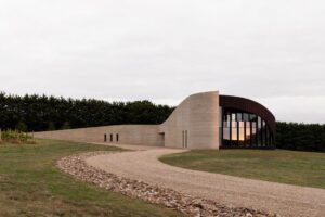
Bundanon Art Museum


Responding to Bundanon as both subject and site of Arthur Boyd’s work, Bundanon Art Museum seeks to heighten the visitor’s appreciation for the sights, sounds, textures, and ecological workings of the landscape. Dubbed the ‘Bridge’, the 160-metre-long and nine-metre-wide structure spans the gully of the historic site on the New South Wales South Coast: “The design is driven by Bundanon’s main Bundanon Art Museum imperative, as established by the Boyd family, to foster an appreciation for and understanding of landscape and art. We have placed the site’s ecology at the centre of the design with the new suite of buildings and landscapes” says Kerstin Thompson, director, Kerstin Thompson Architects.
Humble House by R Architecture


Clad in Spanish black slate shingle the simple geometry of the pavilions of Humble House is deftly articulated. Delivering a classic flow from outside to the interior the shingle cladding spills into the home to coalesce with abundant greenery to enhance a feeling of openness from within, while also stitching pavilions together. “To celebrate the client’s ceramic works, the interior spaces create moments to celebrate the art made in the studio,” adds Gaurav.
Moreover, the restrained (and low-maintenance) palette of robust steel and glass surfaces are juxtaposed by the warmth of timber, exuding an atmosphere of humility and honesty. “From the sense of expanse created by the skylights of the paved walkway, to the courtyard voids between pavilions that burst with clusters of wild flowers, the lines, light, and reflective properties of materials used provide a connected, dynamic experience in every nook of the project,” Gaurav concludes.
Beach House Blues by Corke Design Studio


The architect’s material of choice is a charred timber board (a traditional Japanese technique of blackening timber) for both the façade and internal lining on Beach House Blues. The architects have leveraged the drama by using the material to draw visitors through and up the site, back to the tree line and towards the horizon beyond.
“It is well suited to this coastal project, due to its durability and low maintenance, but is also aesthetically subtle, raw and unobtrusive; making it perfect for Lorne,” continues Kate. “A material that feels quite subtle externally; letting the natural environment do the work but yet also feels quite dramatic internally.”
Feather House by Irving Smith Architects


Feather House is beautiful in its simplicity with the largest area, not inside the home but an outside space. It is this place that is first seen on arrival, the space in which everyone gathers and where the invitation to the house begins. Outdoors are celebrated and so access to all rooms inside can also be from the exterior. Feather House is a home that looks outward not inward.
The colour palette is informed by the materials and the landscape, with a recessive white base, warm timber hues, concrete grey and accents of black that help define spaces and encourage a relaxed and welcoming environment. The exterior of the home blends with the natural surroundings, however the design ensures that it is also a distinctive form in itself.
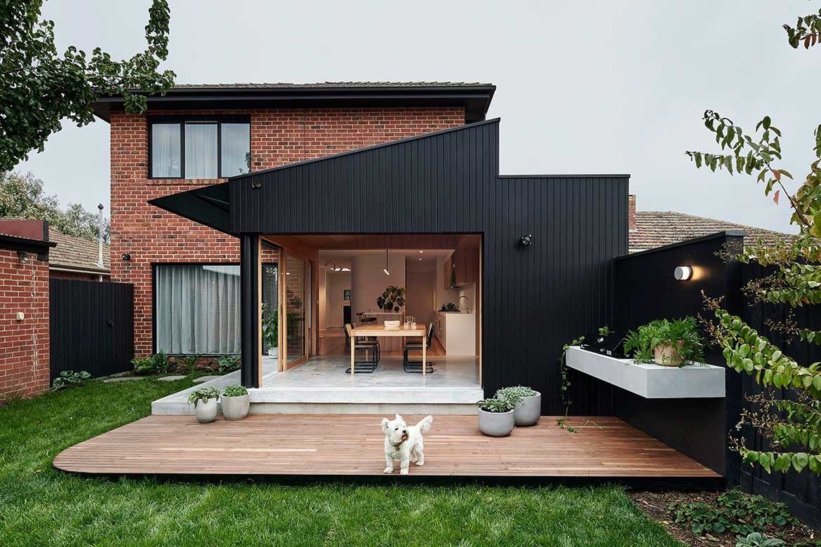
Thornbury House by Dan Gayfer Design


The overall palette of materials in Thornbury House are modest and textured with the use of mosaic tile, porcelain and white terrazzo in the kitchen. This somewhat muted palette is then perfectly complemented by the darker more striking tones of the blackbutt timber veneer. “It is important to note that most of these materials are repeated throughout the house ensuring that this unique collection of colours, finishes and textures can be experienced in more than one space,” Dan explains.
Moreover, as Thornbury is home to numerous architectural styles – Art Deco and Inter-war homes included, the architect elected to move beyond the area’s contextual influence: “We borrowed from the canon of mid-century modern design, particularly features found in post war Melbourne,” he explains. “Or more specifically, characteristics that would be more advantageous for the project in regards to aesthetics, functionality and energy performance.”
We think you might like to see more black buildings that use Shou Sugi Ban


