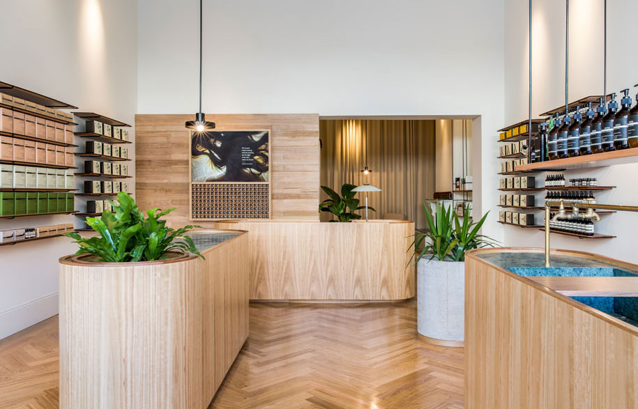
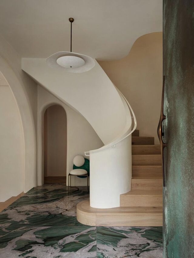
After entering through the pretty Victorian shop front – in muted grey-green to complement the marble inside – Aesop Rundle Street welcomes you with a honey-toned interior. The abundance of Oak and light makes it an especially warm and inviting space – perfectly calming for browsing the skin, hair and body range.
Genesin Studio have embraced the generous proportions of the building in their design, emphasising the sense of openness with white walls “adorned simply with product shelves crafted from solid timber and blackened steel rods”. The paired back choice of materials and colour palette only adding to that.
Giving the room its form and creating usable bench space are three tablet-shaped counters inlaid with antique green marble. Sitting atop parquetry flooring – also in the honey colour – the marble tops are a lush contrast. And to rough it up just slightly, a makeshift side table crafted from imperfectly stacked concrete disk sits on a timber base near the entrance. Aesop know how to create a space – inviting to their customers and a fitting home for their products. No argument.
Genesin Studio
genesin.com.au
Aesop
aesop.com.au


