The Cambridge Road neighbourhood located along the city fringe feels as if it belongs in another era – an old red brick Baptist church, 40-year-old terrace houses, and a quaintness that has escaped the ravages of time and redevelopment. In fact, with surrounding street names such as Bristol, Norfolk and Hampshire, you might well be in another part of the world altogether. When you least expect it, you stumble upon an intermediate terrace house that resembles a Brownstone, and you wonder: Am I in New York City?
Purists may frown upon such architectural importation. But this is different from trying to replicate a temperate glass house in the tropics, or Corinthian column-fronted and pediment-capped houses. There is a legitimate reason for the Brownstone façade. “Having lived in New York for many years, we wanted to have something familiar that we could relate to. When we saw this inter-terrace, we immediately associated it with iconic row houses back in New York,” explains homeowner, Aun Koh, who lives in the house with his wife, Su-Lyn. But they wanted to translate the New York edition into a more contemporary version that reflects its time and place.

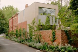
Left: Unlike the traditional Brownstones of New York, this is a modern version, both inside and out.
Right: Glass and mirrors offer surprise glimpses into various rooms and spaces.
As directors of a boutique consultancy that handles luxury and premium brand clientèle, Aun and Su-Lyn appreciate the exclusivity that boutique firms can offer, which was why they approached K2LD Architects to transform their terrace house into something one-of-a-kind. “It is quite unlike the majority of our commissions, which are mostly detached houses,” admits K2LD principal, Ko Shiou Hee, “but we decided to take the opportunity and do something different.”
And different they did; not just in terms of aesthetics, but Shiou Hee and his team of architects may well have created a new typology altogether. The 6 x 17-metre footprint is long and narrow, similar to the shophouse typology indigenous to South-East Asia, with the usual challenges of limited frontage and lack of natural daylight.

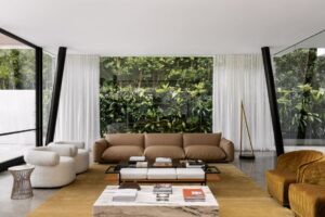
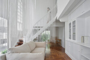
Behind the façade, the living room has a contemporary setting in contrast with the Brownstone’s 05 traditional roots.
A bold red brick façade more than compensates for its narrow width, making its presence felt along the streetscape. In traditional shophouses, intermediate courtyards and air-wells are employed to overcome the problem of limited daylight. Here, K2LD pushed the circulation to one side and introduced two strips of skylights flanking the party walls. By doing so, the interior becomes not just light-filled, but also free of the constraint of the rectangular box defined by the party walls, a concept Shiou Hee calls a “box within a box”, which allows him to then look outside the box.
Despite off-setting the inner box one metre from the perimeter, the interior feels spacious beyond its four-metre width. Shiou Hee has accommodated all ofAun and Su-Lyn’s requirements without resorting to a ‘wedding cake’ arrangement of stacking spaces one above the other, proof that it is not how much space you have, but what you make of it. By cleverly tucking the home-office, pantry, storeroom, dog bath and even a walk-in wine chiller to the sides on the second and third storeys, the two one-metre-wide slivers of space are well-utilised.
Left: In an ingenious orchestration of space, the small plot even accommodates a home office for six.
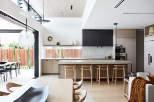
Right: As publishers of the Miele Guide, featuring Asia’s top restaurants, it is not surprising that Aun and Su-Lyn indulge their epicurean pursuits with a spacious, organised and well-equipped kitchen.
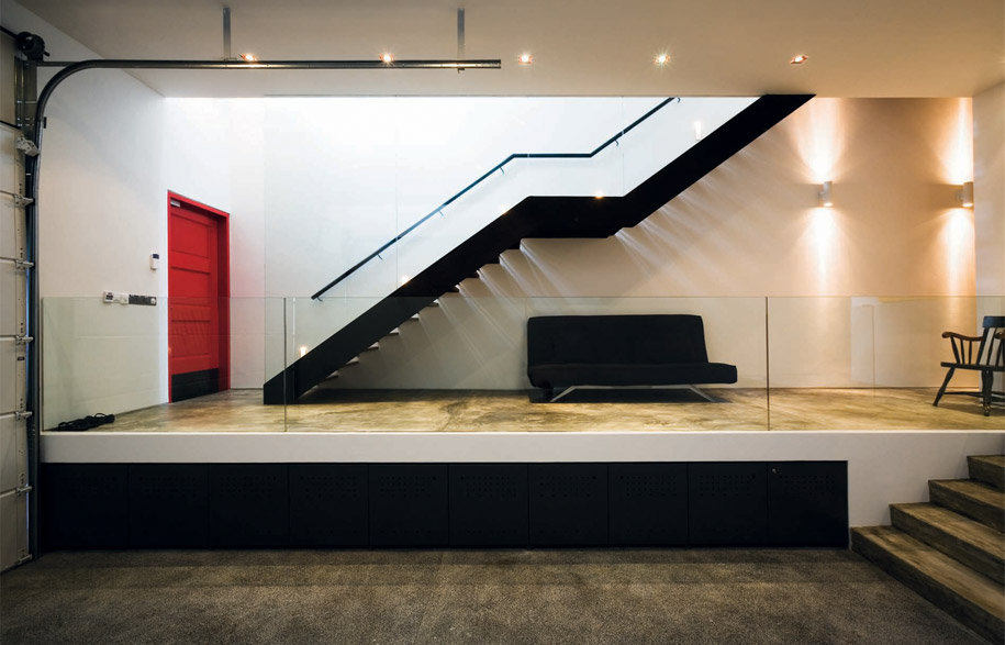
“We perceived the interior as a three-dimensional jigsaw puzzle with interlocking spatial volumes and light pockets,” explains Shiou Hee. The result is an interesting play of light and space and a circulation that weaves its way in and out of the ‘box’. Spatial progressions are also somewhat unusual in the local context. Instead of the typical outdoor car porch, Aun wanted a garage within the house; and instead of arriving into a living room, you find yourself greeted by a welcoming staircase that runs the entire three storeys, bathed in abundant natural light from the skylight above. Another atypical move – elevating the living room, dining room and kitchen to the second storey – allows for a different perspective and positions them right at the heart of the ‘floating box’.
Like jack-in-the-boxes, glass openings surprise visitors in the most unexpected places. One-way mirror-glass in the second-storey powder room overlooks the garage, full-height glass in the third-storey bathroom looks into the living room below, and a glass slit opening above low shelves in the home office on the third storey offers a peek at who is coming up the staircase. Other fun elements include bright red main entrance and master bedroom doors and a mezzanine-like catwalk over the double volume living room that provides access to the topmost shelves of the towering book wall. Even the furniture is an eclectic mix, collected from the homeowners’ holidays abroad, every piece with its own story to tell. Nothing is predictable, but the elements come together to create a look that seems both casually thrown together, and deliberately orchestrated.

The dining room and adjacent living room, are elevated to the second storey ‘heart’ of the house and serve as focal spaces.
Walk into the master bedroom and you are transported into a totally different world. In contrast to the bright and airy house, it is decked in black, from the floor to the wall and ceiling. “It is very Coco Chanel. Su-Lyn needed some convincing at first but now we both love it. It is our dark sanctuary,” muses Aun.
It would appear that the seemingly prim and- proper Brownstone exterior and the boxy massing of the house is just a teaser that belies the whimsical, Alice-in-Wonderland touches beneath. K2LD was given a box but returned the home-owners much more.
This story was originally published in Habitus#07, 2010
K2LD Architects
k2ld.com
Photography by Derek Swalwell
Dissection Information
Living black loveseat and Pumpkin side table by Autoban
Eames lounge and ottoman in white leather by Vitra
Magister sofa in caramel leather and white Kidd tables by Flexform
Chandeliers Double Octopus in Living Area by Autoban
2097 in Powder Room by Flos
White AJ floor lamp from Louis Poulsen
Lamps Black Caravaggio lamps in Dining from Lightyears
Joinery steel bookshelves in Living Area custom-designed by K2LD
Countertop in Kitchen is Caesarstone quartz by Builders Shop
Kitchen appliances by Miele
We think you might also like A Contemporary Vernacular Of Australian Architecture


