Kempsey, a coastal town in mid-northern New South Wales, has a long history embedded in Australia’s timber industry, founded on its thick wood of red cedar. And it was this town in which architect Daniel Hudson spent his childhood kicking pieces of lumber around in his family shed as his grandfather whittled down his own chunks of timber. As a boy raised in a family of tradesmen and builders, Daniel learnt to respect the unique character of this material, something that offers both a connection to the surrounding native landscape, as well as protection from it.
The influence of growing up in a town that thrives on its relationship with the natural world is honoured in Daniel’s practice as an architect with Jackson Teece and director of their Queensland office. Living and working in Brisbane’s sun-soaked CBD, his own home, Gresham St House, elegantly parades his understanding of site orientation and architectural know-how in a structure that evokes the protective woods of his younger years.

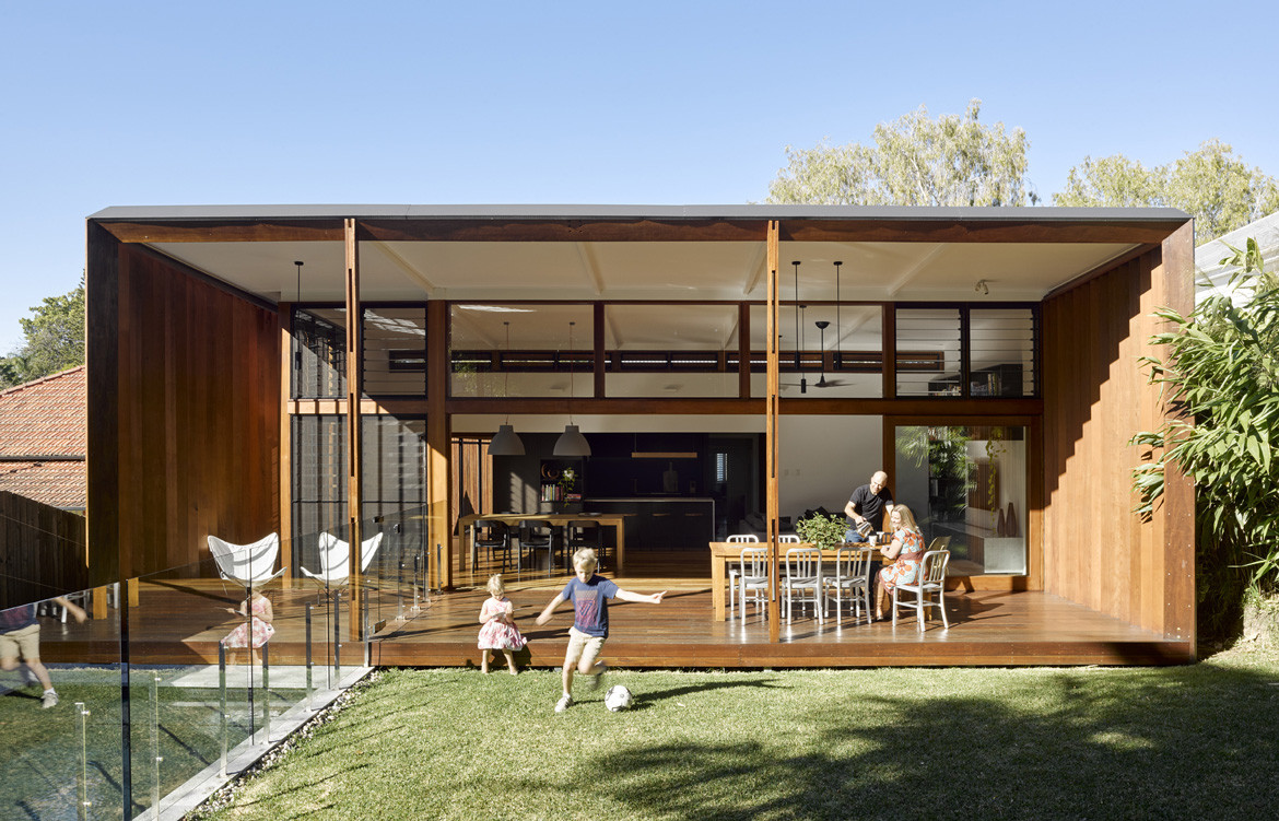
Daniel and his wife purchased the property seven years ago. The house was a 1930s masonry ‘Queenslander’: muscular and elevated, in keeping with the canon of the northern state’s signature architectural style. The house had a great original aspect with the backyard facing directly north to embrace Brisbane’s syrupy weather. And so, when first walking through the property at the inspection, Daniel and his wife mentally configured their plans for the soon-to-be family home. The aim was to amplify a connection to the surrounding environment and expand the amount of liveable space with a timber-wrapped pavilion that honoured Daniel’s upbringing in quiet, coastal Australia.
Yet despite the natural assets of the block, the layout of the house was a mess. “Internally it was almost the opposite of what it should be,” said Daniel. “It was around the wrong way. So the main objective was to reconfigure the layout, the program of the house, without changing any of the wall locations.”
The old house was roasting in summer, biting in winter and longed for sunlight throughout most of the year. None of the old rooms responded to the context of the site and Daniel had to rearrange much of the floor plan. The lounge room became the master bedroom, the entryway a generous ensuite and wardrobe, the dining room a second family room and the old kitchen now the main family bathroom and toilet. “It was a complete reshuffle,” he concedes.
The pre-existing building was reimagined as the sleeping quarters and the new living pavilion contrasted as an open, well-lit space, syphoning in the family’s social activity. The bones of the original structure had to be maintained to keep the renovation within budget and to adhere to the low environmental footprint that was central to Daniel’s design.
The original house lies within a demolition control precinct to protect the character of the original façade. And so the extending new structure – swathed in rich timber and carrying a distinctly modern appeal – creates a striking juxtaposition between the more historical and contemporary architectural aesthetics.

The separation between old and new segments of Gresham St House establish two different destinations to suit one’s mood: one to bathe in the sun and native landscape, and the other to hide away in a more secluded and private space. A concealed full-length sliding door pulls out from the wall to open up or cut between these spaces. This not only visually breaks up the house, but also allows for the family to have greater control over the internal temperature and ventilation. Daniel installed a three-station temperature thermometer in the kitchen, sleeping area and outside of the house, which allows the family to monitor the different temperatures and open up or close down the space accordingly.
“We get the opportunity, in winter, to shut down the sleeping area from the rest of the house so it keeps warm. And in summer, we shut the space down equally so it keeps cool when you’re sleeping at night,” says Daniel.
Working to the house’s orientation was paramount to promote the passive heating and cooling systems within the design, and ultimately create a house that responded to its climate. A gallery of louvres help to welcome in the bay breeze from the east while expelling the heat that is already inside. Over the central living space, large vertical timber blades run from the east and west façades, and are carefully angled to respond to the shifting temperatures throughout the year.
“During summer there literally isn’t any sun that comes [to heat] the deck or house. Whereas in winter you stand in the kitchen and the sun’s on you,” says Daniel. “They’re the attributes that give me joy every day.”

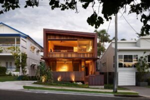
In addition to the rear pavilion, a new entry annex was built, clad in warm enveloping timber batten. The annex soothes the robust frontage while visually introducing the entwining of the old and new parts of the house that is continued into the rear. The annex is an ingenious feature in the design, and while the outer gate is closed, allows for the other doors to remain wide and encourage free-flowing ventilation across the length of the house. The annex also constructs a physical and psychological transition from the urban frenzy of the outside streetscape into the airy and restful pavilion.
“Walking through the house, the idea was to create a serene experience,” says Daniel. Moving from “the timber batten and filtered light [at the entrance] to that more secluded – and I’d like to say protected – living space; when you walk into that space, the acoustics are very quiet. The amount of timber contributes to that definitely.”
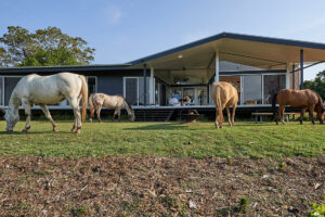
The pavilion addition exists as both a living room and an extension of the outside deck, stirring the boundary between the internal and external parts of the house. And this is perfectly suited to the family’s lifestyle.
“My son plays a lot of sport, so for him to be able to stand in the backyard kicking a soccer ball while he’s eating a piece of toast, it’s a nice thing to be able to do.”
Gresham St House visually plays out the narrative of years gone by. The house draws on components of Daniel’s background and applies them within Brisbane’s urban setting. Illustrated as a result is a harmony between divergent design styles, reinforcing how our past influences continue to evolve and inform the paths of our future.
Jackson Teece
jacksonteece.com
Photography by Christopher Frederick Jones


We think you might also like See Through House by Wallflower Architecture + Design


