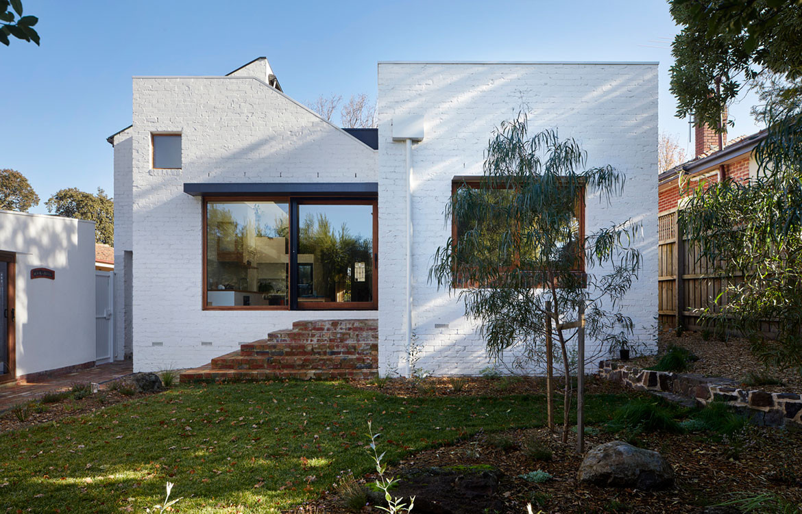
Housed within the shell of an interwar cottage in the Melbourne suburb of Canterbury, the Escher House by Inbetween Architecture uses the tricky heritage overlay to its advantage, making for an incredibly layered design outcome.
Inbetween Architecture worked adeptly within the framework of the 1930s English-style cottage, translating the brief into a light-filled, functional family home. Alongside this was a series of multi-faceted constraints, including that the extension not be visible from the street, a sloping site where the backyard was lower than the house and a complex brief involving competing priorities such as a connection to the backyard in addition to a functional kitchen.
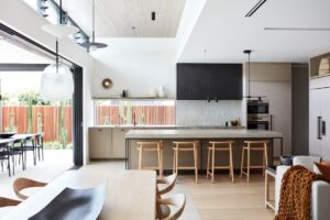
The kitchen has been stepped down a level, providing a connection to the backyard at eye level.


As with many mid-century buildings the original dwelling was dark, compartmentalised and not conducive to a modern way of living. The design responds to the sloping site through a carefully arranged series of four incremental levels. By setting a subtle vertical and horizontal interplay, the intersecting spaces create an intriguing arrangement of unfolding and connecting pieces – much in the same vein as artwork by M.C. Escher, the namesake of the Escher House.
Another key component of the brief was creating a greater connection to the outdoors. “The clients were keen for a better connection, both visually and physically, between the house and backyard,” says Inbetween Architecture’s John Liu. Through this requirement a clever solution was found. Within the new extension to the home, the kitchen has been stepped down a level, providing a connection to the backyard at eye level, while also creating the opportunity for a platform to wrap around the perimeter of the kitchen. In addition, this informal seating arrangement sits lower to the ground inviting the family to take in the views while sitting and dining together. A ‘wet kitchen’, which features a wok burner and heavy exhaust, was then positioned at the back, stepped down again, helping to separate the messy cooking area from the open kitchen and dining space, contributing to a sense of openness and minimalism.
By setting a subtle vertical and horizontal interplay, the intersecting spaces create an intriguing arrangement of unfolding and connecting pieces.


“The split level allowed plenty of storage opportunity and interesting connections,” says John. Space is maximised in every corner with cupboards and storage similarly treated as layered elements, serving as both functional seats and steps. There is even a cheeky pass-through cupboard between the wet kitchen and laundry space, and the main kitchen. On a mezzanine level overhanging the kitchen is a study space, which is flooded with natural light as the window placement captures the best aspect.
But not every corner of the project is about the new, there are original details that have been reappointed and maintained, a nod to the building’s history. For instance the formal dining room has maintained the chimney, leadlight windows and cabinets, and intricate cornicing – albeit suitably refreshed with a crisp white paint. Materiality throughout the home plays off the old and the new. On the exterior all of the brickwork has been painted white, while the interior feels fresh and welcoming with natural timbers bringing warmth to the white throughout.
Inbetween Architecture’s approach is something of an architectural puzzle, fusing and adapting spaces, ensuring all the pieces come together harmoniously, while working within the constraints of the heritage, the site and a dense programme of functions.
Inbetween Architecture
inbetweenarchitecture.com.au
Photography by Tatjana Plitt
We think you might also like Gallery House by Grove Architects


