In the street there are some grand two-storey terrace houses that typically have a basement area below street level. Having lived in such a basement flat in this same street I can vouch for the fact that they are dark and gloomy. Despite the rear being north-oriented, the street elevation on the south typically contributes no light to the basement areas.
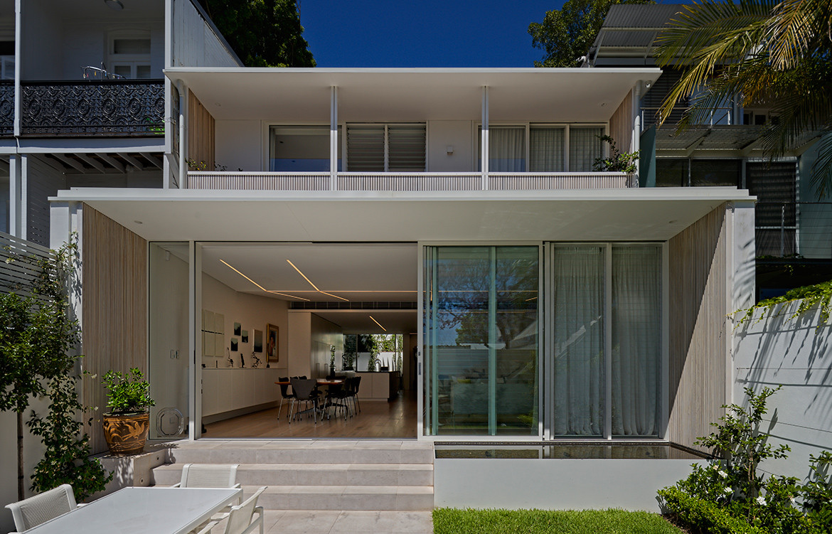
This house is single-storey, but it does have a basement level and part of the magic of this make-over by architect, Sky Grove, is the way the basement space has been turned into a light-filled wonderland, directly linked to green spaces front and back. The usually confined and uninviting street-facing basement exterior space has been transformed into two courtyard gardens, while the rear has been fully opened up with full-width sliding glass doors to connect directly with the sensitively landscaped back garden with views over the garden-roofed garage to two majestic Jacaranda trees beyond the back lane.

Entry to the house is up a low flight of steps to a door that perfectly bisects the house in true Palladian fashion. The two courtyard gardens reflect this proportionate division, but also reflect the union of old and contemporary. Hence, the left-hand courtyard has a traditional fleur-de-lis wrought iron fence at street level with views down to the garden and the French windows leading off the reading and TV nook downstairs. But the right-hand garden is screened by a minimalist white wrap-around wall. What we do see, though, is a handsome glazed atrium rising up beyond the wall, only partly obscured by slender, white-painted, vertical steel fins allowing the large Imants Tillers painting on the inside feature wall to be visible from the street.
The client, Jo, says that passers-by, when they see this display, often think the house is an art gallery – given Paddington is home to so many galleries. Indeed, she is an avid art collector. But, says Jo, she always wanted a home, not an art gallery. And so, the plentiful art inside the house, while carefully hung, becomes part of living in the house – not a dominating presence.


Two key elements drove the re-invention of this house: space and light.
The idea was to create a new spatial experience, opening the house up and devising a circulation which unified upstairs and downstairs spaces and rectified the stultifying impact of two undesirable 1980s additions. In other words, the aim was connection – internally and also with both the rear garden and the street.
Light was crucial to this strategy – both natural and artificial. Central to this strategy was the insertion of two skylights. The first is just past the entry, enabled by going up into the pitched roof. Fortuitously, the roof structure dictated an irregular skylight void, giving it a sculptural quality and breaking up an overly ‘modernist’ orthogonal spatial arrangement. The same happened downstairs in the living-dining space where an existing beam drove an irregular ceiling form – not just undermining orthogonal orthodoxy, but creating a dynamic patterning for the recessed strip lighting system in the ceiling.
The plentiful art inside the house, while carefully hung, becomes part of living in the house – not a dominating presence.

The double-height upstairs skylight void lights up the entry area and the re-worked stairs to the downstairs. A large hatch which has been cut into the wall on the right of the entry draws in more light from the second skylight void, the glazed atrium, and provides a dramatic view down into the kitchen area.
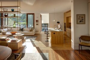
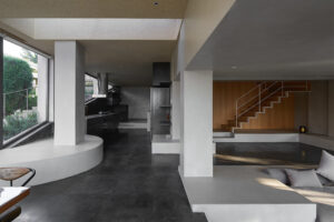
Downstairs is basically one single space. But it has a vaguely serpentine circulation (generated by the bulkhead of the stairwell) which again prevents the plan falling into an uninteresting regularity. The spatious living/dining area looks out on to the rear garden and is linked back to the street side atrium by a long and sleek galley kitchen. Opposite the kitchen at the atrium end is the kind of surprise which is so welcome in an otherwise minimalist home – a cosy living room nook to escape to when all that light and space becomes too much.


Drawing as much light as possible into the house was a major objective. But controlling that light was also important. Partly this was to do with ameliorating the potential fatigue from too much space and light. But it was also essential both to protect the art on display and to enhance it.
The architects worked closely with gallery specialists, Steensen Varming, to develop the dimmable strip lighting system in the ceiling and in the skylights, where timber battens also serve both to break down the light and to soften the brilliant white of the walls. “While seemingly similar in their appearance” says Sky, “each strip is located and specified to serve a particular purpose – either art-specific lighting, general lighting or spatial definition.”
With the renovated bedrooms and bathroom upstairs and the public spaces downstairs, the house has a clear functional division, but also a more effective connection between the two due to the skylights, the re-worked stairs and the delightful hatch at the entry. One suspects that it has finally become a home – both to both the client and her art collection.
Grove Architects
grovearchitects.com.au
Photography by Michael Nicholson
We think you might also like Bundeena Beach House by Grove Architects


