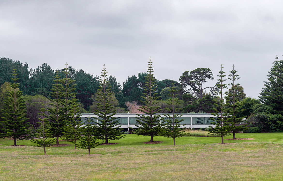
Located in Central Tilba, a five hour’s drive from Sydney on the southern coast of New South Wales, sits this garden-style weekender. One of several dotted on the substantial property, this latest offering from Tobias Partners sums up the great Mies Van der Rohe’s approach of ‘less is more’. A simple palette of materials, including glass, concrete and steel, allows this extruded low slung coastal house to sit quietly in a landscape by designer Myles Baldwin. This landholding, including the heritage-listed period home – Haxstead -, has been in the family for many years. Now it was time to create a contemporary weekender for the couple’s son, his wife and their two young children, a stone’s throw from the original homestead.
Tobias Partners initially introduced a more contemporary style of architecture with a yoga pavilion on the property, as well as making a number of sensitive modifications to Haxstead. “The brief for the Garden House, as it’s referred to, came from both the parents and the next generation: the son and his family. Both were interested in maintaining the views of the Pacific Ocean and these beautiful gardens, some more intimate and pocket-like, others more expansive,” says Richard Peters, project principal.

Richard worked closely with architect Julia Cumines, who assisted with the design and development of this unique project. “This specific location on the property was perfect for the new house. It has sweeping views to the south-east and would engage perfectly with the surrounding landscape,” says Nick Tobias, the practice’s founder and director, pointing out the majestic pine trees that frame the southern lawns.
Tobias Partners initially introduced a more contemporary style of architecture with a yoga pavilion on the property, as well as making a number of sensitive modifications to Haxstead.
Given the differing climatic conditions between the north and south, where the southeast winds blowing up from the ocean can be severe, Tobias Partners conceived one long pavilion-style house (36-metres long by approximately six metres in width), with a slightly raked steel roof to allow the northern sun to penetrate with automated, external louvred blinds to eliminate the harsher sunlight on the northern elevation. “The house is effectively one room wide making it a long pavilion. This allows a sense of transparency through the house where both conditions, from the north or from the south, can be appreciated at the same time,” says Nick, who was keen from the outset that the broader landscape, surrounded by national park, wasn’t sacrificed in the process. “The architecture is a continuation of that,” he adds.

To the north, the house features large sliding glass doors, while to the south, the treatment is more bunker-like with concrete columns supporting an overscaled concrete gutter designed to collect the rainwater (this part of the coast is well endowed with heavy rainfall). “We could have concealed the gutter, but we decided to make a feature of this instead,” says Richard, who juxtaposed the gutter’s concrete ‘underbelly’ with birch plywood for the ceilings and large format limestone format tiles for the floor. There is an economy of material used in this house. “We wanted to create a ‘quiet’ backdrop for the views and this special site, rather than making things overly fussy or too complicated,” he continues.
One long pavilion-style house with a slightly raked steel roof to allows the northern sun to penetrate with automated, external louvred blinds to eliminate the harsher sunlight on the northern elevation.
Although appearing pared back and relatively simple, the detail of Haxstead Garden House is exceptional. Even the simplest materials, such as birch plywood or the powder-coated aluminium sheets used for the bathroom walls, were treated as though they were ebony or marble. “It’s a beach house after all, where the family can come back from the beach, a five-minute stroll away, and not feel precious about dragging sand into the home,” says Richard. “The house had to be low maintenance, robust and extremely durable, particularly with two young children.”

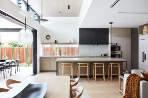
Only one room wide, to allow for cross ventilation as well as maximising the winter sun, the house is simply planned. At one end of the residence (west), is the guest bedroom, bathroom and laundry. And at the other end, to the east, is the main bedroom and ensuite, together with the children’s bedrooms and a shared bathroom. At the core of the floor plan is the open plan living, dining and kitchen area, loosely delineated by the slow combustion fireplace and raised concrete hearth. The beautifully executed birch walls at either end add texture and warmth. “It’s not overly luxurious if you associate luxury with expensive materials and lavish embellishments. But you could say there is a sense of luxury in its honesty and in the way materials have been crafted,” says Richard, who saw the design as being recessive to the site. “The young family also wanted a sense of independence from the main homestead,” says Nick.
The house is simply planned.
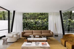
To complement the architecture, Haxstead Garden House features loose birch Artek furniture sourced from Anibou and extensive built-in joinery along the residence’s entire southern spine to accommodate drawers. Everything from the children’s toys to beach gear can be stored away to ensure the space remains relatively uncluttered, allowing the surrounds to be fully embraced. “[It] appears like a rudimentary shelter when seen from the main house, protected from the often inclement weather on the southern coast. But when you actually step inside, you really feel as though you’re still in the garden. I think we’ve got the balance right,” says Richard, who was mindful of including exactly what was needed and nothing more.

“This shelter is like a microclimate, in a sense, creating a windbreak or buffer against those southeast winds,” he adds. Even on windy days, the family can enjoy being around the swimming pool located on the protected northern side of the house. The native bush, the Norfolk Island pines that punctuate the Haxstead lawn, together with the strategically placed succulents in courtyards, further create a unique microclimate in this very special part of the world. “It’s simply a nice place to be,” says Nick, who regularly spends time along this part of the coast. “You never lose sight of Mount Gulaga, looming behind us.”
Tobias Partners
tobiaspartners.com
Photography by Justin Alexander
Dissection Information
Concrete by Boral
Limestone flooring by Aren Blanco
White laminated plywood wall and ceiling linings from DMK Forest Products and WISA
Sliding doors and windows from Vitrocsa
Steel awning windows from Skyrange
Aluminium louvres and blinds from Horiso
Window furnishings by Simple Studio
Steel and roof sheeting from Bluescope Steel
Lighting by Viabizzuno and Bega
Door hardware by FritsJurgens
Sanitaryware by Astra Walker and Duravit
Freestanding fireplace by Riva Studio


We think you might also like Tongue N Groove’s new space by Tobias Partners.


