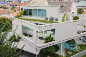
Brian Zulaikha’s clients, James and Kristina, who now have a toddler, paid a short visit to his home after they had purchased a house on the waterfront. “I was really unsure of whether or not they liked my place, as they must have only stayed for 15 minutes,” says Zulaikha, whose own house began its life as a bunker-like gunpowder store, which he extended in 2006.
While the couple’s initial visit was put out of Zulaikha’s mind, he received a call from them six months later asking if he would inspect their property and respond with a design.

“James isn’t from a design background, but he was apt at reading plans and could see where I was headed. He fully understands the terrain – there’s a significant fall to the water’s edge – and he regularly made accurate observations as the design process progressed,” shares Zulaikha.
Ensuring the historic façade wasn’t ‘blurred’, the couple decided to forego having a spot for the car. It was an attitude that aligned with the council’s request to retain the original front rooms of the two-storey house, preserving the heritage precinct. Aside from maintaining the character and volume from the street, a whole new home has essentially been added, comprising four levels in response to the steep site.

Working with landscape architect Jane Irwin, director of JILA, each level is framed with a combination of Indigenous and European plant species. A Jacaranda tree ‘pierces’ one of the rear cantilevered terraces, helping to diffuse the northerly aspect.
Although the couple only stayed briefly at Zulaikha’s property on their first meeting, there are elements that have been repeated on both homes. For instance, timber bookshelves span from the basement, up four levels, which are accessible from the timber stairs and from the adjacent spaces.

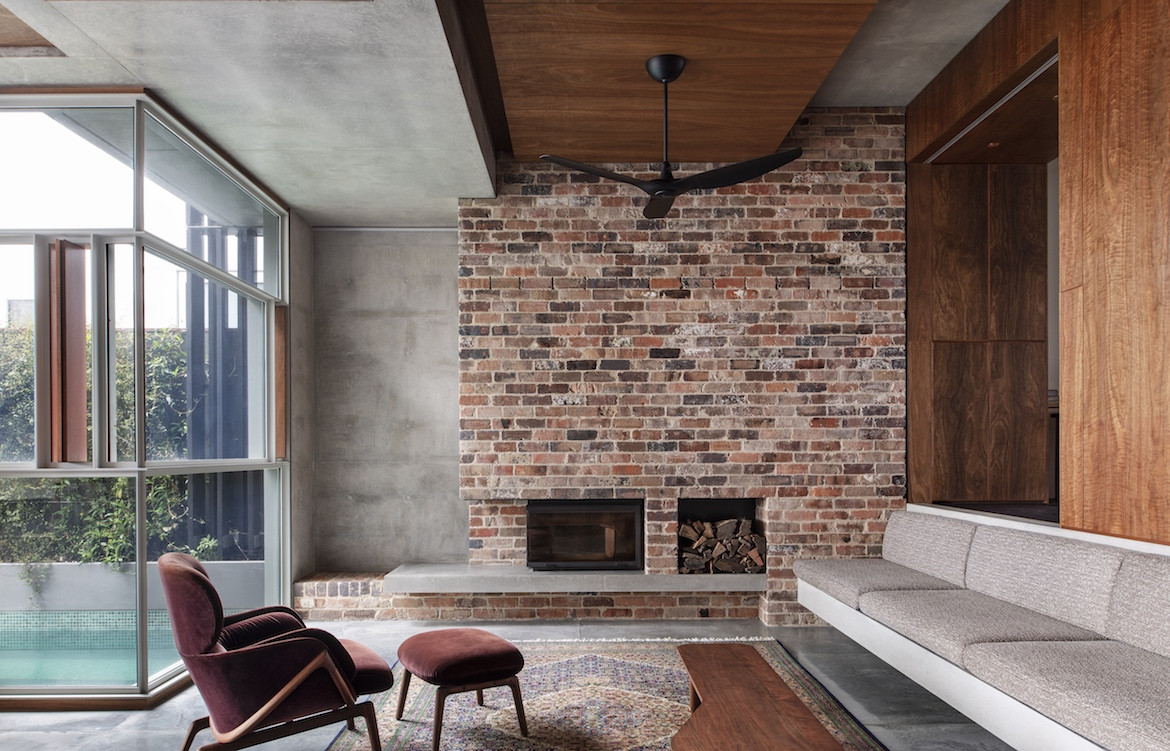
Birchgrove House offers a great sense of warmth and tactility; rich timber combines with chunky concrete beams that are generously expressed.
“I graduated from university in the late 1960s so you could say I was greatly influenced by the ‘nuts and berries’ [also referred to as Sydney School] approach to architecture,” says Zulaikha, pointing out the rustic recycled brick wall saved from the original house in the main living area.
“Kristina and James are strong environmentalists,” he adds, opening up one of the timber window panels in the dining area that allows for continual cross-ventilation, while flyscreens allow them to be open 24/7. Even though environmental issues were discussed at length, the brief was left relatively loose.

The home’s façade and the two original front rooms were retained, one is now used as a guest bedroom with ensuite and the other, located above, is the kid’s bedroom. Connecting the guest bedroom to the open- plan lounge, kitchen and dining area is a large sliding door, which is left open most of the time. “Their young child tends to use that front room as a stage when it’s not being used by guests,” says Zulaikha.
Given the fall of the land, approximately seven metres from the street to the water’s edge, there are four levels concealed behind the home’s period façade.

At basement level is a gymnasium/Pilates studio, a steam room, a bathroom and a storeroom. The swimming pool, which is glazed on two sides, not only animates this space when it’s used but also creates a watery underground world that allows the northern light to reach its core.
On the ground floor, the swimming pool frames the edge of the dining and living areas, and the water from the pool cools the house via the window vents during the warmer months of the year.


Architecture – Tonkin Zulaikha Greer
Photography — Nicole England
Enjoy this story? Read more from Habitus #51.


