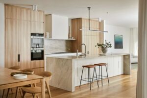
“The communal spaces are designed to draw people intuitively and naturally together, while private spaces focus on a creating sense of security and retreat,” says Matthew Murfutt co-founder of Mitsuori Architects, when asked about the studio’s Northcote House project. “The planning of this home includes a series of separate zones designed to respond to the needs of different family members.”
His clients’ existing home, a modest freestanding Victorian-era terrace located in Melbourne’s inner northern suburb of Northcote, needed some critical upgrades and enlargement to cater for a large family. “Our client’s key aim was to extend the house but at the same time they wanted to minimise the impact of new building elements on the wonderful sense of openness in their back garden and surrounding properties,” adds Matthew.
“However a double storey above ground addition would have caused greater amenity impact to adjacent properties compared to the single storey structure created.” As a result, Murfutt’s team avoided adding any substantial visual bulk, opting instead to go down instead of up.

Suffice it to say, the decision to dig down into the site generated numerous construction challenges and a deep dive into the best methods in which to achieve their goal of a subterranean extension. “The greatest challenge of this project was no doubt the creation of a basement (extending from boundary to boundary), having to excavate through volcanic rock, on a site with tight access,” says one of the clients.
“But as a commercial builder, I was up for the challenge and it was worth it. When our friends and family saw the challenges of the build, which included weeks working through rock, the original house suspended and supported on piles and needles, living in the house through the renovation (noise, mud and dust) they asked why we didn’t just go up and we are so glad we didn’t.”
Buoyed by the support of their client, Murfett pushed the concept even further. “We also wanted to exaggerate the experience of descent,” says Murfett, “so we designed the stair to cut through the existing foundations revealing a section of the existing wall above and below the ground.”

The effect is dramatic, also highlighting the transition between the heritage and contemporary components of the house. “It was important to us that the new addition reflected the functional and spatial qualities valued by the family but also celebrated the transition between old and new,” explains Murfett.
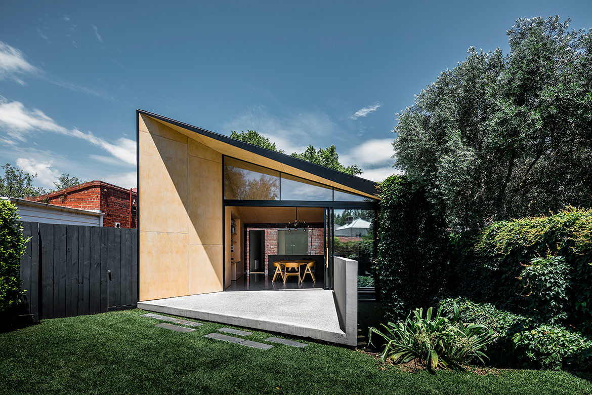
The result is a light-filled pavilion that bridges the existing heritage home and garden with more private subterranean bedroom areas below. Externally, the move is characterised by a singular metal-clad form with a fully glazed roof that defines the junction between the new structure and original brick building, a deliberately minimal material palette to emphasise light and form.
“With the addition designed as a respectful but playful counterpoint to an existing heritage home, the junction between old and new is treated as an unequivocal transition point in the building and the two appear not to touch,” Murfett adds.

In addition, the placement of bedrooms below ground meant that the team were not hindered by the presence of an upper storey and a playful shaping of the roof form was made possible. As a result, an angular ceiling form brings in an abundance of natural light and provides necessary sun shading without the need for active shading devices. In contrast, a separate lounge, designed as a cosy, conversational space was tucked into the existing heritage house, separated from the noise of the main living zone.
Internally, a simple natural material palette of concrete, steel, glass and plywood was adopted, which serves to accentuate the striking form but also adds warmth and a tactile quality to the interior spaces. It’s the unveiling of spaces and contrast between old and new that takes centre stage.
“Many people have no idea what lies behind the front façade of the old Victorian home and we love to see the surprise on their face and hear the words – ‘wow, I had no idea!’ when they see the house open up,” adds the client. “We smile quietly and feel very lucky to live in such a wonderful home.”


Project details
Architecture and interiors – Mitsuori Architects
Photography – Michael Kai
Landscape architect – Andrew Plant Landscape
We think you might like this story about swapping suburbia for a compact inner-city terrace.


