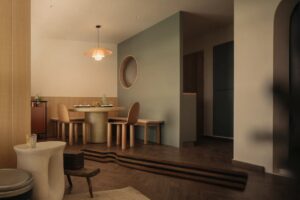
When it came to designing their own home, the five-month renovation for architect Felicia Toh and her husband Joel Keh was an experimental experience. Felicia, a partner at Quarters Architects says: “The process of designing our own place was very iterative; we would test things out in 3D, take multiple trips to suppliers, toss and repeat. It was a fun process as we could make the final call in design decisions and choices.”

Aligned with a soothing aesthetic for their home, the couple appreciate the little things that make them feel at ease. Felicia says, “We look for quietude and a certain calming atmosphere that envelopes you. It’s how materials feel against your skin, and little details like whether there are black lines in laminate joints and how the mess is hidden away through careful detailing.”

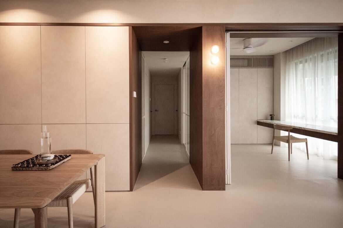
Their condo at Hillview is anchored in a minimalistic material palette with natural finishes of plywood, rattan and stone alluding to their love for tropical resorts. To improve on the spatial flow of their home, Felicia outlined the space carefully through an artful expression of demarcation.

Envisioning it as portals, she explains: “The idea of portals is an analogy for travel — to step through the frame and emerge in another world. It is employed in the main entryway to the study, as well as the master bedroom; key spaces that are prioritised in the home. The transitions of daily life from relaxing to concentrated focus to rest are marked by passages through these portals.”

Bi-fold and sliding doors in fluted glass cordon the study, making the transition from open space to private quarters a seamless feat. The intention was to visually enlarge the living area, and to still offer the study a sense of privacy with the flexibility of the doors.

Overlooking lush greenery, the window in the study is a prime spot for the work desk, which is topped with gorgeous Statuario marble in a matte honed finish. Having it suspended makes the 2.7-metre table setup even more stunning, especially with the unblocked view and daylight streaming in.

To indulge in artistic whims, there is an art corner made up of a pegboard and a custom-made rolling pedestal to store art supplies. It can be tucked behind pocket sliding doors to maintain the neat and seamless appearance of the full-height cabinetry.

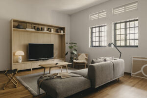
In line with the pared-back materiality is microcement flooring devoid of grout lines and overlaid on the existing marble and parquet floors. The couple also debated on the placement of a TV, but opted for a projector screen now receded neatly within the ceiling when not in use.

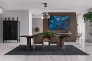
On the original dining space, Felicia reveals that the layout had ‘strange diagonal angles’. She says: “The wall was knocked down to form a more ideal rectangular setting for the dining table.” One side of the dining area is now fitted with full-height storage that lies flush with a column in stained plywood and linked to the study area.

The previous kitchen entrance at the dining area was also relocated to regulate the layout. “We shifted it towards the main door,” says Felicia.

Rattan has been used as an accent finish on cabinets and doors around the home. Of the tropical material, Felicia says: “We wanted to reference a texture local to the Southeast Asian region we are located in.”

Items on the display shelf also hold special significance to the homeowners and are mementos of their travels to Japan, India, Zurich and Spain.

With the new kitchen entrance, Felicia could reorientate the layout of the counters to facilitate a more space-friendly setup. An angled corner adds an interesting dimension that offsets the symmetrical details of the raw stained plywood finishes.

Following a reconfiguration, the door to the modern tropical resort inspired master bedroom opens to a view of the bathroom vanity, with a separated WC and shower stall to its left, and the bedroom proper on the right.

To allow the bathroom and sleeping area to flow as one cohesive space, rattan double doors framed in raw plywood separating both areas can be lined flat against the wall when opened.

Fluted glass is used as a divider for the shower stall as the homeowners like the hazy outlines and its ability to still obscure the view.
Project details
Architecture and interiors – quarters.sg
Photography – Felicia Toh


