Known for its refined aesthetic, Sarah & Sebastian was founded on the principles of understated luxury and avant-garde innovation. And when Sarah Gittoes and Robert Grynkofki, Sarah & Sebastian’s creative director and managing director respectively, briefed Landini Associates for the brand’s second physical retail space, these principles remained core to design. The brief was to create a space that was intriguing, without being intimidating; a complementary evolution to the brand’s Paddington Flagship, which opened its doors in 2017. Drawing inspiration from the Paddington store Landini Associates have created a space in Mosman that celebrates the magic in mystery, discovery, warmth and intimacy.
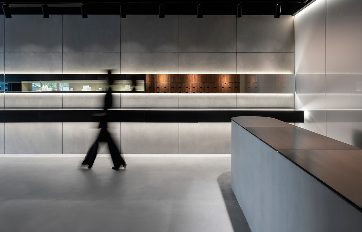
In keeping with the timeless elegance of the brand’s look and feel, the space is minimalist – almost museum-like – by design. The interior utilises refined, lightweight fixtures aimed at exhibiting the intricacies of Sarah & Sebastian’s handmade pieces. This is anchored by a linear display case stretching the length of the store, and further elevated by streamlined and strategic lighting design. Throughout the store’s interior, Landini Associates uses materiality to toy with notions of reflection, translucency and discovery. Key materials such as concrete, walnut, blackened steel, mirror and frosted glass are layered to form a harmonious balance between light and dark; floating and solid; and lightweight and heavy elements.


“The challenge of traditional retail is what galvanized us to approach our second store with the intention of engaging clients through immersive experiences, tactile installations and intimate communication with our people,” says Robert on the thinking behind the store’s design.
Meanwhile Mark Landini, creative director of Landini Associates, is glad to been a part of Sarah & Sebastian’s latest evolution. “It has been a joy to collaborate with Robert and Sarah once again on the design of their second store,” says Mark, “our first collaboration was a simple glass box in Paddington, our second an extruded concrete sleeve. Each version a surprise, but both a reflection of Sarah & Sebastian’s core philosophy of beauty, simplicity and timelessness.”
And going by what Robert has to say, this won’t be the last we see from this creative coupling. “Our Mosman store is an exciting evolution of the Sarah & Sebastian retail concept which we will continue to refine and develop.” We’ll be watching this space to see what comes next.
Landini Associates
landiniassociates.com
Sarah & Sebastian
sarahandsebastian.com
Photography by Ross Honeysett


We think you might also like Aesop Pitt Street by Snøhetta


