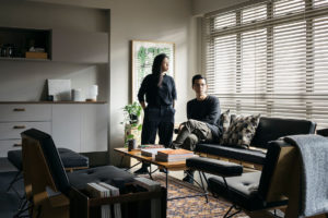
There is a tried and tested formula that developers subscribe to when launching new condominiums in Singapore—as many rooms as you can reasonably pack into the given floor area, minimal storage and vanilla interiors that, while not particularly eye-catching, are tasteful enough to appeal to a broad base of buyers.
When a young family of three first moved into their apartment a decade ago, what the condominium developer had provided ticked enough boxes such that no renovation was needed. Ten years on and with the changing needs of the family, this was no longer the case.


“Things were starting to break down and there was a lot of clutter with no shelves to hold our things,” the owners share. “We needed a lot of storage.” They turned to EHKA Studio to rethink how the apartment could present itself both functionally and aesthetically.
While the crux of the brief was to include more storage, the challenge for EHKA Studio was to include cupboards in a way that didn’t distract or add bulk to the modestly sized space. “We wanted it to add to the overall experience of the space,” the design studio shares.

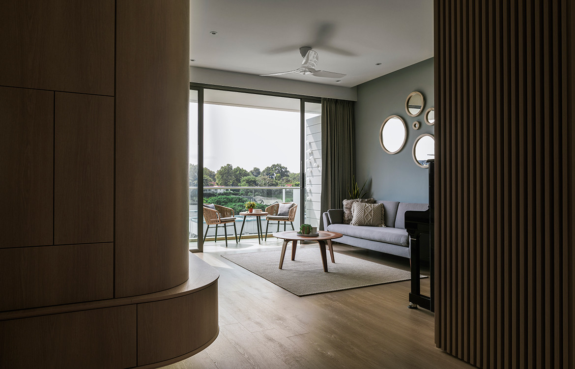
The unlikely catalyst for the easy, flowing spaces that mark this home were the handle-less, full-height cabinets that were introduced in the living area. EHKA Studio had rounded the corner of the cabinet wall to allow as much light into the adjacent dining space. It was also a gesture that mitigated what would have been an obtrusive corner in the middle of the living space.
From here on out, the curved corner became a leitmotif that sculpts its way throughout the rest of the apartment—partitions, wardrobe corners, ceiling details and built-in furniture. EHKA Studio shares, “We didn’t knock down any rooms, but still wanted the space to feel very connected, and a lot of these curved corners help the space feel more fluid.”


A key example is the newly introduced curved glass panel that provides a seamless view from the cooking area into the rest of the home and vice versa. This goes a long way in making the core of the home feel substantially more spacious.
Adding another dimension to the apartment’s design expression, the private lift lobby, which was originally encased in glass, is now wrapped by the steady rhythm of timber screens that bring greater privacy. Desiring to maintain a lightness to the interior, the design team used a combination of see-through and mirror-backed screens to avoid anything too solid and heavy looking. In the same vein, a calming palette of light timber and white was chosen for the entire apartment and is a veritable balm to the senses.

Details factor heavily in the resulting space, with the design team taking great pains to delve into intricacies—a slight chamfer of a cabinet edge to create as slim a profile as possible; a recessed frame to purely express the verticality of a screen; the attenuation of gaps between cabinet doors to avoid unnecessary distractions.
“We wanted everything to be very elegant, very trim,” shares the design team. “It’s a design preference for our studio. We like things simple, not overly done.”
EHKA Studio
ehkastudio.com
Photography by Studio Periphery
We think you might also like Grand Small Apartment by Tsai Design


