FONDA HAWTHORN by Techné Architecture + Interior Design
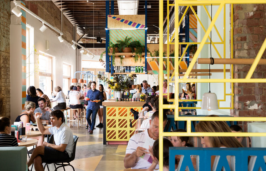
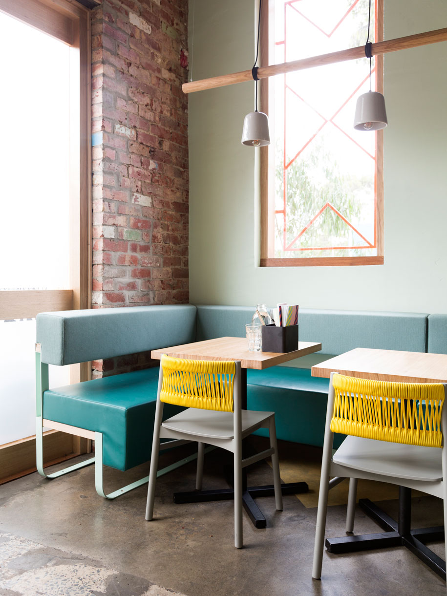
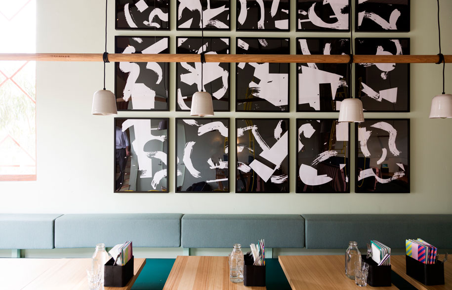
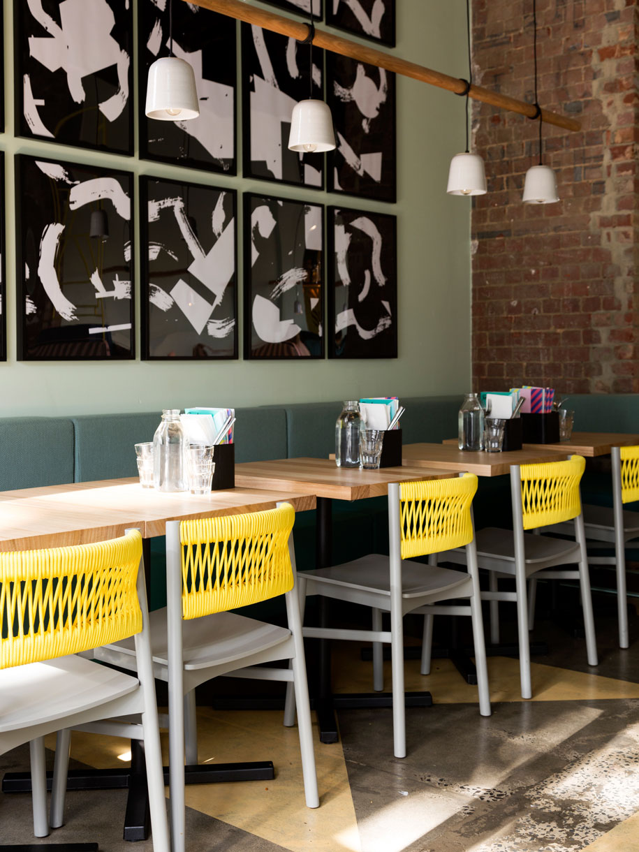
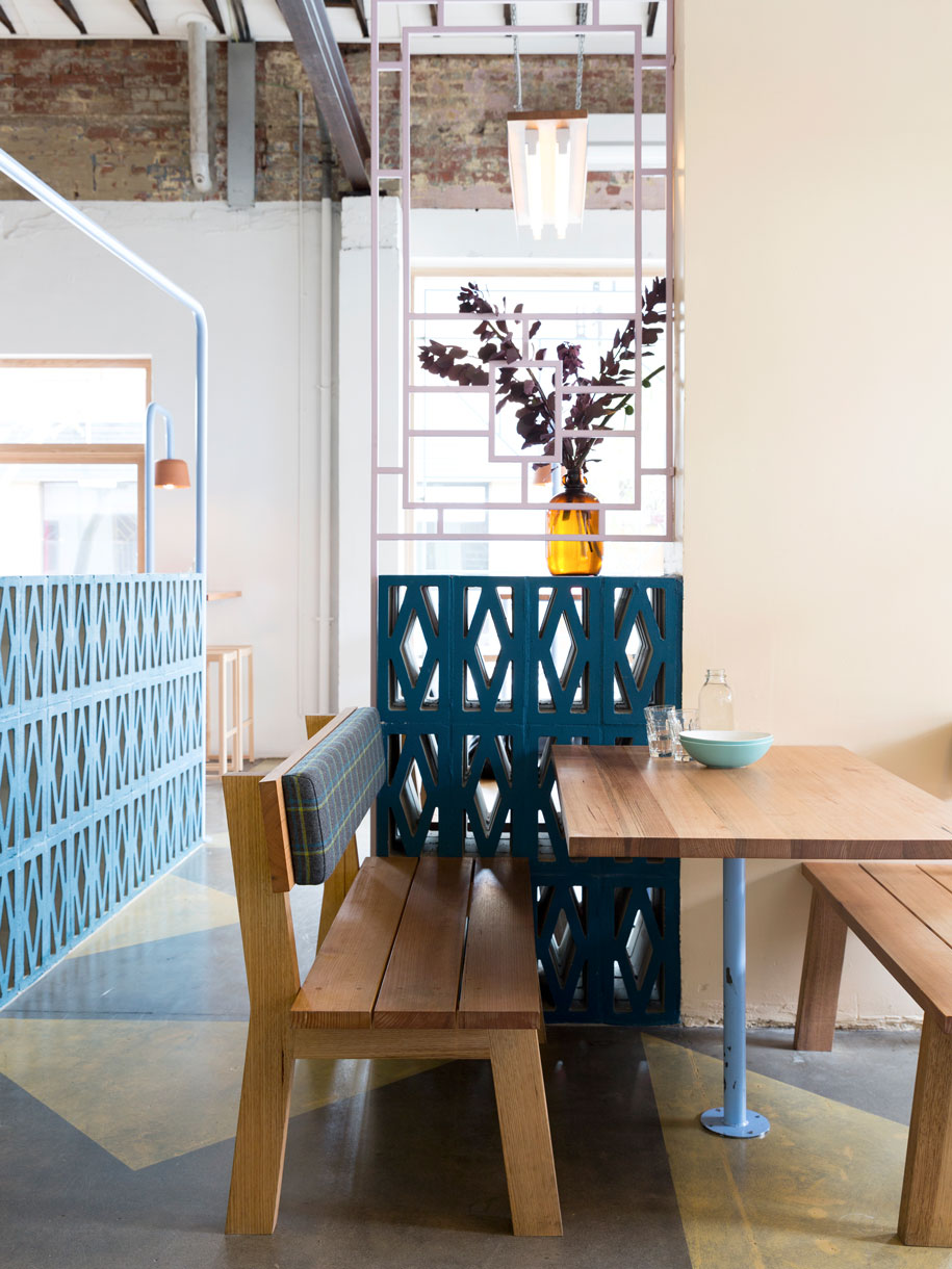
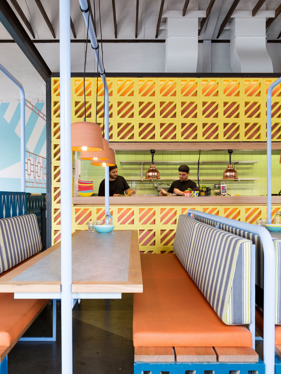
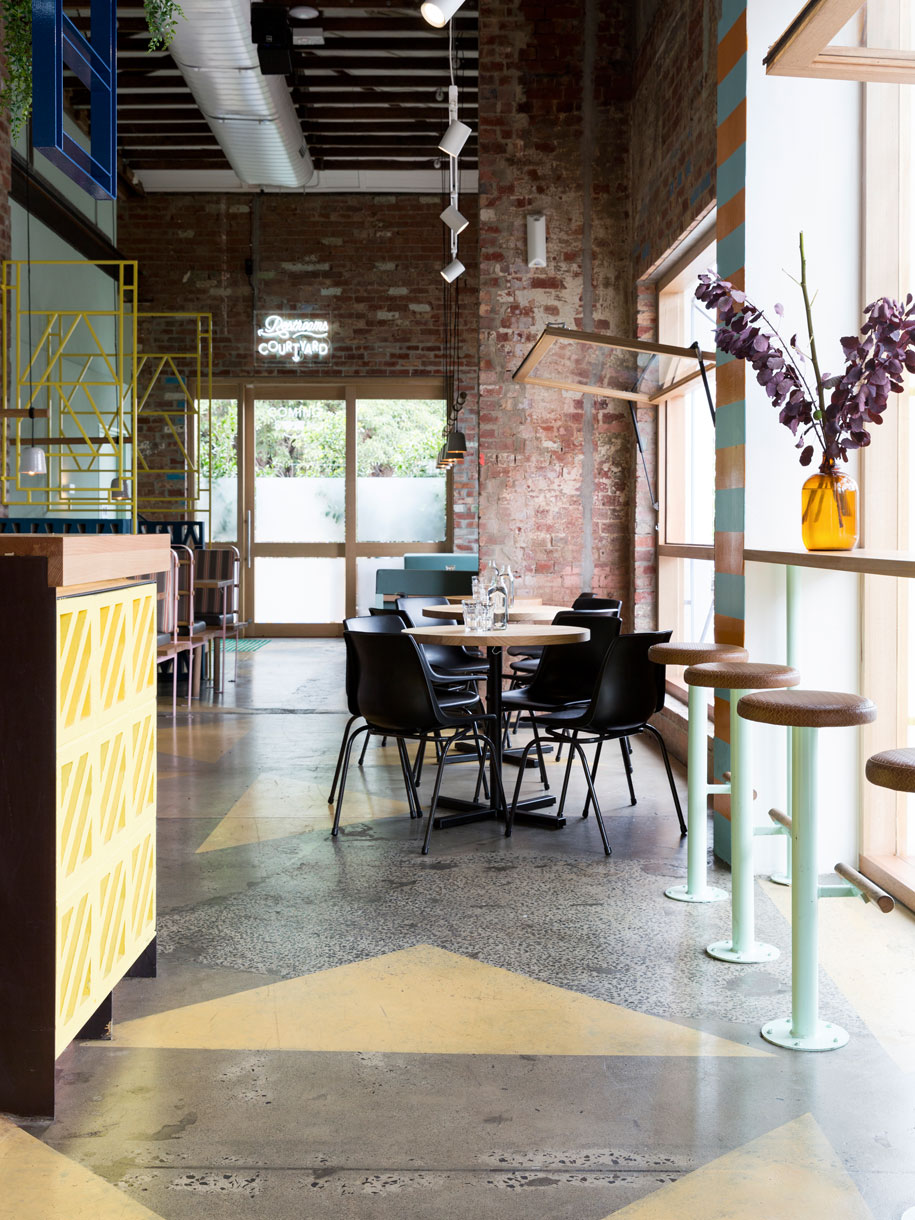
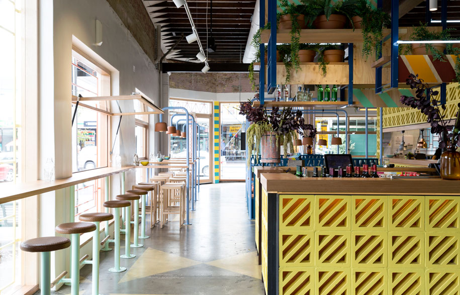
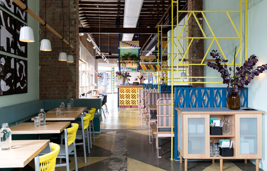
It’s the third restaurant in the Fonda familia, but Melbourne-based firm Techné Architecture + Interior Design have still achieved a playful and original interior that references its popular predecessors.
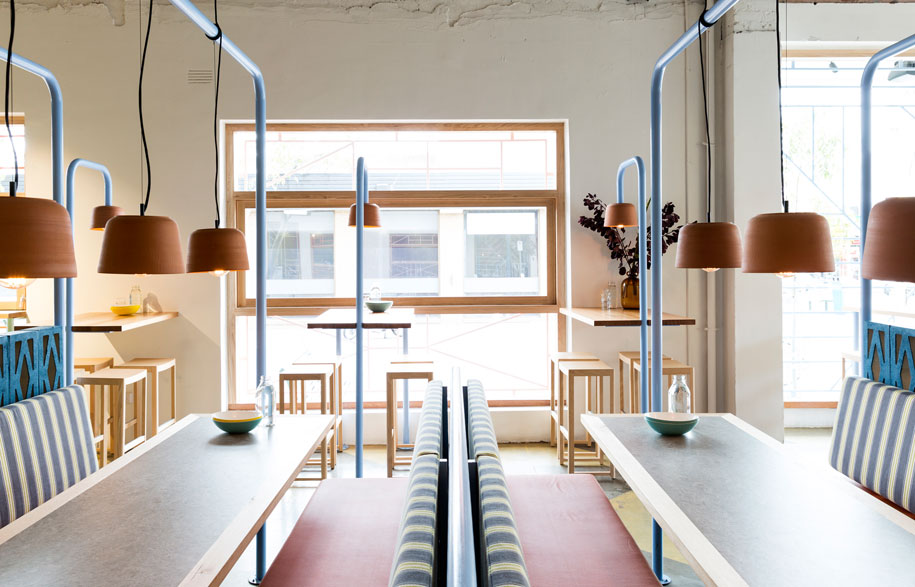
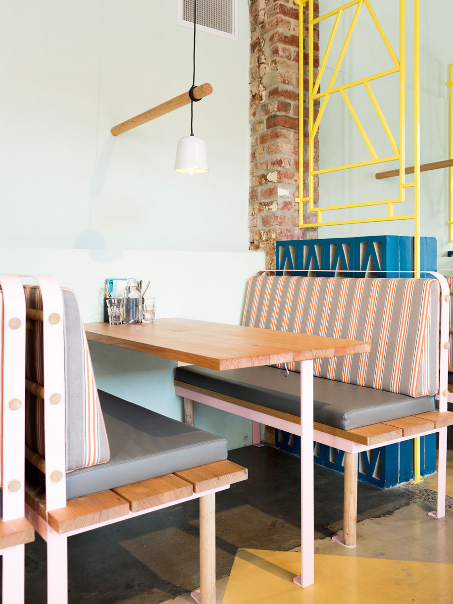
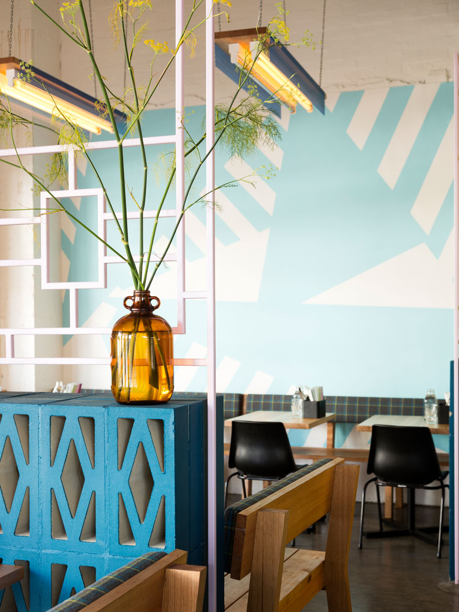
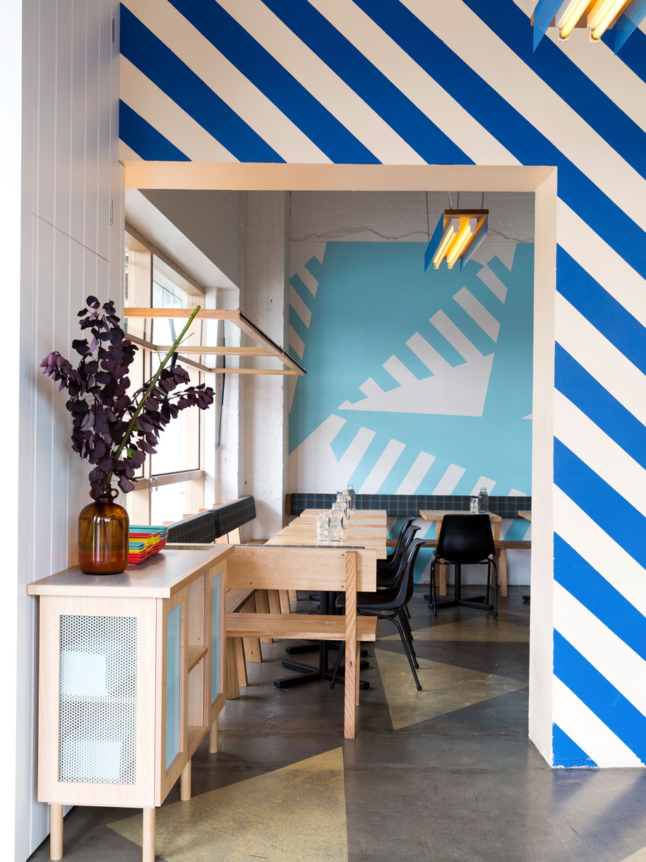
Echoing the fresh Mexican fare on offer, Techné have shaped their design though colour, texture and pattern, deriving inspiration from vernacular and contemporary Mexican culture.
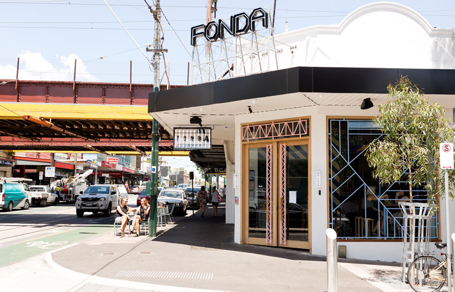
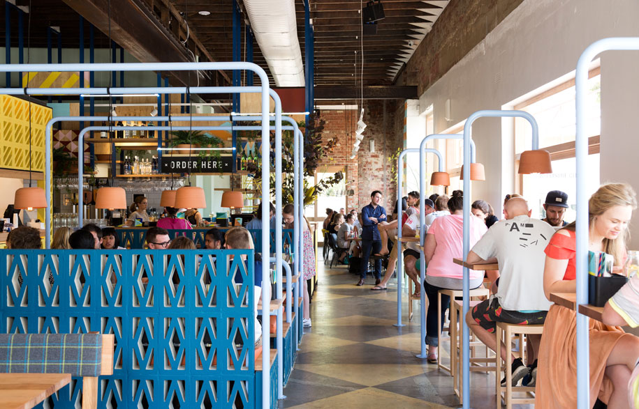
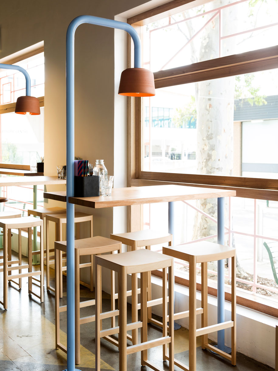
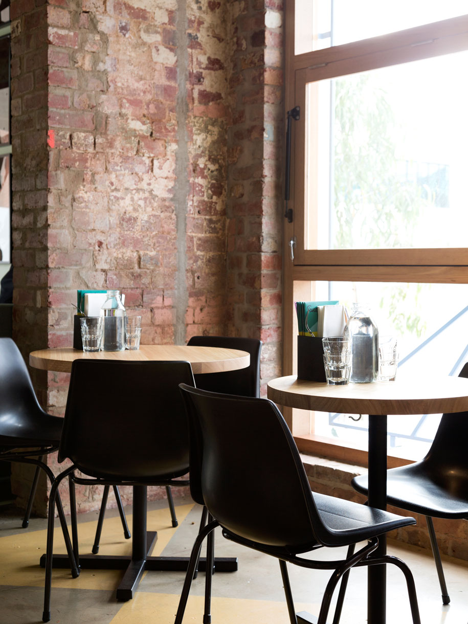
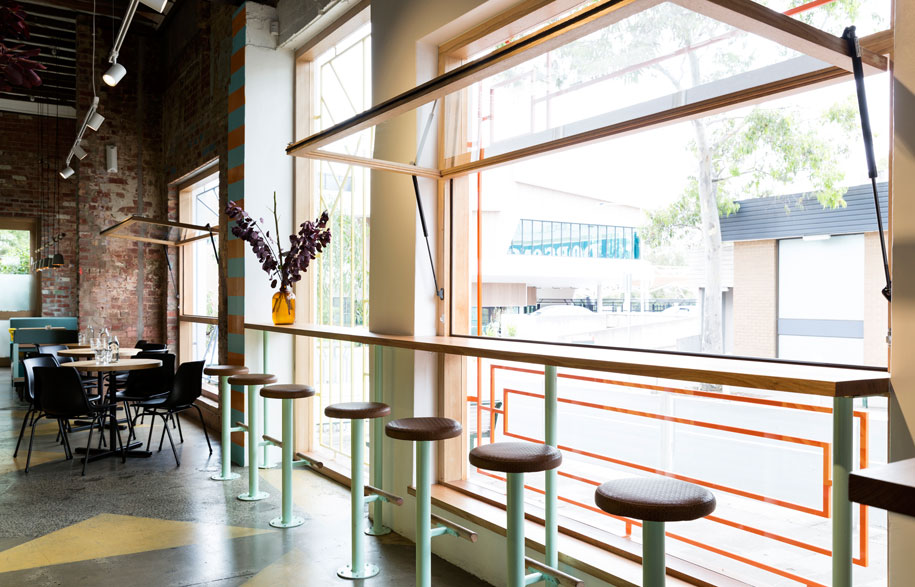
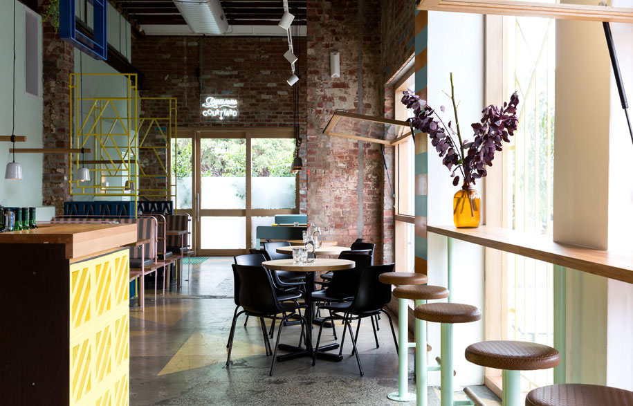
Against the heritage backdrop of the Hawthorn corner building, the signature Fonda colour palette of pastel pinks, yellows and blue and vibrant hues is offset against original timber trusses, exposed red brick walls and concrete flooring.
Custom-fabricated steel screens and Besser Blocks break up the large space into more intimate dining spaces, defined by a range of bespoke furniture pieces and varied seating typologies which include intimate booths, small tables and bar seating.
Photography by Tom Blachford
techne.com.au
fondamexican.com.au
Design studio TomMarkHenry have recently completed a sophisticated fitout for Bondi’s Best, appropriately representing the Sydney providore’s high quality produce.
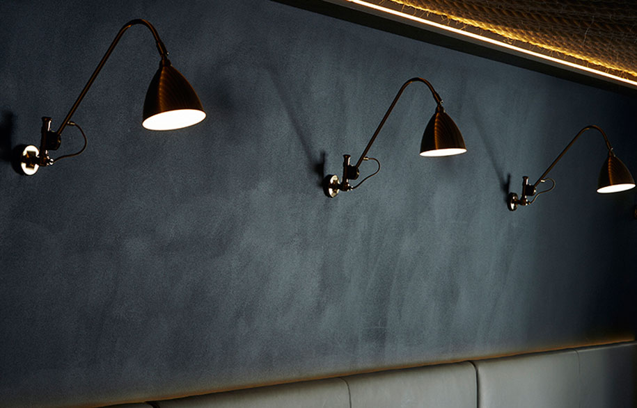
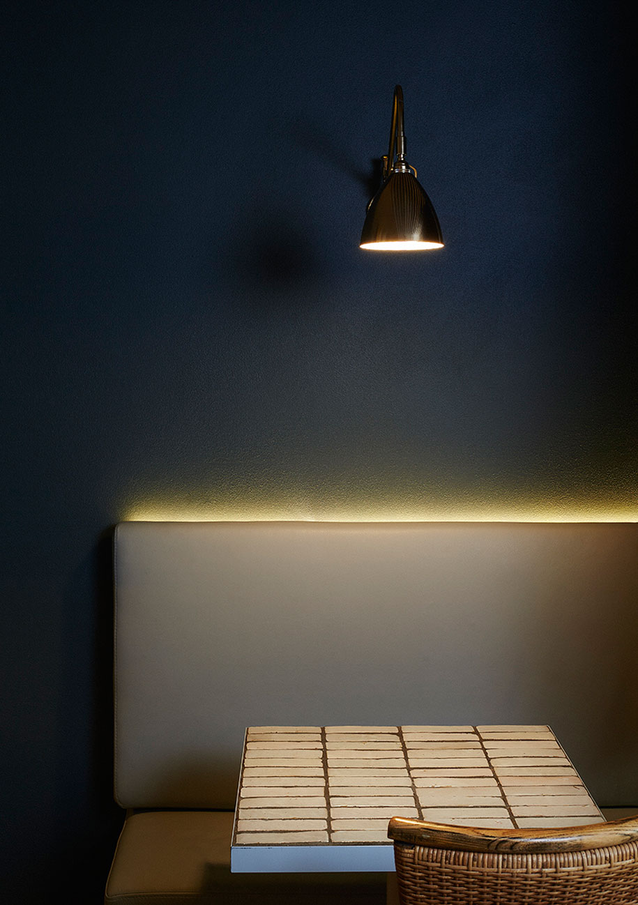
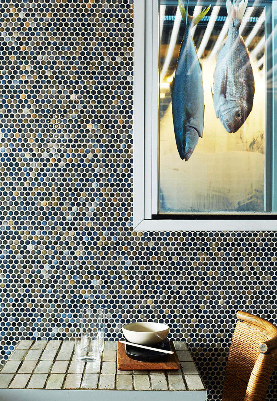
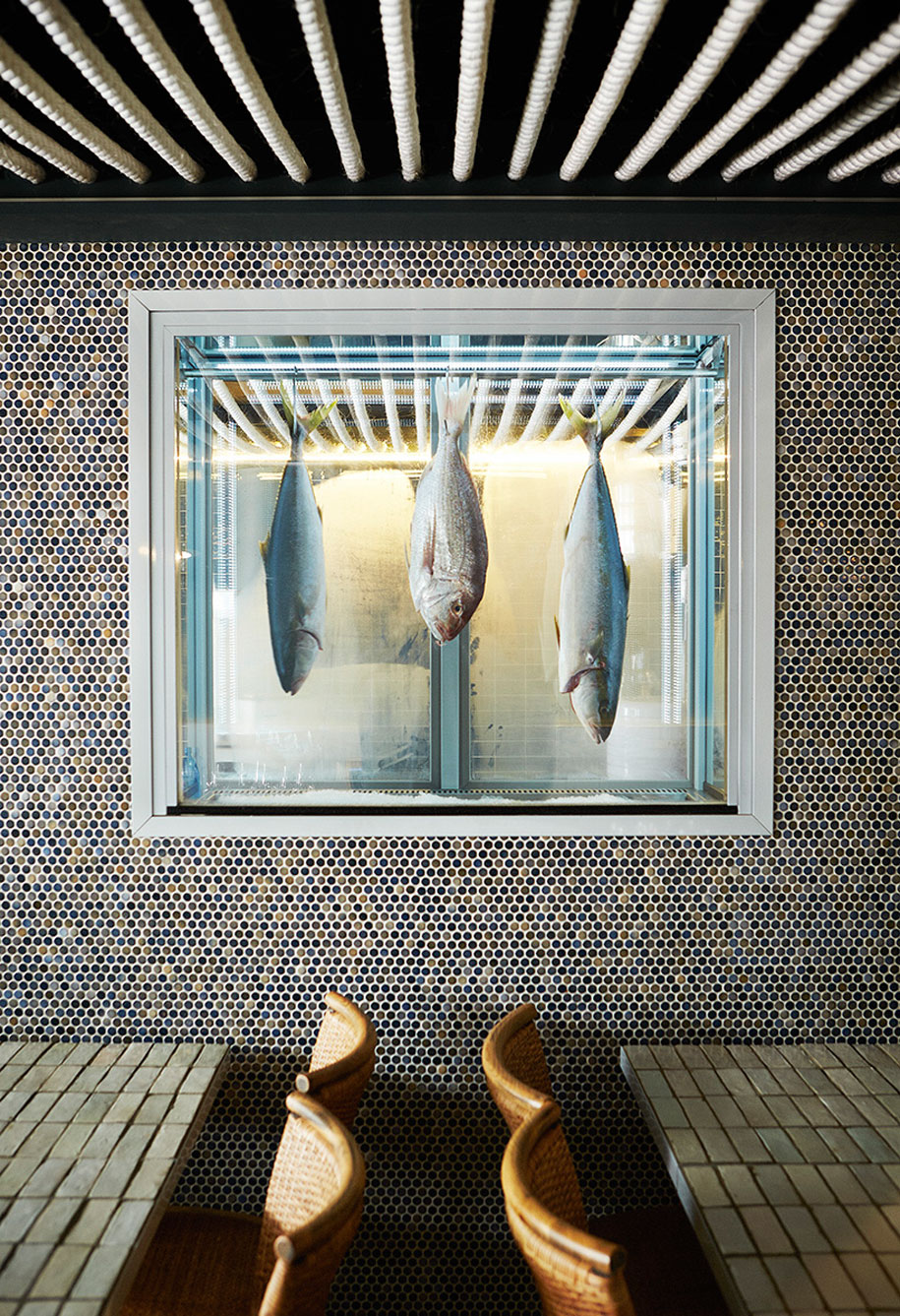
“Bondi’s Best is a tonal exploration of blues that emulate a sophisticated seafood restaurant with hints of shapes and textures that speak to the sea, without being your average seafood joint” explains Cushla McFadden, a partner of the practice.
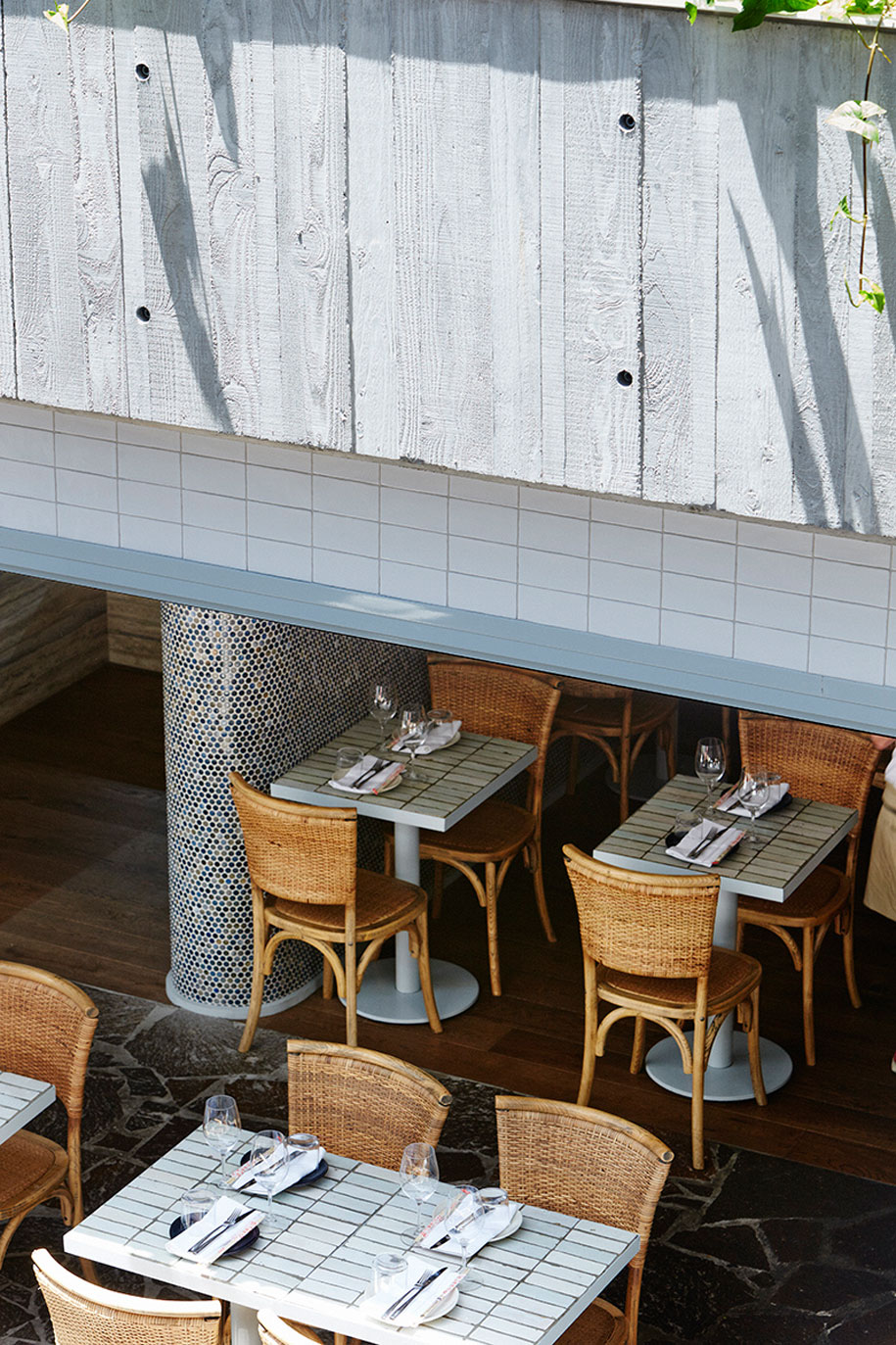
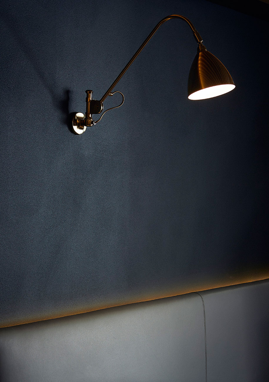
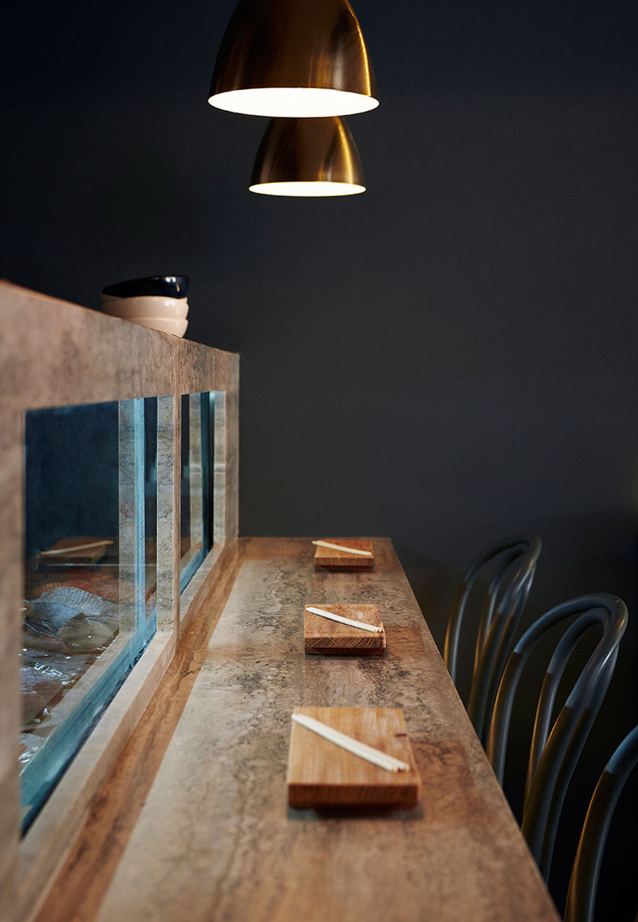
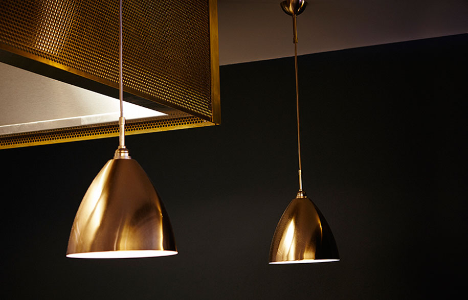
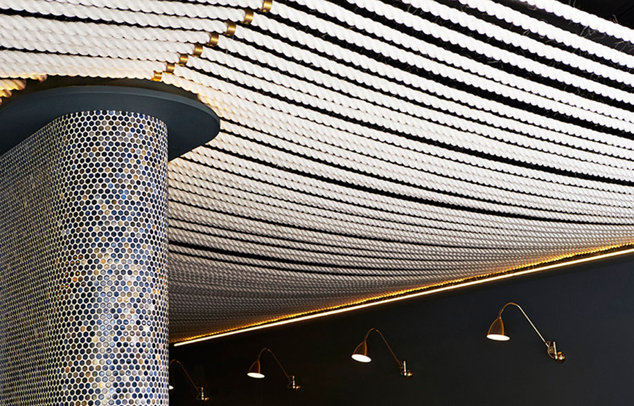
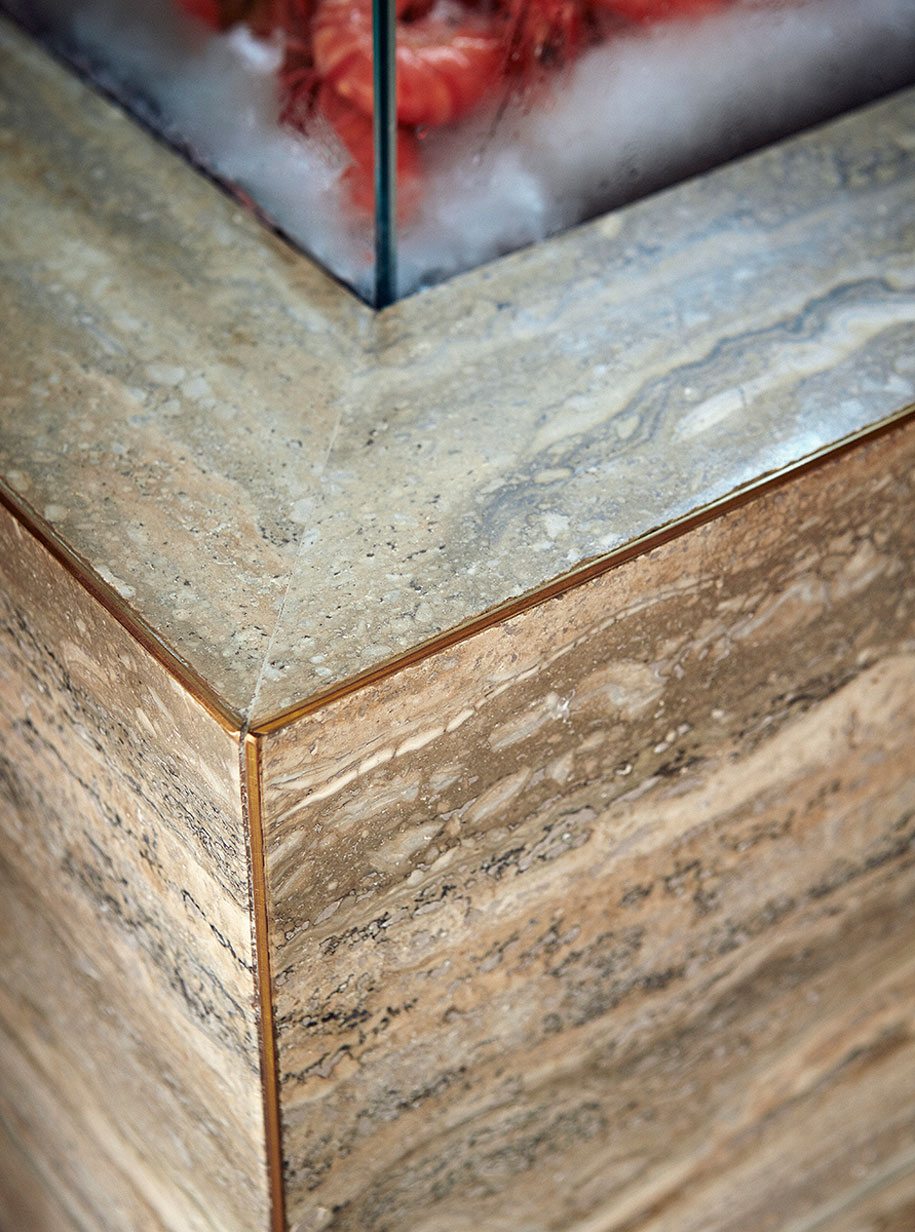
A ceiling defined by stretched ropes creates an intimate environment, further enhanced by travertine and tile-clad surfaces in blue and grey tones. The element of premium quality is underscored by use of brass accent lighting and edge trims which sit comfortably amongst the charcoal walls, bespoke glazed terracotta-tiled tables and a feature fish locker wall which houses and displays fresh fish.
Photography by Damian Bennett
tommarkhenry.com
bondisbest.com.au
GREENE ST JUICE CO by Travis Walton
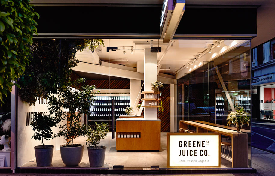
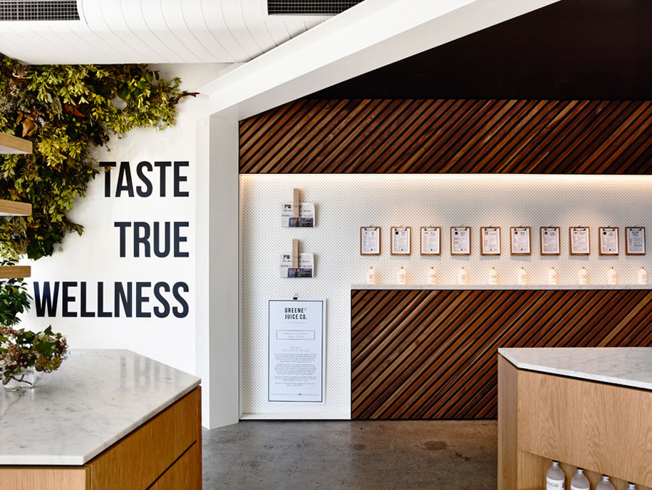
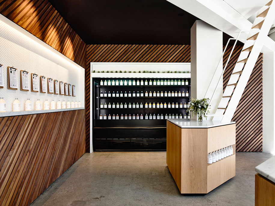
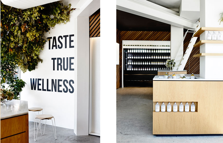
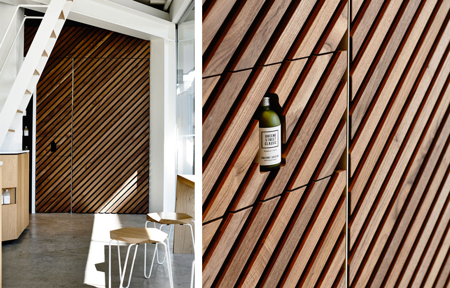
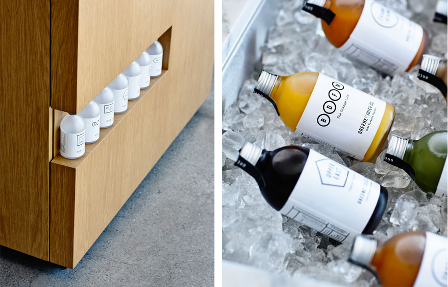
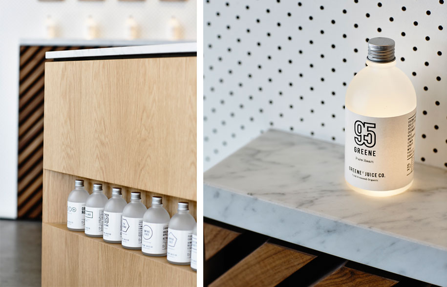
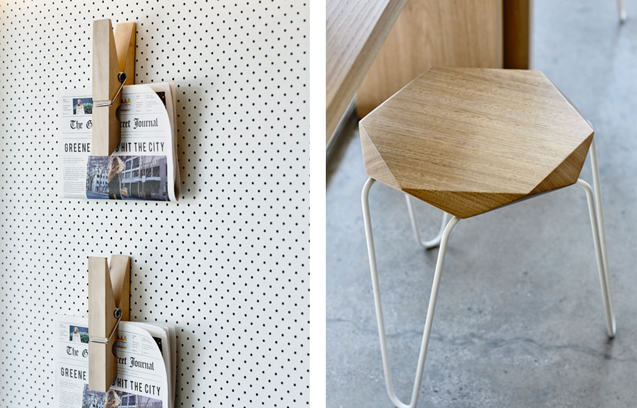
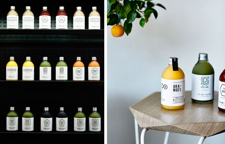
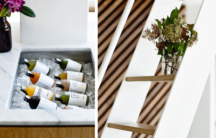
Strictly speaking it’s a store, but designer Travis Walton’s interior for Greene Street Juice Co in Prahran deserves special mention for its appropriately restrained and meticulous craftsmanship.
Inspired by its Manhattan origins (and organic products), the driving influences in designer Travis Walton’s interior include natural textures (like stone, walnut battens and planting) and a combination of geometric and directional forms in steel and timber which echo New York’s iconic bridges and fire escapes. Exposed services, a fully glazed shopfront and a concrete floor complete the urban aesthetic.
YARDSTICK COFFEE by ACRE
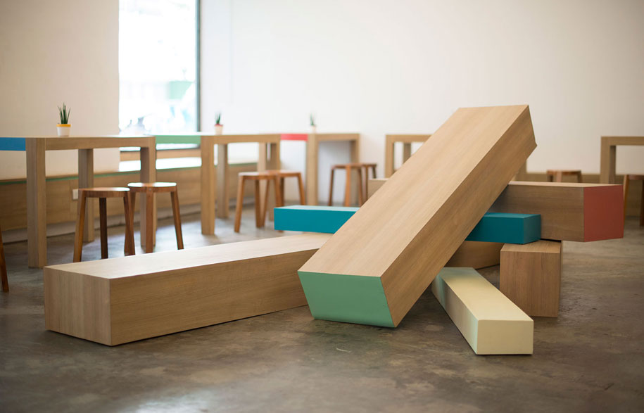
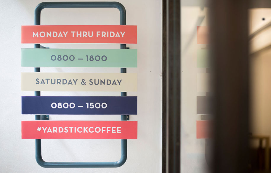
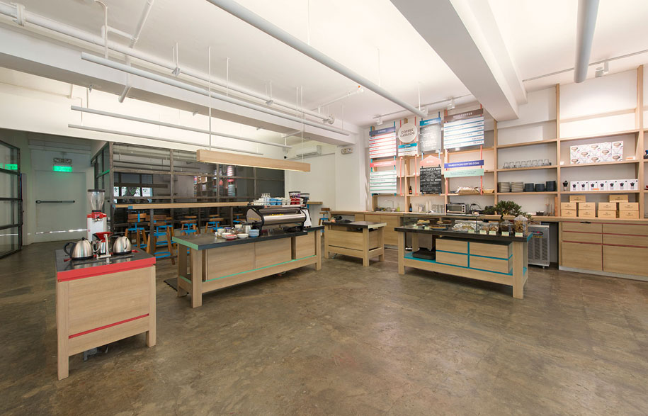
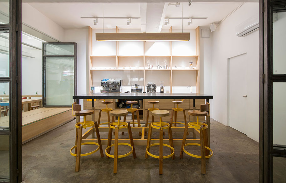
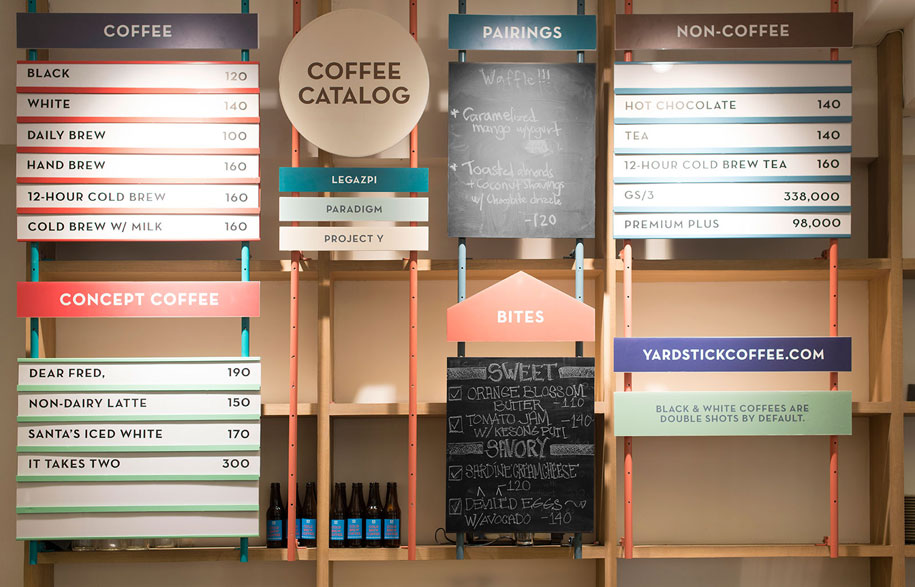
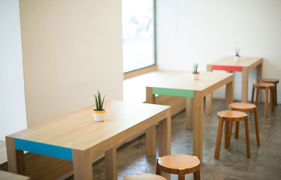
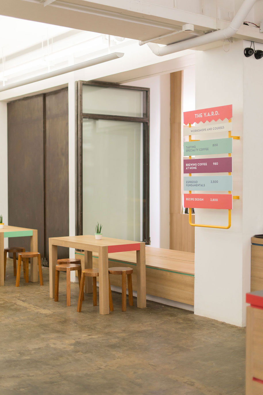
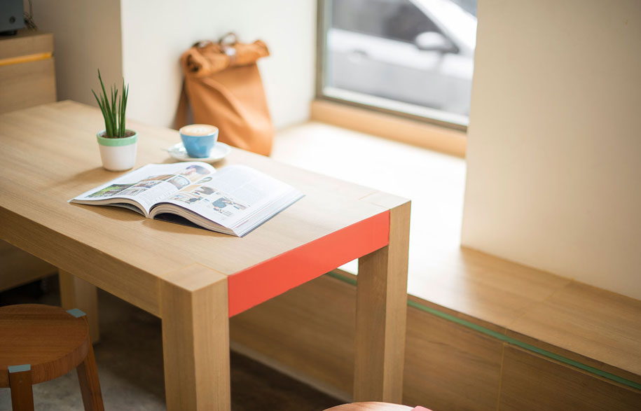
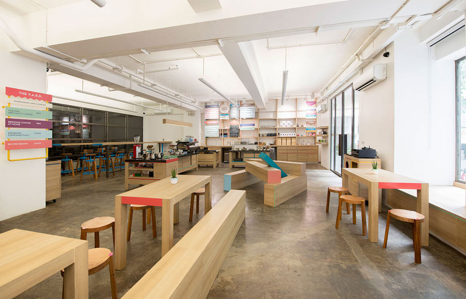
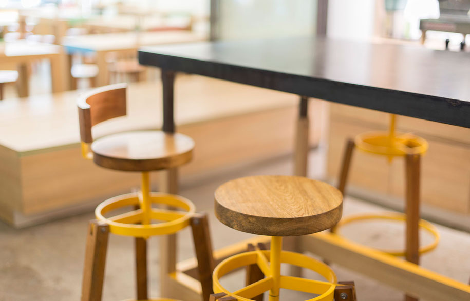
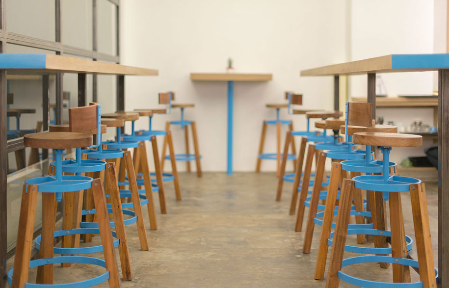
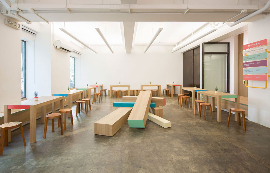
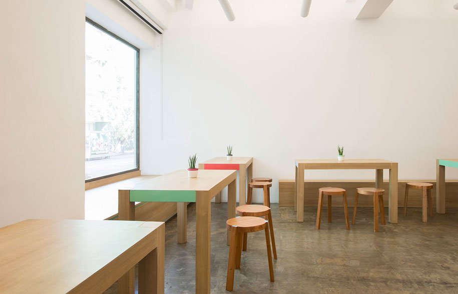
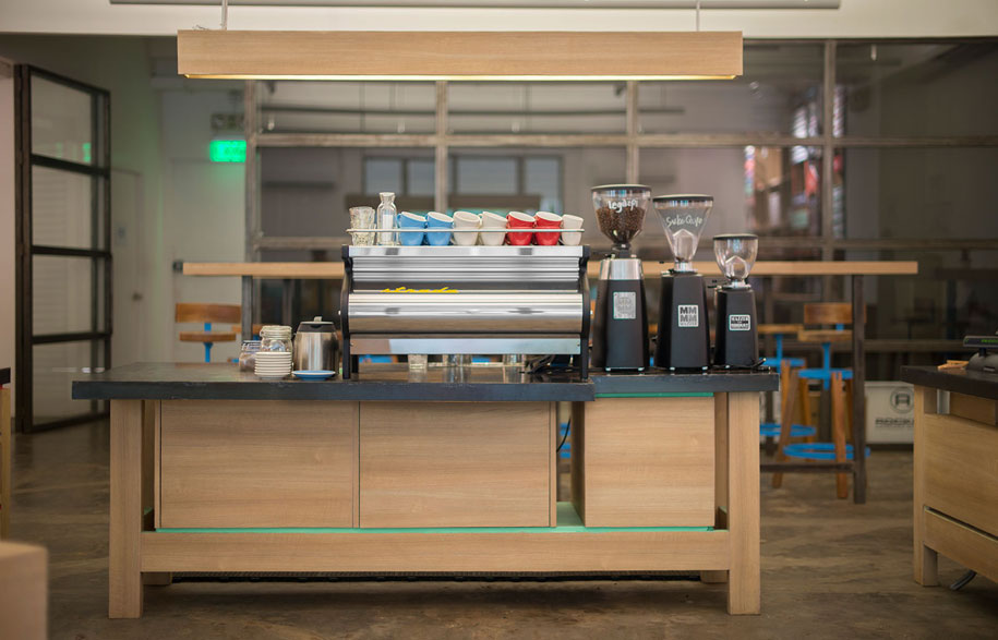
Yardstick is an “institution of coffee” located in Makati City, Philippines. Designed by self proclaimed “idea crafters”, Acre Studio, the space has been designed to increase the knowledge and spread of specialty coffee in the Philippines. The project is composed of three elements – a cafe, a coffee roastery and a coffee lab.
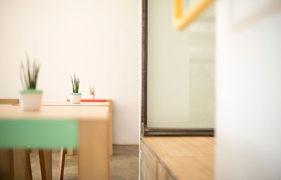
Despite their sparing use of colour, the space has the feel of a fun workshop, accented by a playful use of colours and juxtaposed against the use of diffused lights which have eliminated shadows, thereby creating an evenly lit canvas to communicate the idea of a“clean and honest space.”
Images via ACRE
L’AMERICANO ESPRESSO BAR by Alexander & CO
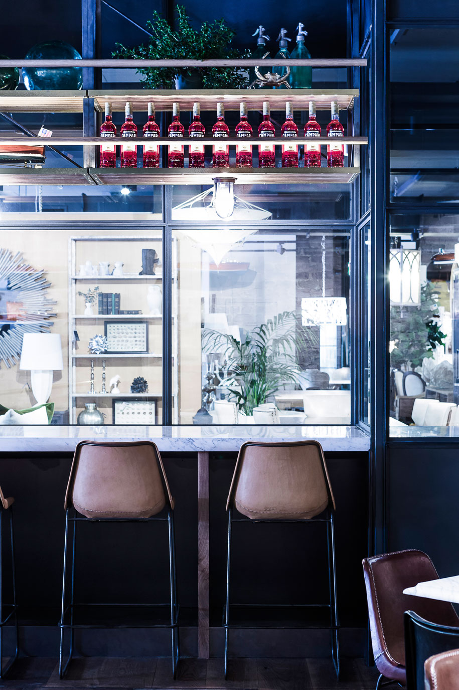
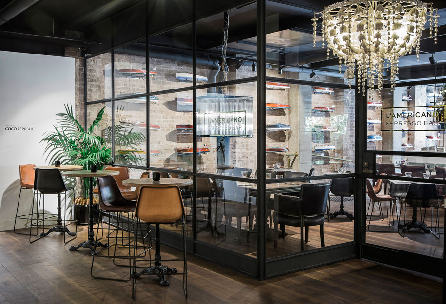
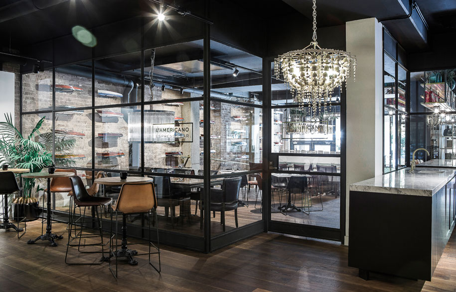
“An Italian American cafe meets Dicky Greenleaf from The Talented Mr Ripley,” says Jeremy Bull, principal of design studio Alexander & CO when describing furniture retailer Coco Republic’s brief for a new cafe located at the furniture retailer’s Sydney showroom.
“Coco Republic desired a look that was nautical, atmospheric and genuine,” he continues. “But it also had to feel luxe enough to support the Coco Republic brand with sympathy, but be a brand in its own right.”
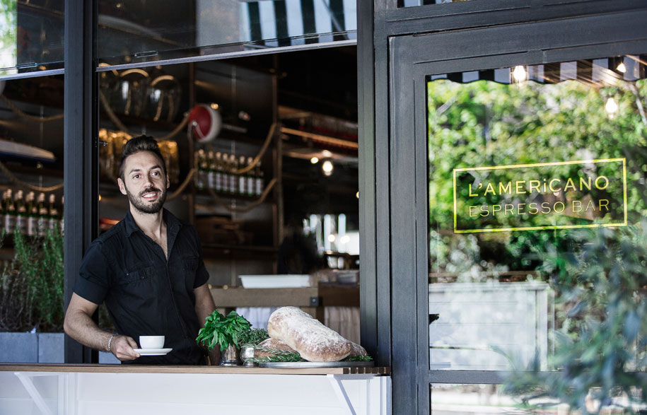
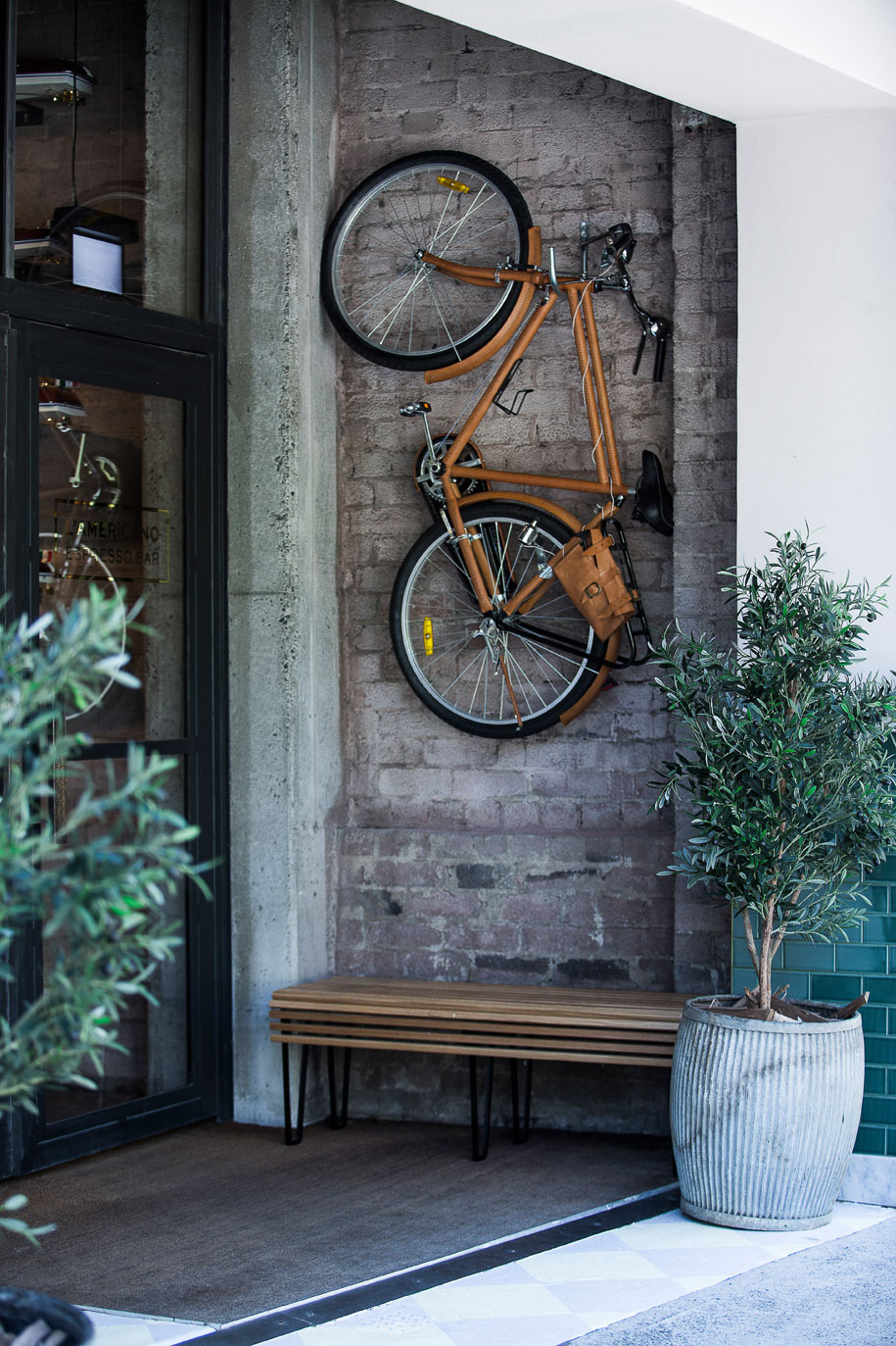
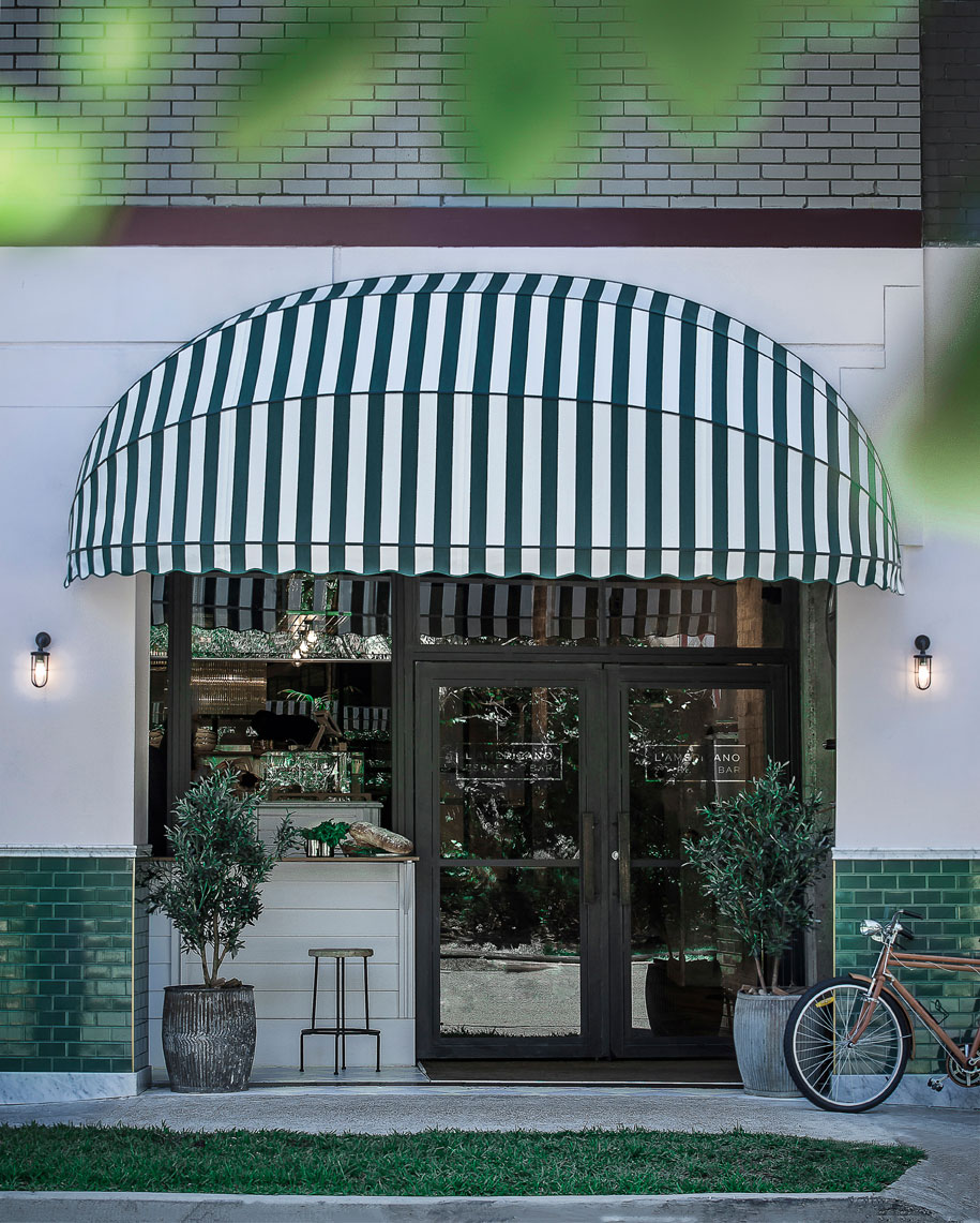
In response Bull has created an elegant interior that also integrates an element of the quirky. A green and white candy striped entrance canopy flanked by glossy green tiling opens up to the street via a European style hatch juxtaposed by raw brickwork, a vintage bicycle and gold leaf signage.
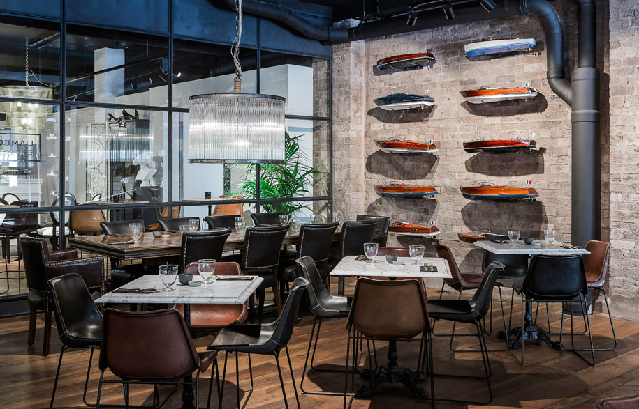
Inside, the American-meets-Italian aesthetic is expressed through hardy leather furniture, metal and timber handing racks, nautical rope detailing, painted weatherboard and herringbone flooring and a sandblasted masonry backdrop, accented with glamorous lighting, marble counter-tops, brass detailing and a gallery wall of miniature leisure boats.
Photography by Maree Homer
alexanderand.co
lamericano.com.au


