As your first project, how did the project affect your self-awareness as an architect? What have you learned about yourself and your approach to your work?
The project highlighted the layers of complexity associated with transforming a conceptual idea into a resolved architectural solution. Each stage of the design process brought a new set of challenges. I realised that, as an architect – the success of a project is substantially dictated by our ability to deconstruct problems and provide alternative solutions in order to achieve a level of resolution that we are happy with. This project has made me realise the significance optimism plays in the delivery of our craft.
How did having your father as the client affect the design process?
Having my father as the client helped to streamline the design process. We have a good understanding of the way each other think and operate. It can make the lines of communication relatively less complicated and time intensive, which allows for more time to be spent on the exploration of ideas.
Were there any unexpected opportunities or challenges during the design and construction phases?
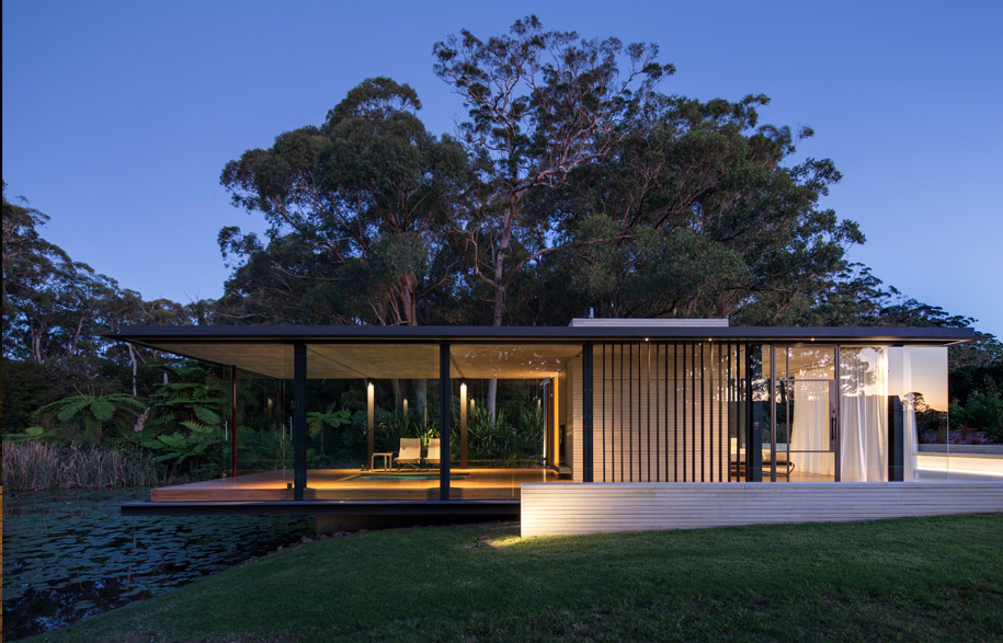
There were plenty of challenges to overcome when seeking approval for the project from the local council. One challenge was the fact that the building was being erected within a flood prone area. The local council made us raise the building twice during the process as the finished floor level was required to be at the 1 in 100 year flood level + 0.5m, even though the existing dam has two overflow spill ways during times of flood. This was frustrating from a design perspective, as conceptually we wanted the pavilion to float over the water so the user would feel like they were walking on water. The second time we were informed to raise the building, we left the steel floor fascias where they were and just raised the internal timber floating floor up to the required level to satisfy council requirements. That way the language of the building would still visually read at a level we were more comfortable with.
With Mies’ Fansworth House as inspiration, did you have any considerations on which elements would need to be adapted for the Australian context and the specific site?
The site of the Farnsworth House is very much a flat, horizontal plain landscape. The horizontality and simplicity of the house is pronounced due to it floating effortlessly above the landscape. The site for the Somersby pavilion is a sloping site towards a flat surface of water. From a conceptual approach, and visual perception – it was important to connect the building to the earth with a sandstone mass on the bank of the dam. This roots the building to the earth on the site before horizontally projecting and floating out over the flat surface of water.
With a very successful first project under your belt, what would you like to tackle next?
That is a good question… I think all projects bring with them a unique set of challenges, no matter what size or scale. I have currently been doing some master planning which is a completely different project but the thought processes and generation of ideas are conceptualised in the same manner. The challenges faced are unique, but what matters is how we deal with these challenges to progress and move towards the destination.
Matthew Woodward Architecture
matthewwoodward.com.au
Read the full story on Woodward’s Wirra Wirra Pavilion in Habitus Issue 23, on sale March 26
habitusliving.com/current-issue


