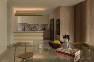
Butler’s pantries have undergone a revolution of sorts. Previously the domain of staff from which tea miraculously appeared, they are now a hidden extension of the kitchen proper taking the form of breakfast pantry, tea facility, scullery or additional bench space as per the unique requirements of the home owner.
The scullery for example, where the large open plan kitchen allows hosts to simultaneously cook and entertain, answers the need for a hidden space where the messy side of cooking can be hidden from view. Similarly, the breakfast pantry can be concealed as continuous cabinetry, but opened up to reveal a recessed nook containing toaster, kettle, cereal and coffee machine.
Conversely, the butler’s pantry can be as simple as a small benchtop, cupboards and sink, with the sole purpose of making cups of tea.
This series of five butler’s pantries show just how versatile and convenient this addition can be to the home.
River House by KA Studio


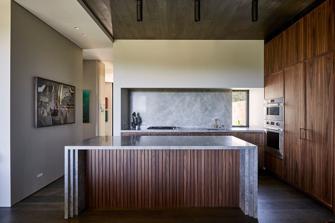
KA Design Studio’s River House is home to three luxurious kitchens. On the first level of descent into River House is a large, open-plan kitchen/living/dining area that flows – visually as well as spatially – seamlessly into a generous balcony and the landscape beyond.
Anchored by a monolithic marble island bench and backed by a working wall of dark timber cabinetry, this is just the first of River House’s three luxury kitchens. Designed to be seen and not soiled, its utility is neatly concealed behind the closed doors of dark timber Poliform joinery. Meanwhile its more pragmatic sibling – a scullery kitchen – resides adjacent.
Villa Carlo by Daniel Boddam


Villa Carlo by Daniel Boddam Studio is an exceptionally well-conceived home. From the material palette to the careful layout and intricate detailing, the effect is holistic and embracing. Here a small nook has been transformed into a beautifully detailed butler’s pantry whereby the palette and form is continuous to the home.
“Villa Carlo is holistically designed with architectural and interior details forming a consistent dialogue – the macro is in the micro,” explains Boddam.
Bona Vista by Studio Prineas


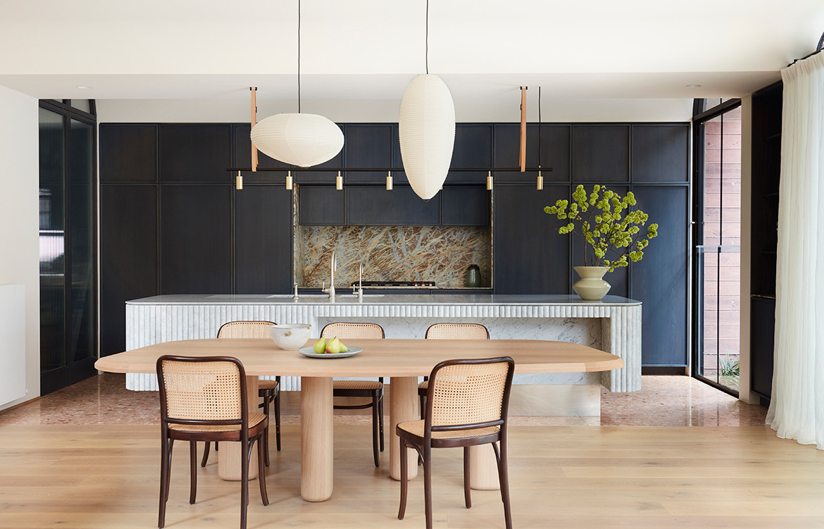
The kitchen created by Studio Prineas for Bona Vista presents an intimate centre stage for home life. Balancing a precise layering of materials and textures, marble and timber parquetry cultivate a calmness for those being hosted.
The strategic placement of storage and considered accessibility to appliances is extended into a side corridor that functions as a butler’s pantry and can be closed off from the main as needed.
House Jacoby by Lucy Clemenger Architect


Lucy Clemenger Architects’ gorgeous House Jacoby, gives the butler’s pantry a decidedly adult twist with a beautifully detailed ‘secret’ bar concealed within the living/dining room cabinetry. Housing a fridge, wine storage, liquor and glasses, there is also room enough for a keg and a back wall of bling! Bi-fold doors close to a seamless expanse.
Old Oaks by Carole Whiting


Carole Whiting’s kitchen for Old Oaks was the start of an extended relationship that eventually saw most of the house renovated by Whiting. For this space, the owner’s vision was to put the kitchen front and centre, so every family member felt included in the daily rituals of home life. Whiting’s design is an exemplar in terms of spatial clarity with clever solutions such as placing the V-ZUG ovens – an important feature of the kitchen and central to the family’s cooking rituals – on a side wall, close to the butler’s pantry.
Fitting with the clean-lined and minimal theme, Whiting freed up some essential overhead space by selecting V-ZUG’s “sleek and discreet” down draft extractors. In doing so she has been able to bring natural light into the pantry through a glass panel inserted above the cooktop area.


