Ice cream has a special place in everyone’s life and now this cold sweet treat has an exciting new, purpose-designed home that pleases the eye while satisfying the cold treat cravings. Designed by the exemplary, and aptly named, Architects EAT, Kōri Ice Cream is certainly making a name for itself for excellent ice cream and stunning interior design.
Located in Hawthorn on busy Glenferrie Road, queues have been known to form just to taste the delicious and unusual Japanese-inspired flavours of ice cream, but it’s upon arrival at the shop that the experience really begins. The outside hints at what is inside, the heritage façade is painted white with a large terracotta/red (Dulux, Retro Disco) stripe on the side.
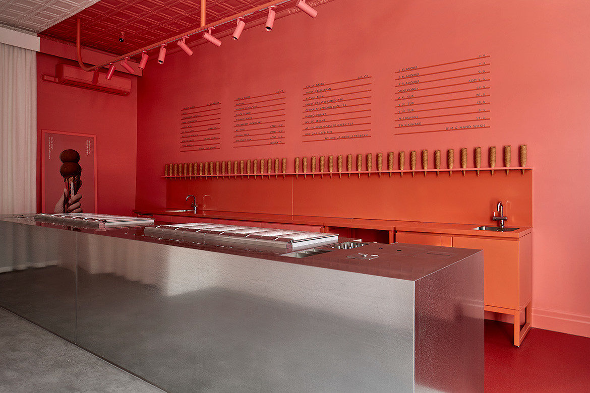
But enter Kōri Ice Cream and arrive in another world. Think terracotta and red saturated colours and the lightest of grey vinyl floor with accents of white on the ceiling and walls and a stainless-steel façade on the counter. It’s simple and it’s simply divine with empty cones standing all in a row, just waiting to be filled, used as decoration on the wall behind the counter.

As usual, Architects EAT, with co-director and lead on the project, Eid Goh, has created an experiential retail concept that has been expertly realised. Rectangular windows at the front provide natural light and allow passers-by to view the interior, while patrons can take a stool and peer out. White curtaining hangs at the rear of the space and is reflected in the stainless-steel counter to resemble a glacier at sea.
A strip of terracotta-coloured spotlights on the ceiling above the counter showcases the multiple inset tubs of ice cream below and the transparent glass covers invite patrons to compare the colours and textures that are encased. Artwork of a cone with a double header stands against the wall at the front and helps to entice.
Goh explains, “Kōri Ice Cream is a new business, and their first store needed a fit-out that was strong enough to create an identity for the brand not only on the competitive Glenferrie Road but in the already saturated ice cream market. We poured our attention into translating their core brand ideas and beliefs into a physical space that was unique to them. For Kōri, this was about traditional Japanese hospitality with a modern twist.”

This is a bold and exciting interior. With strong colours and complements of white perfectly placed, the interior is spacious and warm for one or a crowd. The menu of flavours is discreet, on the wall behind the counter with brass letters against the terracotta, but in reality, it’s so much better to choose a colour, think about the flavour and just order.
Goh says, “The hero of the space is the island bench made from galvanised steel sheeting. This meticulously planned piece of joinery, inspired by an upturned fridge, houses all the equipment, ice cream, cutlery and point-of-sale electronics the staff need to serve a customer. It means that staff never have to turn their back on a customer. Reinforced by the elimination of typical perspex screens, the design of the island bench reinforces the brand values of Japanese hospitality.”

And talking of the product, it’s as individual as the interior design, with 24 flavours of ice cream and sorbets that include fuji apple, miso, black sesame, matcha pistachio and strawberry shortcake, along with eight vegan options.
Architects EAT has demonstrated that it has again hit the mark for originality and ingenuity with a design that captures the essence of a brand to create an experience. While eating the ice cream is at the top of the list for many people, just visiting Kōri Ice Cream will satisfy even the most discerning of design tastebuds.


Project details
Architecture and interiors – Architects EAT
Photography – Shannon McGrath
We think you might like the QT Hotel in Newcastle


