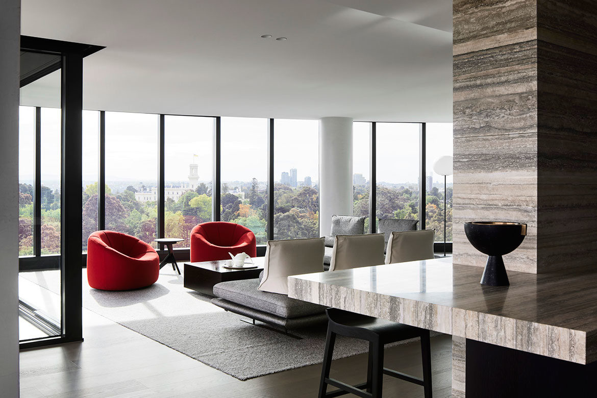
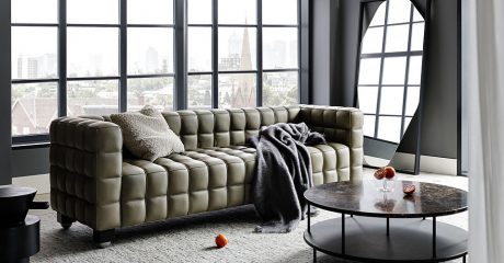
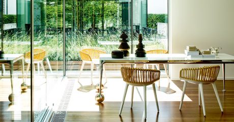
Responding to their clients’ collection of Australian art, the material finishes for this Melbourne apartment are breathtaking. As is the view, which formed a primary focus for Studio Tate’s reworking of what was two small apartments into a large and comfortable contemporary home.
Spatial planning has significantly changed the apartment layout to better suit the couple’s lifestyle. Moreover, sightlines to Melbourne’s Royal Botanic Gardens have been instated with rooms both removed and repositioned.
“Our planning directly responds to the clients’ living practices and allows the home’s 340-degree views of the city, gardens, sky and bay to be appreciated at every opportunity,” says Liz Ride, Associate Designer at Studio Tate. A partition wall formerly separating the two apartments, for example, has been replaced with glass to further invite the view into the home.

Entertainment has been a key consideration in the remodelling with a walk-in robe converted to a Butler’s pantry: “The kitchen and pantry are carefully arranged to suit the client’s needs and have had a dramatic impact on their day-to-day lives,” says Ride.
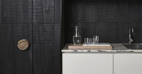
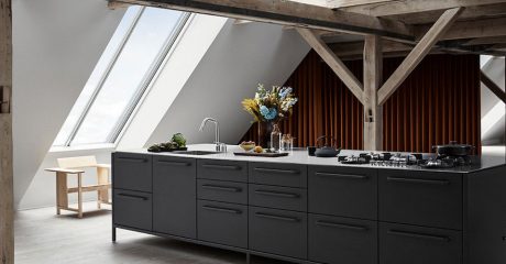
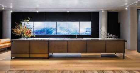
Indeed, the kitchen is extraordinary. Here, vein-cut Ocean Travertine (Signorino) has been used extensively to effectively represent the Australian landscape and “tell the story of the material’s formation in the earth” says Ride. Large expanses of blackened cabinetry (Oak veneer, Japanese black) both frame and balance the travertine, while ensuring a plethora of storage options. This combination of travertine and black timber cabinetry is used throughout the home to excellent effect being both sparse and dynamic.
It is in fact an exceedingly clever combination with material departures presenting as discreet features. The combination of strong strawberry (Dulux) and red veined travertine in the newly created office, for example, is gorgeously warm and inviting, while the bar in gold veined Port Laurent marble (Signorino) is exceedingly opulent. Countering the bar, the Port Laurent marble has been used as an inset shelf in the hallway to display Danielle Segal ceramics. It is a delightful and beautiful use for this marble which is transformative when used well, as it is here.

In keeping with the clients as collectors, the furniture is limited to a few select pieces. That said, it needs to be acknowledged that there is nothing of the ubiquitous roll call of iconics. Rather, these are curated beauties that are well suited to the space.
Pierre Paulin pumpkin chairs in red and white are paired with Prado lounges (both by Ligne Roset, from Domo), a Mode coffee table (Momu) and the angular delight that is Konstantin Grcic’s MC4 Medici side table (Mattiazzi, District). A Flos Glo ball lamp from Euroluce is countered by a pair of Lee Broom’s Orion Globe/Tube pendants, with track lighting in matte black used sparingly.
Studio Tate is an interior architecture practice of designers and thinkers, committed to intelligent and responsible design: “We take a creative, collaborative and pragmatic approach to interior architecture that delicately balances craftsmanship with functionality, using a highly-considered methodology and a refined, polished finish that manifests in inspiring, deliberately resolved outcomes,” says Ride.


Project details
Interior design – Studio Tate
Photography – Sharyn Cairns
We think you might like this apartment in Singapore by Pupil Office with custom-made furniture throughout.


