Once the byword for passé, the arch has returned to favour with force. Indeed, the cheeky epitome of seventies chic is now championed on a grand scale with both renovations and new builds opting for the arch. Iterations range from the curving sensuality of freeform to symmetrical repetitions that follow the golden ratio 1:1.618, that magical ratio that exists in all nature from the human form to the galaxy itself.
Dating back to the second millennium BC with Mesopotamian brick architecture, the arch really got underway in ancient Rome, where architects started applying the technique across multiple building styles.
Simultaneously developed across Europe, the UK, Asia, Africa and Mexico (in 2010 an arched passage was discovered below the Pyramid of Quetzalcoatl in Mexico City), the arch form gained variations from the basic semicircle to include a lancet, shouldered, trefoil, horseshoe, inflexed and more. Religious buildings were a prime beneficiary, as are bridges which define our cities with magnificent arches from Sydney’s Harbour Bridge to the magnificent Juscelino Kubitschek Bridge of Brazil.
Here we have a selection of residences, bars and hotels that have made the arch the centrepiece.
Nic Brunsdon‘s North Perth House is curvaceous

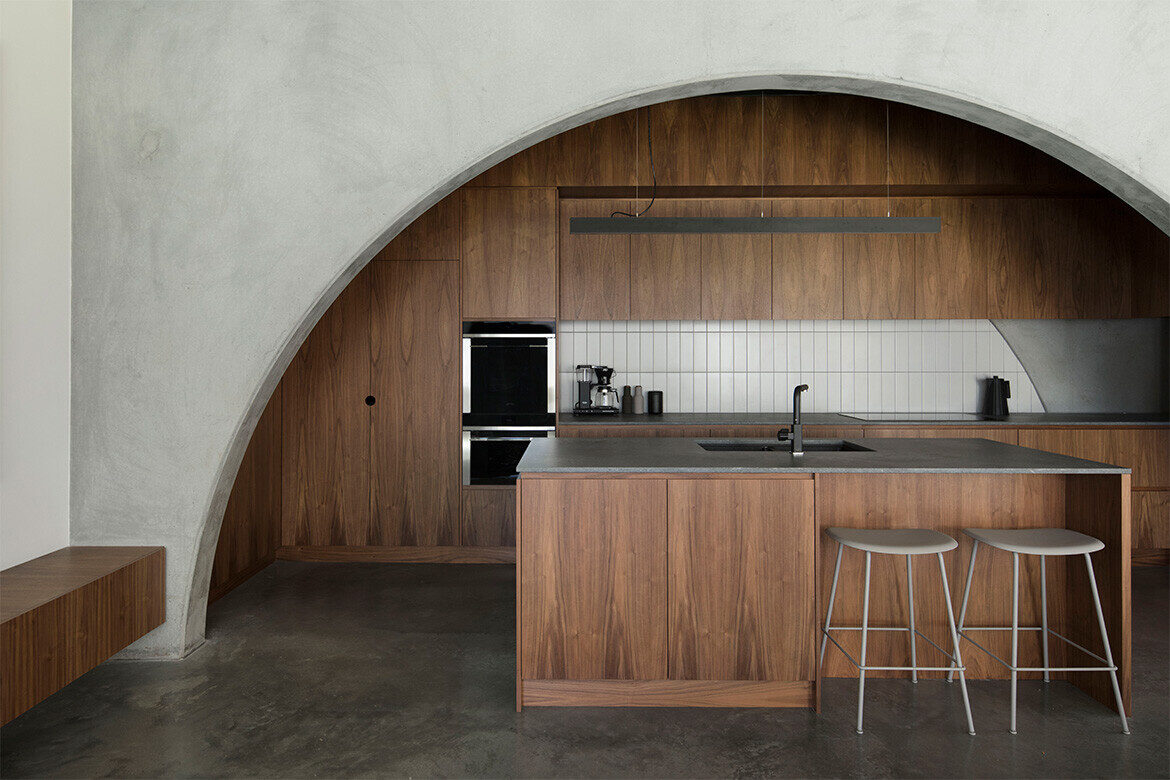
A defining factor of the design response for North Perth House was the project’s materiality. “They [the clients] were set on a concrete house,” says the architect Nic Brunsdon. While initial investigations revealed that an in-situ concrete build would cost above and beyond what the budget could afford, a suitably economic solution presented itself in the form of precast concrete panels — provided a restricted type and number of them were featured in the design.
Each panel is punctuated with one of two types of arch: a grand arch, and a pedestrian arch. The grand arch is provided for the more significant gestures in the house, such as the prospect from the kitchen; the gallery window; and the bookshelf on the first-floor landing, to name a few. On a more perfunctory note, the pedestrian arch acts as a silent guide for both the line of sight and the flow of movement throughout the internal volumes of the house.
Bridge House is defined by an arching façade

In designing the Bridge House, which marries the historical roots of the 70s house with a contemporary extension, Kister Architects has brought to life a modernist triumph.
Kister’s inventive streak, is clearly realised in the way she has manipulated the seventies genre. The arches, which were fairly minimal in the original house, for example, have been repeated to form a colonnade, with angles exaggerated and manipulated to provide privacy on one hand and maximum dialogue with the landscape on the other: “The glazed bridge and separated retreat, sunken living room and glazed dining area breaks the home into spaces that address the many varied aspects of the landscape,” says Kister.
This Vietnamese townhouse uses arches throughout


Tropical Townhouse, designed by Đất Thu Design & Construction, is situated in Thủ Dầu Một City in the Bình Dấng province of Vietnam. It was crafted for a young family looking for a quality home where they could make the quotidian special.
This is a home of moments framed by arches, which aesthetically add an elemental grandeur. On the exterior the arches frame the residents as they gaze over their balcony, while internally arches are set into the concrete and vary tonally from the rest of the walls, elevating moments from day-to-day.
On upper floors, arched doorways lead to mezzanines, interior walkways and stairways that frame the atrium. Dappled light from petite square and circular wall details enlivens these interstitial spaces, where the journey is as important as the destination.
Historical arches worth celebrating in Italy


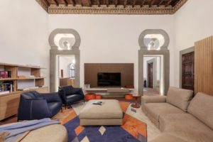
Apartment living in a fifteenth-century palazzo in Florence is an extraordinary proposition, made more so by being in the super cool district of Borgo San Frediano.
Revelling in the charm of generous interiors, local materials, ornate frescoed ceilings, this apartment is all about the identity and eclecticism of this location.
With heritage so ingrained in the apartment, artisanal woodworkers of the region were tasked to create beautifully detailed woodwork for doors, walls and detailing.
A large central living area is open plan with kitchen, dining and living rooms flowing seamlessly, but distinctly arranged within large arched openings. The huge golden Skygarden domed pendant (Marcel Wanders, Flos) over the oval Saarinen Tulip dining table and Warren Plantner chairs (Knoll), echoes the arch perfectly.
Free-formed arches set into the wall make this apartment feel organic


Contemplative ryokan vibes and natural elements come together in this anything-but-ordinary apartment in Singapore.
Japanese hospitality comes to mind in this home that resembles a ryokan, or a traditional Japanese guesthouse. The homeowners, a young couple, didn’t just want a home of the usual amenities, but a space filled with zen that would signify their love for Japanese culture, while having an artful connection to the outdoors.
Drawing inspiration from naturally formed crevices, Amanda Pang of AMP Design Co designed grotto-shaped niches in the living area that serve as open shelves for the couple’s keepsakes, as well as their very own paintings and craftworks.
Echoing the curvature of the niches is a raised platform and this low-lying resting spot houses hidden storage, floor chairs and a mini pebble rock garden for that relaxed Japanese zen quality.
In the communal spaces, an archway has been paired with other contoured details like overhead shelving laser-cut in a curved design. Layered across the wall, these cantilevered shelves form part of the settee area.
A motel with a retro vibe

Coastal cool gets kicked up a notch at this beachside motel, where a mid-century vibe is met with Australiana.
Once the roadside pitstop of late-night travellers, the 1970s-built Abel Tasman Motel at Batemans Bay on NSW’s south coast, was quaint but hardly a destination accommodation. Conversely Batemans Bay is the idyllic stuff our dreams are made of with national parks, snorkelling, fishing and pristine beaches.
The Isla Motel effectively gets the pairing right with a design by Those Architects that nods to the motels’ seventies origins while giving the spaces a contemporary and comfortable refresh. “The ambition with Isla was to create a destination, worthy of its beachside address,” says Ben Mitchell, Director of Those Architects
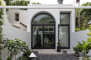
Externally the illusion of symmetry has been brought to the building through additional arches in ochre steel that create a frame within the window voids of the upper level and entry points on the lower. Effectively mimicking the smaller window arches, these two-storey arches in deep burnt orange are wholly fabulous.
Surrounding the arches, the brick façade has been painted white with walls of concrete breeze blocks added along ground-floor walkways. The combined changes of breezeblock and arches, shift the building’s weight from horizontal to vertical in a move that makes it far lighter and contemporary.
Glamour writ large


The tapas-style menu of Bar Lucia is short, while the wine list is long. Moreover, the wine list is predominantly of female wine makers at the forefront of the wine industry.
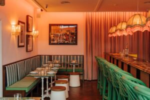
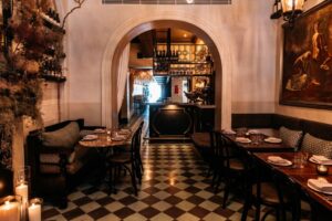
Setting the scene of Bar Lucia in Potts Point is a Madrid-style experience of warm hues, soft lighting and elegant proportions. For designer Imogen Reed, the principal of her relatively young practice IJR Studio, the space needed to be “moody, even a little ghostly or ethereal, without being oppressive”.
Moreover, she was tasked with working with the legacy of a previous iteration, where as much as possible would be reused or repurposed.
To this end, the lighting was addressed immediately with much of the existing lighting decommissioned and re-specified in preference of a low and very large chandelier. Coupled with the checkerboard flooring, soft dado line and a large arched entryway, the bones were set to deliver a layered and textural interior: “I wanted to cultivate a sophisticated warmth that capitalised on the character of the building, and in so doing give Bar Lucia a distinctive personality of her own,” says Reed.
Occupying the ground floor of a grand Victorian Terrace on Kellett Street, the tones are on the warm side of buff to give a pinkish glow to the interior. Reed has been at pains to make her references to Spain oblique with mood carrying the suggestion rather than motifs.


