At Habitus, we often liken bathroom spaces to places of nourishment – on both a physical and emotional level. They serve some of our most primal needs, but it has been in more recent times that, as a society, we’ve cottoned on to just how enjoyable these spaces can be.
Straight from the pages of Habitus #48, our 2020 kitchen and bathroom special edition, these five contemporary bathroom designs, dotted across the Indo-Pacific Region, are each in their own right the very definition of a domestic inner sanctuary, tending to their residents’ needs physically, emotionally and esoterically.
Indooroopilly House, Owen Architecture

 Words by Sandra Tan | Photography by Toby Scott
Developed by Brisbane-based Owen Architecture in collaboration with Lineburg Wang, Indooroopilly House is designed in sync with its surroundings.
Inside, a strategy of gradual split-levels creates a sequence of platforms emulating the sloping site, which falls away toward Brisbane River. This internal topography is defined by angular custom joinery and a robust material palette of concrete and marble, accented by timber. The effect is confidently minimal, with a bold weight.
“We believe not every finish should be ‘beautiful’,” says architect Paul Owen. “Spaces should feel they have a permanence to them.”
Entering through a walk-in robe in the main bedroom, the linear ensuite also employs a‘micro’ split level. To the left, a discreet shower drain runoff. To the right, the bathroom floor steps down to form a tiled marble tub, entirely open to the bedroom and densely treed view beyond. This unexpected spatial detail of a raised, skylit masonry bath evokes the feeling of a cave, or eroded cliffside opening.
“There’s a particular type of condition we’re trying to create, of being enclosed but also having an outlook,” explains Paul. “It’s the opposite of open plan, and more about editing or curating the space that you’re in.”
RSB House Bathroom, Davidov Architects


 Words by Holly Cunneen | Photography by Jack Lovell
Longevity was core to the brief Davidov Architects received from their clients for the wet rooms of RSB House. A couple with young children, they also wanted a return to the family bathroom. “This room is intended to be used by all the children for the time being until they are old enough to graduate to their ensuites,” says architect Robert Davidov.
The highly functional design of the bathroom lends itself an almost civic feel, with an entirely intentional feeling of robustness and utilitarianism. Examples include the shower zone’s tiled niche – “to house a household’s supply of soap and shampoo” – and the extended hob at the end of the bathtub for parents to sit while bathing children; for children drying while their siblings finish up; or simply to sit and keep company.
Orange ceramic square tiles extend from the floors to the wall accompanied by venetian blinds and wall-mounted lights. Through the large north-west-facing window light streams in. Cleverly, the partition walls are tall enough to offer privacy while allowing light to traverse the demarcated zones. Together, these design cues delight the younger occupants while simultaneously offering a subtle nod to the building’s 1970s origins.
This sensitive homage plays out through the rest of the renovation, ensuring the bathroom is connected to the house as the young family moves through the complementary spaces.
Tiled Bathroom, Katie Lockhart Studio


 Words by Vicki Wilson | Photography by Neeve Woodward
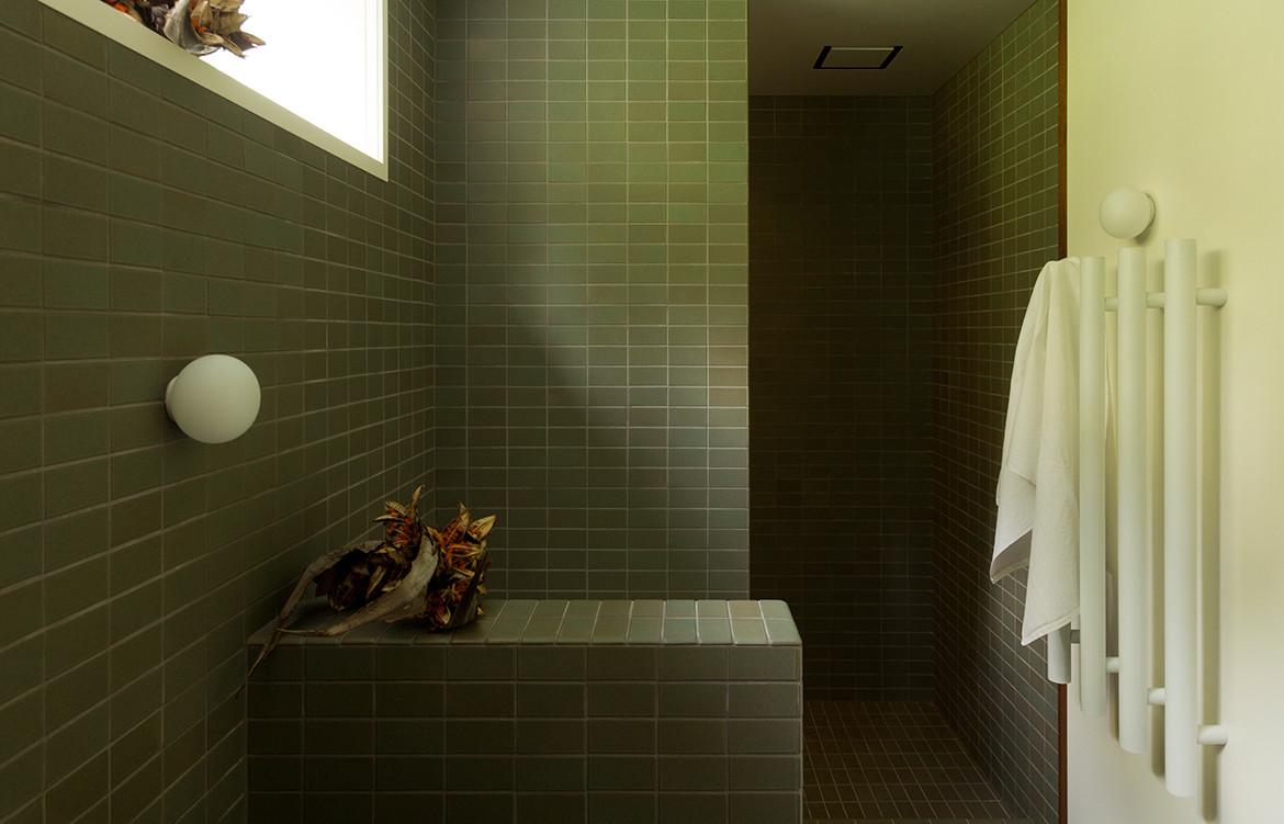
A bathroom space should evoke a sense of tranquillity and calm. This is true at least from the perspective of New Zealand-based interior designer Katie Lockhart. “I like to be able to relax in a bathroom,” says Katie, sharing an inclination with which most can surely relate. “Good natural light and a simple palette of materials contribute to this overall feel.”
Channelling a mid-century affinity with the mosaic tiles and the material simplicity of Japanese washrooms, Tiled Bathroom by Katie Lockhart Studio offers a tranquil place of respite for the bustling family residence that revolves around it.
At the crux of this bathroom design is the tile that covers almost every surface. “Once we had decided on using this particular tile by Heath Ceramics,” – the soothing hue of which is Soapstone – “the challenge was in planning the tile placements to make use of the bullnose edge tiles,” says Katie.
The painstaking intricacies of planning have evidently paid off, with the end result being a bathroom space permeated by a formidable sense of instant zen.
Venus House, Ming Architects


 Words by Luo Jingmei | Photography by Studio Periphery
With just frontal and rear faces, terrace houses are notorious for their dearth of natural illumination. But not this abode by MingArchitects. The Singaporean studio carved an atrium in the plan’s centre, bestowing interiors with not just good light but a deeper connection with the weather’s natural rhythms. The house is designed for a multi-generational family and hence considers a balance of private and common spaces. The master bedroom rules the roost, with the bolde nsuite privy to this light and sky view that caps the atrium through ample glazing.
The freestanding bathtub’s curves are put on display through this glass wall like a sculpture. The tranquil vista of pale blue skies and shifting clouds above is a boon when one is soaking away the day’s stresses. When the privacy blinds are drawn up, the bathroom converses with the lofty bedroom across the atrium and the through views enhances the house’s porosity.
Light is a dominant concept, with the alabaster, marble-inspired homogenous floor and wall tiles selected to bounce light off their surfaces. Behind the bathtub, a dark granite counter and matching joinery contrasts in tone. Yet, designed as an elevated volume, this element evokes a sense of lightness. Custom-designed teak timber and spray painted steel plate lights border the mirrors, their unfussiness accentuating the bathroom’s elegance. Tucked behind opaque walls, the shower and toilet cubicles give added privacy and visual neatness.
Imperfect Residence Bathroom, NC Design & Architecture


 Words by Tamsin Bradshaw | Photography by Harold De Puymorin
At Imperfect Residence, the bathroom sits like a beacon of light at the end of a dark corridor. It’s the pinnacle in a “series of meditative moments,” says Nelson Chow, founder and principal of Hong Kong-based design firm NC Design & Architecture (NCDA), the design firm behind this home – and it brings a new level of meaning to the idea of the bathroom as sanctuary.
Here, bathing and grooming are a reverential experience; no wonder NCDA called this space ‘the Altar.’ Setting the tone is a round of marble, inlaid on the floor in front of the basin. “When you wash your hands here there’s a sense of ritual and purification. You’re preparing yourself to do certain things,” says Nelson.
The same veined, green marble finds its way onto the basin’s splashback and the column separating the bathing space from the basin area, creating balance without the need for perfect symmetry. Other materials also repeat across floors, walls, ceilings and other surfaces: plaster, Caesarstone that resembles concrete and oxidised metal.
“We used the same materials in different ways to create a variety of layers and depths,” says Nelson. “By keeping our colour palette really simple, you get to see how the light changes the textures of the materials, and the environment.”
This is a space that revels in the integrity of materials, in their imperfections, and in the harmony that comes from asymmetry and contrast. It’s wabi-sabi made modern, and the result is sculptural and serene.
We think you might also like these carefully curated Australian bathroom designs


