“When our clients initially came to us, they were so excited about moving from suburbia to the inner city,” says Melissa Lim, principal at Mitsuori Architects. “It was the same excitement you see when someone sets themselves on a path to a tree change – it is liberating. We loved that they were intending to create a family home on this tiny block and how committed they were to creating an unconventional home that didn’t tick boxes, but was just right for them.”

Analysing Tree Change House is an exercise in grasping just how expertly Mitsuori Architects has conceptualised and crafted space and light in a modest Victorian terrace house, within exceptionally challenging planning and spatial parameters.
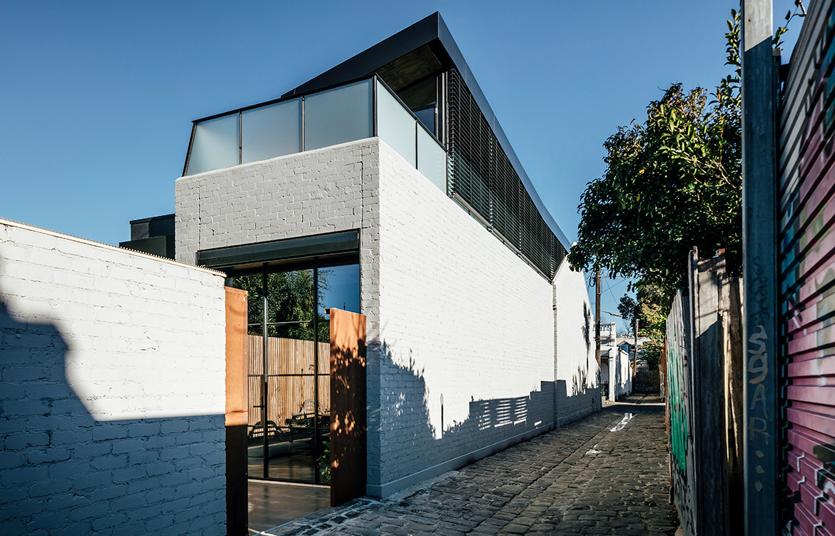
Given that the original house was sited on a mere 4.2 metre-wide corner parcel meant that an additional level had to be added to the building to accommodate the new spaces required. In addition, the proximity of the neighbouring properties precluded the addition of windows to either side of the building at ground floor level. The team’s solution was to bring light in from the top of the house.

“Our approach to the design of spaces (especially very small spaces) is to influence the perception and experience of spaces by manipulating light and views. In a sense, spaces are visually enlarged by ‘borrowing’ from other spaces as daylight and volume became extremely valuable,” says Melissa. “The result is a necessarily sculptural building form that is legible from inside and out.”
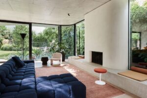
The architects’ resolution includes a soaring six-metre-high void over the main living space, which brings north light into the centre of the home and allows extended views through both floors of the house. In the deepest part of the home, a sky-lit shaft is positioned over the bath to bring light and contrast to the ensuite, also drawing natural light into an attic bedroom above. At first floor level, a bridge with views across the skyline crosses the void below and links bedrooms with a small outdoor terrace. “The interlocking of spaces and sharing of views makes this home feel larger and more open than it actually is,” adds Melissa.

From a planning perspective, the layout comprises a number of “zones”. “Zoning is particularly important for a family home as occupants need opportunities to come together but also to retreat to their private spaces,” explains Melissa. As a result, the house has two separate points of entry, the existing front door and a gate through to the rear yard.
A master bedroom and ensuite are located in the existing rooms of the house. Behind this, a stair, study nook and utility areas separate the bedroom from the main living space. The stair sits discreetly off the main corridor and splits in two with one flight leading to an attic bedroom tucked between the ceiling of the main bedroom and the existing roofline. This room was cleverly transformed from a constrained space into a studio bedroom by placing the ‘bed’ on a raised platform over the existing bedroom. The other stair flight leads to a third bedroom, a bathroom and a bridge to the outdoor terrace.

Industrial in nature, the approach to interiors was driven largely by the clients’ perception of Fitzroy as a vibrant and edgy retail precinct. “The restrained palette of dark grey paint, stained plywood, steel and glass are reminiscent of Fitzroy’s industrial heritage,” says Melissa. “In addition, the original house had very few original features left. Chimneys had been removed, brick walls were painted out and wood panelling covered almost everything!” The team stripped back the painted brick walls to reveal the natural color and texture of the original brick and in referencing the client’s connections to the timber industry, reclaimed timber was used in the structure, cladding and joinery.

“This house was one of those projects that began with us wondering if it would even work,” concludes Melissa. “We had never heard of a family with two adult children moving from spacious suburbia to a compact inner-city terrace.” Reverse Tree Change House serves as proof that a house that prioritises the ergonomic and pragmatic needs of occupants over architectural form, still has the potential to be both extremely functional and aesthetically arresting.
Mitsuori Architects
mitsuori.com
Photography courtesy the architect
We think you might like this Portsea project by Mistuori Architects


