As the owners of The Lune Co. were finishing their South Brisbane croissanterie below the Standard, the space opposite was unoccupied, sparking the question “Why not us?”
Briefed on three tenets of comfort, conscience and community, the space has been orchestrated to accommodate a range of patrons from small groups to solo and couples. Working around two support columns and a 50 square metre space that is effectively a corridor, Hogg & Lamb has effectively extrapolated the intimacy to suit the space. Rather than block it out with booths, the designers have overtly expressed the length.
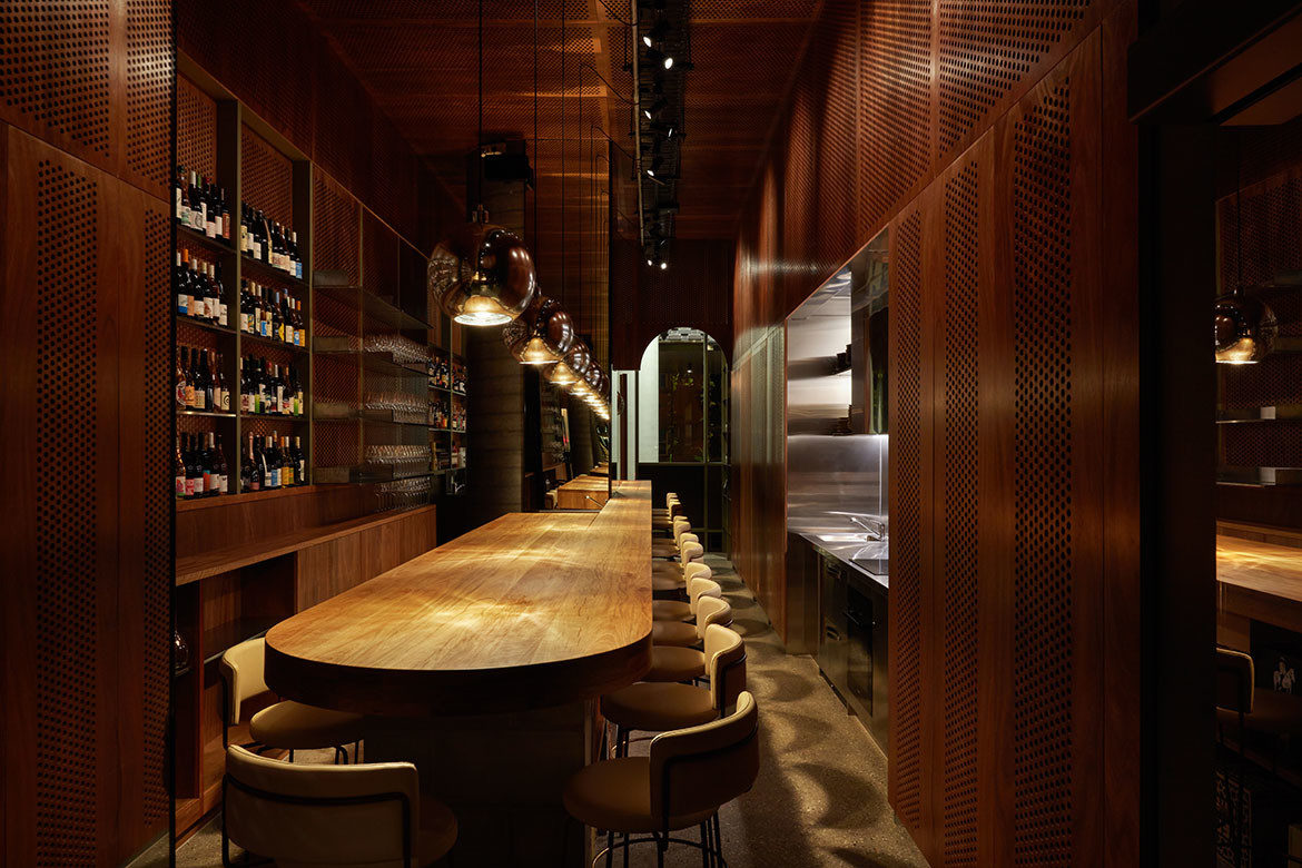
To this end, the main bar stretches the entire length with 15 bar stools dotted along the expanse. At the rear two tables for four are available by reservation, but generally, the mood is relaxed with food and drinks served with pristine precision and care.

It is an elegant juxtaposition that understands the style of dining the patrons desire. Moreover, the staff are charmingly friendly with an inbuilt trigger for recognising the level of engagement appropriate to the individual.
The interior too is keyed to the contemporary dining and drinking experience with a Melbourne aesthetic altered to Brisbane weather. Cleverly calling on Japanese influences where winters are polar and summers are tropical, the designers have created a space where air travels freely throughout, and night time nooks or al fresco options can be found. The spatial arrangement is additionally influenced by Japanese izakaya-style dining with part of the kitchen coming into the space and the bar staff working in the same space as diners.
The palette is dark and moody with the predominant olive and timber countered by the light polished floor and bling of lighting. The large timber bar/dining table has a good heft to its presence. Topping a solid wall of concrete blocks, the bar is constructed as a very large piece of furniture that effectively defines the dining space as both intimate and communal.

It is a fine line to balance and Hogg & Lamb have pulled it off well by pairing the table with largish stools. These are not designed to cram people in, but rather to give each person a sense of their own space. Comfortable, lightly toned caramel beige leather with brass detailing, the stools have a familiar gravitas and occupy the space with the same weight as the table. Lighting is similarly thoughtful with a series of round chrome pendants running the length of the bar without defining dining groups. The very back wall of Butler is mirrored and these lights continue to be reflected as the place fills, perpetuating the illusion of space with both beauty and charm.
Darkly stained perforated ply has been used extensively throughout. Used as walls and dividing elements, the perforations are large and centrally placed to each sheet.
As such, the borders of unperforated ply become a detail within the arrangement of sheets. This has been highlighted with pairings of perforated ply with unperforated ply that has been cut with a circular motif to create vertical space around transition zones. In other areas, the perforated ply gives glimpses into the space, but never enough view to give the goldfish bowl experience.

Arguably the best possible use of this tiny space, Butler is fun, easy and a delightful space to find yourself in.
The go-to designers from Byron bay on up, Michael Hogg and Greg Lamb have been carving a name out for themselves with residential, commercial and public spaces. With lots of hospitality work that many will be familiar with Duck and Rice, Gemelli and Sound Garden, just a few of the places to be seen.


Project details
Interior design – Hogg & Lamb
Photography – Christopher Frederick Jones
We think you might like this story about the Ovolo Hotel in South Melbourne


