There has perhaps never been a more relevant time to spend your idle moments admiring the study spaces and home office ideas of others’ houses. So much comes into play when it comes to creating a space that is optimised for productivity – and even more so when that space suddenly finds itself in the middle of one’s guest room, living room, or bedroom.
Above and beyond a place to park your laptop, the best home office ideas take into account everything from lighting to acoustics; storage solutions to spatial ergonomics. Whether it be due to their inimitable style; the beauty of their built-in joinery; their wealth of natural light; or the practicality of their materials, we could all take a leaf out of the home office ideas book used for these projects.
The Ridgeway House by Ha Architecture
 Featuring blackbutt veneer joinery from Timberwood Panels. Photography by Derek Swalwell.
Being home to a workplace architect, one would certainly hope that The Ridgeway House by Ha Architecture would be host to a plethora of home office ideas and study space inspiration. This particular study space finds itself tucked at the far end of the client’s bedroom.
The bedroom and study have been tailored to suit how the clients, Steve and Keryn, live. Dimmable lights at a low level on the bedhead wall joinery enable Steve to rise for travel without waking Keryn, with a little light strip allowing him to see his clothes. The same Blackbutt veneer joinery forms the built-in wardrobe that runs the length of one wall, culminating in the study nook which benefits from plentiful natural light.
Urban Cocoon by Bean Buro
 Featuring a wardrobe system similar to Battente designed by Piero Lissoni for Porro
When it comes to home office ideas and small, multi-use living space design, one need not look much further than the likes of Hong Kong and Singapore for some of the best-in-class examples. Aptly named ‘Urban Cocoon’, this 110-square-metre apartment in Hong Kong has been masterfully programmed by Bean Buro to house a series of intimate living and working areas informed by the different family members’ needs.
The designers were originally challenged by creating spaces that fitted the needs of the couple – who both work from home – and their newborn child. Bean Buro began by designing the cocoons where the views and natural light were most plentiful. The working ‘cocoons’ centre on the parents’ individual needs. The husband preferred a private enclosed working space, while the wife has an open hidden nook in which to work. Taking into account her love of playing piano on short breaks from work, the designers integrated space for the musical instrument in the continuous wall of her area.
Marrickville Warehouse by Adele McNab
 Photography by Benjamin Hosking
Though technically this one is not a ‘home office’ as such, it is a multi-use workspace designed impeccably by Sydney-based architect Adele McNab, and therefore simply should not be overlooked when searching for home office ideas.
The Casing Boutique, a natural sausage casing business, is a warm, open and inviting space with a focus on people and sustainability. The workspace is located in a warehouse in Marrickville, Sydney, and incorporates a kitchen, product display, sausage-making room and refrigerator. “I wanted to make sure that I pushed for a fresh and inspiring concept that was functional for the constraints and operations of the business,” Adele explains.
In an industrial-esque, concrete-coated space that serves first and foremost as a commercial kitchen, Adele employs timber, plants, art and furniture to add colour, life and detail.
Rose Bay House by Ricci Bloch
 Featuring Chair 811 by TON from James Richardson Furniture. Photography by Tom Ferguson.
Rose Bay House is a charming Californian Bungalow in Sydney’s inner-east, eloquently altered by architect Ricci Bloch to accommodate a couple who work from home; their teenage son; a pet dog; and a yearning to age in place. Their vision was for a humble abode; a house that would also serve the function of a home office, while catering toward their love of entertaining, and comfortably accommodating the needs of their small family – now, and into the future.
In response, Ricci took a holistic approach – sensitive of site, landscape, and materiality – to deliver extra space, light and amenity, while retaining the original charm and character of the house. Through a meticulous reconfiguration of the original volume, Ricci turned the front half of Rose Bay House into a series of well-proportioned private rooms for sleeping and working.
Victoria Gardens House by Lucy Clemenger Architect
 Featuring wallpaper by Studio Droog. Photography by Shannon McGrath.
In renovating her own home – a c.1880s double-fronted Victorian residence – architect Lucy Clemenger incorporated biophilic design principles in a number of ways to create an inner-city home connected to nature
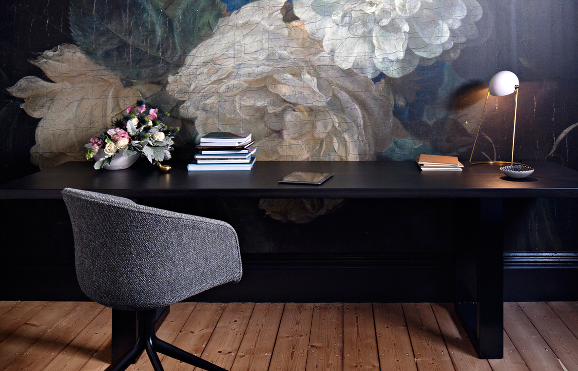
The timber and natural material palette borrow from a nearby park, with cool greys, warm caramels and deep greens that mimic the textures and colours of the foliage and branches of the plane trees. Lucy engaged local artisans and tradespeople to build custom-designed timber furniture and joinery, and commissioned Droog to produce the over-scaled botanical wallpaper in the study, which replicates Coenraet Roepel’s painting Still Life with Flowers from 1721. “It is a nod to my time living and working in the Netherlands, and also references the classic English children’s book The Secret Garden by Frances Hodgson Burnett,” says Lucy.
8m House by Architects’ Creative
 Featuring stained teak veneer cabinetry from Prime Panels. Photography by Sam Hartnett.
8m House is yet another exemplar of an architect’s – or in this case, architects’ – renovation of dilapidated architectural heritage into their own comfortable and modern family home. Based in Christchurch, New Zealand, Kate and Daniel Sullivan are partners in life as well as their practice, Architects’ Creative. Over the course of nearly eight years, the duo worked on 8m House in-between working on client projects, running their practice, starting a family, and the occasional surf.
With design for longevity and sustainability front and foremost of the project, Kate and Daniel rescued a rare still-standing piece of Christchurch’s architectural heritage and elevated it to meet modern living expectations and best practice design standards. Proving that clever home office ideas are more often than not a matter of being strategic with the space you’ve got, a built-in library / study nook makes use of an otherwise redundant corner in 8m House, demarcated (though not entirely cut off) from the living room by an archway.
Fitzroy Terrace by Taylor Knights
 Featuring engineered timber floorboards from Tongue n Groove and Compact 04 Pendant by Douglas & Bec. Photography by Peter Clarke.
For anyone from – or at all familiar with – Australia, the name Fitzroy Terrace pretty much says it all; a terrace in one of Melbourne’s grittier inner-suburbs in disrepair, with a need of being brought up to speed with its resident’s modern lifestyles and expectations.
Working in quite demanding industries, the residents of Fitzroy Terrace ultimately wanted to create a series of flexible, connected spaces that would host not only their private lives but also their love for entertaining. In response, Taylor Knights sought to create a series of layered volumes that harness light – or omit it – accordingly, accommodating for both moments of privacy and stillness, as well as times shared with treasured family and friends.
Contrary to the light and airy kitchen, living, and dining spaces, Fitzroy Terrace’s study is finished in a somber palette of deep, yet soothing hues. The desk is positioned against the window, affording abundant natural light, while a sheer drape mitigates unwanted distractions caused by the visual stimuli of the world outside.
Haidan House by HAO Design

In Beijing, urban space is at a premium. In the Haidan district a family of three was looking for a home that could accommodate their family, as well as the occasional working from opportunities afforded to a software engineer and architectural book editor.
The solution came in a unique, slanted roof 116-square-metre home, and the keen design eye of the HAO Design team who noted that the unique ceiling was in fact an opportunity, opting to preserve the design. In doing so, the home is given a unique interior look, as well as an increased feeling of space thanks to the ceiling height.
Above the common area are a sidelong bookshelf, master bedroom and bathroom, and a workspace study – a quiet place for rest, work and reading. Through this height division, the home is split between public and private activates. The ground floor has been designed for socialisation, games and entertaining, while the above level is ideal for these parents to work, relax and keep an eye on the activities below.
Ang Mo Kio Residence by Atelier Here
 Featuring 265 adjustable wall lamp by Paolo Rizzatto from Euroluce.
Designed by atelier here, the three storey single residence in Singapore is anchored by a predominantly white colour palette in order to visually bring in the lush greenery from outside. In search of a similar effect, the living room boasts a unique atrium that extends up from the ground floor. Here, a purpose designed white veil of gridded sunscreen fragments the park foliage into constant – yet varying – glimpses of green.
Likewise, the first floor is heroed by a U-shaped balcony that atelier here have cantilevered out and over the street to further unite the lush foliage opposite and the interior design of the house. Raintree canopies frame the study to a peaceful, and work-inducing effect.
Redfern Warehouse by Ian Moore Architects
 Featuring Walk Easy Smooth Profile cork sheet flooring from Comcork. Photography by Rory Gardiner.
In this pristine renovation of a brick-warehouse-turned-family-residence, lack of space was not an issue for architect Ian Moore. Rather the challenge was to make the expanse of space as comfortable for living and working in as it is to park a car.
“The clients had lived in the space for a year before I started work on the project and their major issues with it were that it was boiling hot in summer, freezing cold in winter and when it rained they could not hear anything due to the noise from the tin roof,” explains Ian.
The large natural cork flooring sheets are not only worth dwelling on, but are also one of the most overlooked home office ideas. In addition to their concrete-like appearance, they are soft underfoot, provide good acoustics (even when it rains), are cool in summer and warm in winter, and set the tone for the house’s restrained palette.


